

8 tips for photographing art
Wednesday 12 December 2018, 21:18 by Michelle Peeters | 38,173 views | 10 commentsThis article was translated from Dutch with the help of AI. Read the original.
Photographing art is an art in itself. It is much more complex than quickly taking a snapshot of a painting or sculpture. This quickly produces flat and meaningless images that do not show the artwork at its best.
When photographing works of art, you need to pay attention to many things, such as the right lighting, possible reflections, the right angle, etcetera. That is why artist Jacqueline van den Bos gives you some tips for photographing art in this article.
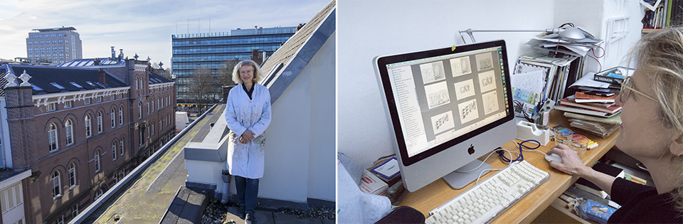
Jacqueline exhibits her paintings at Galerie ADK on the Prinsengracht in Amsterdam and photographs her own work. If you want to present yourself well as an artist, having good, technically correct photographs is an absolute must.
Photographing her own paintings and drawings is a difficult task that takes a lot of time. She uses a Nikon D80 DSLR with an 18-55 lens for this. She zooms in slightly to avoid distortion as much as possible. Straightening converging lines afterwards is really not an option with works of art.
The aperture is not particularly relevant when photographing flat surfaces, such as two-dimensional paintings or drawings. She regularly photographs at an aperture of f/5. It really does not need to be f/22.
With three-dimensional artworks, depth of field is of course a different matter. You can best photograph sculptures at eye level, while taking some distance and zooming in slightly.
The artworks should not be presented in a frame, that is an unwritten rule, and they should not be behind glass either, as that would create too many reflections. A light grey background, so not white or black, often works best.
1. Turn off the flash
It is best not to use the flash, because this quickly causes overexposure and reflections, especially with non-matt paint. The texture of the paint also becomes rather flat when using a flash.
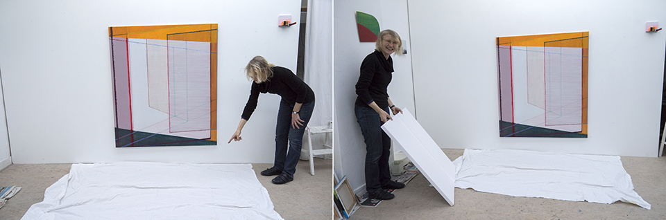
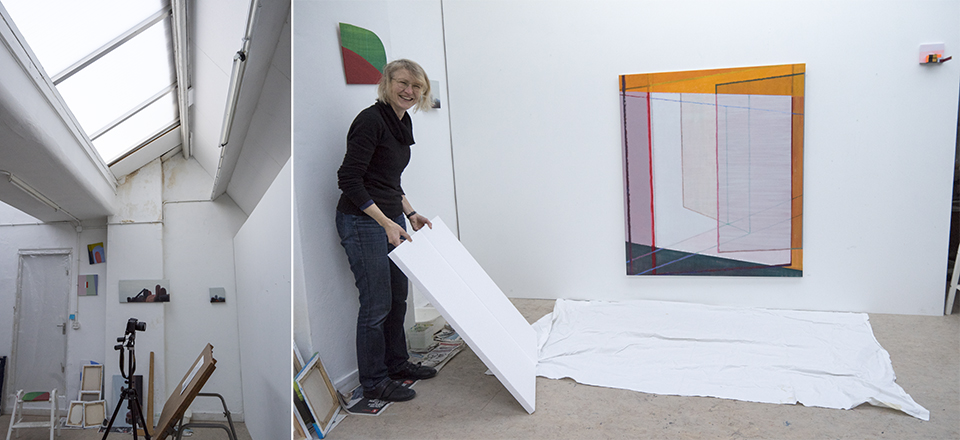
Instead, you can use a reflector, for example an improvised one made from white polystyrene foam. Jacqueline also has a white sheet on the floor to reflect the light from above.
If, for example, there is a window on the left-hand side of a painting, reflect the light on the right-hand side with your reflector. The light is then reflected, at a reduced strength, so it still comes from both sides.
You may have noticed that the rooms in museums containing lots of shiny paintings are always fairly dimly lit. To prevent reflections from shiny paint, a matt varnish is sometimes applied as well.
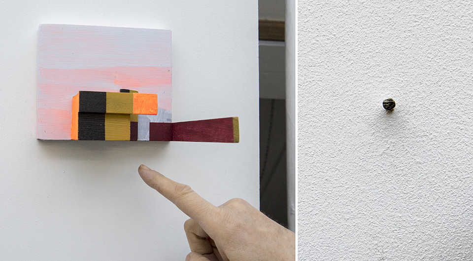
Do you really need to use flash? Try doing it indirectly, for example via the white ceiling or a side wall. If you do have to flash straight on, take enough distance from the artwork and use fill flash only. This is less harsh than using TTL or full power.
With three-dimensional works of art, flash can actually work well, because it can brighten shadows in corners and gaps that would otherwise disappear completely.
2. Use a tripod
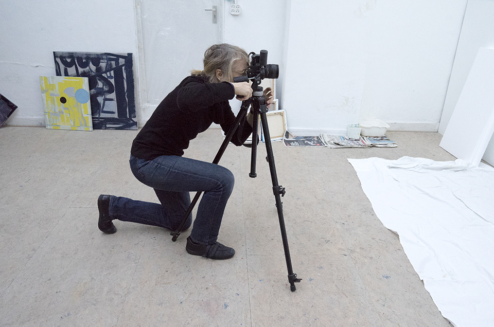
When photographing art, it is useful to use a tripod. This can also prevent you from having to use flash. You can then take photographs more easily in low light without a flash by setting a longer shutter speed.
Thanks to the tripod, you do not have to worry about camera shake. To prevent camera shake completely, you can also use your camera's self-timer.
No tripod to hand? Place your camera on a flat surface, such as a low wall or cupboard, or lean against a door frame.
3. Pay attention to colour temperature and white balance
If you photograph indoors, which is often the case with paintings, using light sources other than daylight, it is important to pay attention to the colour tones or colour temperature of these light sources, the lamps.
LED light has a colour temperature of 6500 Kelvin. This provides a good colour temperature, the same as daylight. Jacqueline is lucky to have a skylight in her studio, which lets in lots of diffuse daylight.
Daylight always looks slightly bluish. It is definitely not warm, yellowish light! Photographing in low light produces incorrect colours. Everything becomes too blue and too dark. This can no longer be recovered on the computer.
Our eyes easily adapt to different colour temperatures and can readily determine what is white. A camera has more trouble with this. That is why it is important to set the camera's white balance correctly for the situation. The aim is to match the white in your image to the white your eyes see.
If you photograph in RAW, you can still adjust the white balance afterwards. Different colour temperatures in one room are more difficult to fix in post-processing, however. You can even them out by using gels or filters.
You can still adjust the colour temperature in post-processing based on the white of the wall that you photographed as well. Preferably work with neutral light, in lightly overcast weather.
Sometimes photographing with artificial light is unavoidable, and then you are bound to get yellow photographs. Correcting this on your computer is very difficult. Try to turn off artificial light sources as much as possible, especially fluorescent light, which gives a green cast.
4. Make sure the colours are right!
If you have photographs of the artworks printed, you need to make sure the colours are right. Or at least that they come as close as possible to reality.
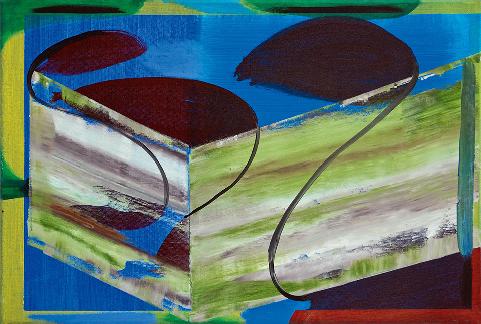
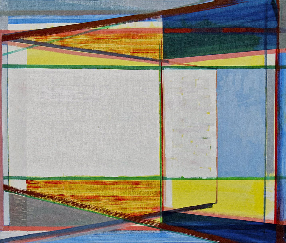
The painting above contains, for example, two different shades of blue. The colour Ultramarine, a purplish blue, cannot be printed, only approximated. What a good printer does is choose one of the print colours, CMYK, in this case Cyan, and add some red to it. In the photograph, you therefore only see Cyan blue.
The colour gamut of a print is simply much smaller than that of oil paint. It can never match the original. Pink and kraplak always become red. Dark yellow and lemon yellow always become one standard yellow.
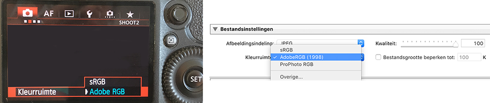
In any case, make sure you set the colour space to Adobe RGB or Profoto RGB. You can do this on the camera, although it makes no difference if you photograph in RAW, and in Photoshop/Lightroom when exporting to JPG. This gives you a much wider colour range than sRGB. Read Elja's article about using colour spaces here.
In this article by Hans Frederiks, you can read how to calibrate your monitor and use print profiles to achieve the most realistic reproduction of the colours used in the artwork when you start printing.
Photographs on a website should of course not be too large, otherwise they take too long to load and people quickly give up. High-quality files are only important for your own archive and for printing.
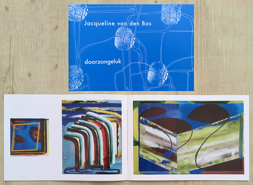
Digital printing is now rapidly gaining ground and is much cheaper than high-quality printing. It is actually a kind of high-quality copying: it goes into a huge photocopier, a laserjet, instead of an offset printing press.
It is the difference between digital printing and the work with three different colour layers and black and white. You can see it when you look at a copy or a photograph in a book with a magnifying glass. The screen is diamond-shaped or inkjet.
The booklet below was not digitally printed and Jacqueline had to explain it precisely to the printer. A specialist job!
5. Preferably use soft daylight
You do not need a high resolution for the internet, so you can easily photograph with a simple compact camera. But the more detail you can capture, the better, of course. Photographing with a full-frame system or DSLR camera therefore offers many advantages.
Daylight is ideal for photographing paintings. Before she had this studio, Jacqueline always dragged her paintings outside to photograph them.
Natural light does not become yellow, but tends towards blue. This keeps the red in a painting beautifully red instead of turning it orange. It gives a realistic colour reproduction, which is essential for your overall colour balance.
Try to create a setup with as much natural light as possible coming from the front, while making sure you cannot see the shadow of yourself with the camera.
Jacqueline's studio is ideal in this respect. The light comes in diffusely from above at an angle through frosted glass. This is why the drawing table is positioned at an angle for photographing black-and-white drawings at the end of this article.
A setup with grazing light can also work very well. This means natural light from the side. You then get good depth and the 3D aspect of your paintings comes out beautifully. A nearby window letting daylight in often works very well too.
With side light, you can add light nicely with a sheet of polystyrene foam or an empty canvas. White walls also reflect the light back beautifully and diffusely. Black or dark walls would absorb the light instead.
There is a difference between photographing a dark work and a light work. You sometimes need to overexpose or underexpose. If you photograph in RAW, you can recover blocked-up shadows or reduce clipped highlights to bring back some detail when contrasts are too high.
The best light source is soft daylight. Sculptures or other works of art are often outside. It is best to photograph them in the shade rather than in bright sunlight. An overcast day is perfect because of the soft light. Direct, harsh light creates unpleasant shadows and reflections and can affect the colour of the artwork in the photograph.
Also always check that no strange patches of light fall on the artwork through reflections from glass, mirrors or furniture.
6. Position of the artwork and camera
When photographing a painting, it is important that the edges of the painting run parallel to the edges of your photo frame. When a painting is hanging on the wall, this is often not a problem.
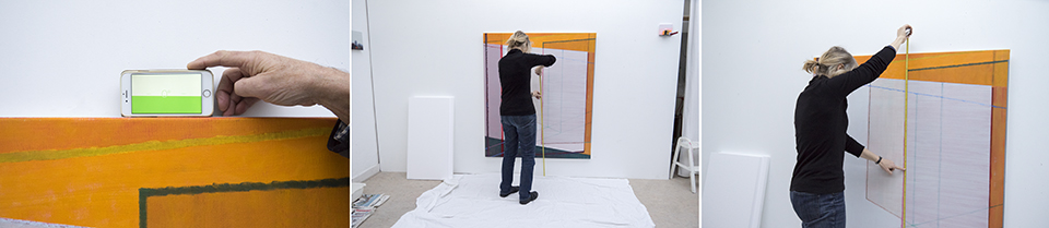
A rectangular canvas should be photographed straight on. You can do this by measuring the height of the centre of the canvas while it is hanging. Then place the camera on a tripod at exactly the same height. Small deviations here create skewed distortions.
It looks best to show artworks without a frame or wall. So you need to crop them. That is why you should photograph the image as straight as possible. You can, incidentally, use the Free Transform tool in Photoshop to fill a skewed corner to 90 degrees. But with artworks this is of course tricky.
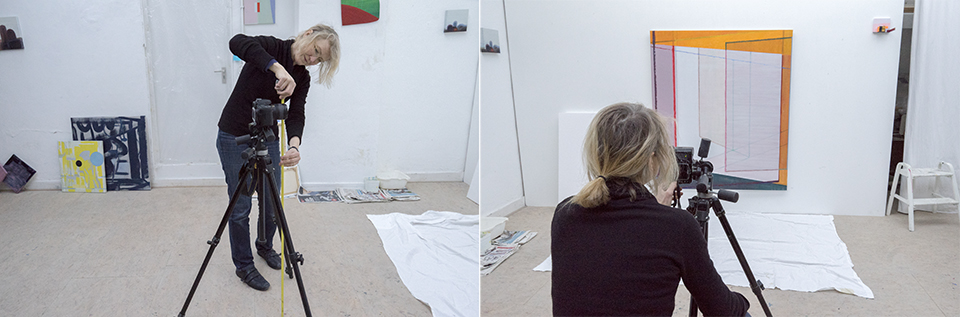
If, for example, an artwork is leaning at an angle against the wall, you will also need to tilt the camera slightly so that the edges run parallel again. As long as you do not have to point your camera upwards at an angle, so make sure you photograph at the same height as the painting, it works fine.
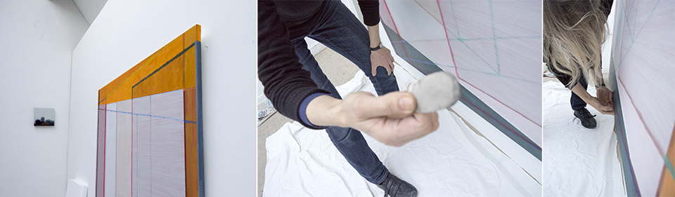
Try to zoom in as much as possible and fill the frame with the artwork as much as possible. Leave only a small border between the artwork and the edge of the frame. This makes optimum use of your camera's resolution.
She also always puts a sheet on the floor, because otherwise you always get a gradient from light at the top to darker at the bottom, in the case of skylight.
7. Check whether the background is suitable
If you photograph a painting, this is less important, as you make sure you capture the painting filling the frame. But if you photograph a work of art other than a painting, you do need to pay attention to a suitable background.
A plain background is often best, light grey often works best and is better than black or white, because the attention is then focused only on the art object. A black or white background is often used. With certain artworks, colour can also work very well.
You can easily make a background yourself by hanging a cloth or paper against the back wall. If you let the cloth or paper continue across the floor, you can avoid corners that only distract from the subject.
If you present your work on a website, a beige or very light grey background with lots of space around the artwork is usually the most effective.
8. Black-and-white drawings
Photographing black-and-white drawings is an art in itself. If you hang them on the wall, this creates too much tonal variation in the white and too much variation in light from top to bottom.
Jacqueline attaches the drawing to the background with masking tape rolled up, as Blu Tack creates bumps in the paper. She attaches the drawing to a drawing table set at an angle, dark in colour.
You also avoid the shadow of your camera hanging above the drawing, which you would get if you placed the drawing flat on the floor. She then positions the tripod properly.
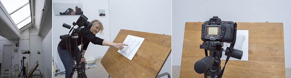
She places small markers so that she can quickly photograph a series one after another. The light must once again be even! You often still need to increase the contrast on the computer. Sometimes she converts the photograph to black and white to make the image calmer.
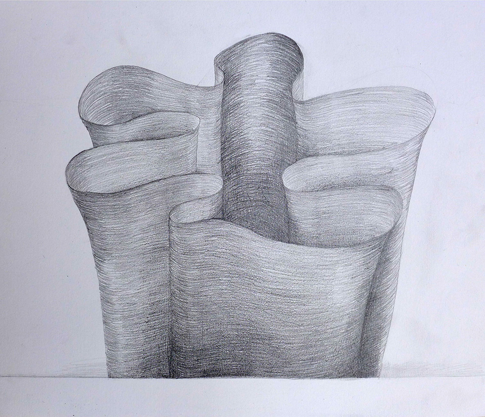
Improvising
Jacqueline had to improvise and experiment a lot to photograph her work professionally. This turned out to be very educational. There will probably be better and easier ways to achieve good results.
If you have a good and useful tip, let us know in the comments!
Art photography course
Want to know more about photographing art or photographing artistically? Then take a look at the Van Beeld naar Kunst course by Micky Hoogendijk, art photography.
About the author
Michelle Peeters is fotografe en oprichter van DeuxBleus Fotografie. Michelle herkent het bijzondere in het gewone en het gewone in het bijzondere. Ze heeft zich nooit willen specialiseren en is daardoor van alle markten thuis.
You might also like
-
 Review: Discover the World of Fine Art Photography with Micky Hoogendijk
by Michelle Peeters
-
 An Ode to Holiday Snapshots
by Michiel Heijmans
-
 Classic paintings recreated as hilarious quarantine photos
by Michelle Peeters
-
 Paintshoot; playing with paint in the studio
by Elja Trum
-
 10 tips for light painting
by Liesbeth van Asselt
-
 Light painting: a creative form of photography
by Nando Harmsen
10 comments
-

-

 Michelle Peeters wrote on Tuesday 20 February 2018 at 18:56
| reply
@Jan: goeie tip, dank!
This comment was written in another language and has not been translated yet. -
 PhotoDante, Philip wrote on Wednesday 21 February 2018 at 12:30 | reply
Met zo'n lichtstraat is het ideaal om kunst te fotograferen.
This comment was written in another language and has not been translated yet.
Een setting met strijklicht, zoals in het artikel genoemd wordt brengt het risico dat je duidelijk een lichtrichting ziet. Zeker met olieverf schilderijen of schilderijen die afgelakt zijn met vernis.
Als mijn klant een schilderij ingelijst heeft wordt de foto met lijst op de website geplaatst, ze wordt immers met lijst verkocht.
Veel experimenteren inderdaad voor dat je tot goede resultaten komt. -
 wim hendriks wrote on Wednesday 21 February 2018 at 14:25 | reply
grag zou ik willen weten hoe ik een goede foto maak bij voorbeeld van kerkramen,en gebouwen dan zijn de zijkanten altijd scheef .dit vind ik een heel groot probleem
This comment was written in another language and has not been translated yet. -
Michelle Peeters wrote on Wednesday 21 February 2018 at 16:09
| reply
@Wim: afstand nemen en inzoomen scheelt een hoop om scheve lijnen te voorkomen.
This comment was written in another language and has not been translated yet. -
-
 Alain wrote on Wednesday 21 February 2018 at 18:45 | reply
@wim,
This comment was written in another language and has not been translated yet.
Inderdaad met een tilt-shift lens of een technosche camera.
Google eens naar de "regel van Scheimpflug" voor de theorie. -
PhotoDante, Philip wrote on Thursday 22 February 2018 at 12:28 | reply
Als je een tilt/shift lens wil gebruiken , ik heb er één liggen van Canon.
This comment was written in another language and has not been translated yet. -
 primefoto.nl wrote on Sunday 25 February 2018 at 16:56
| reply
Kleuren correct krijgen betekent colormanagement. Dus een Color Checker Passport gebruiken. Dan maakt het soort licht ook niet meer uit zolang het geen gemengd licht is. Het geheim van schitteringen is begrijpen dat invalshoek gelijk is aan uitvalshoek en licht gepolariseerd kan zijn. Dan moet je nog begrijpen dat de meeste mensen op een te blauwe monitor naar je foto kijken. Een ander zal dus zonder gekalibreerde monitor nooit de exacte kleuren zien.
This comment was written in another language and has not been translated yet. -
Michelle Peeters wrote on Sunday 25 February 2018 at 17:09
| reply
@Primefoto: het is nog niet eenvoudig inderdaad! Zo'n Color Checker Passport lijkt me inderdaad een erg handig hulpmiddel!
This comment was written in another language and has not been translated yet.
Have your say
Please note: Articles older than a week can only be commented on by signed-in visitors.Would you still like to comment? sign in or create a free account.
Become a better photographer every week
A practical photography tip in your inbox every week.
38,885 photography enthusiasts already receive the tips! More about the weekly mail. Or keep up to date via  Facebook.

Elja Trum
Photofacts; everything to do with photography!
Would you like to take better photos and keep up with what is happening in photography? Photofacts publishes articles that teach you something about photography — from a product announcement to a practical shooting tip or a look at a website. Photofacts covers photography every day and is a hobby project of Elja Trum's that got out of hand. The articles are written by a team of volunteer authors. If you would enjoy writing one or more articles for Photofacts, do get in touch.More about PhotofactsPhotofacts is made possible in part by
