

11 Tips for Creating the Most Beautiful Photo Albums
Monday 16 January 2023, 20:02 by Hermine Snellink | 9,215 views | 4 commentsThis article was translated from Dutch with the help of AI. Read the original.
Creating albums is a lovely activity for some, while others often put it off. Yet it is always great to see the end result, printed and finished.
To help you create your own albums, I want to share some tips I have collected over the years.
Because of my work as a wedding photographer, I create around 40 albums a year. And I have made the necessary mistakes. With a bit of luck, you won't have to make them.
Hence this blog post. With 11 tips that make creating a photo album easier.
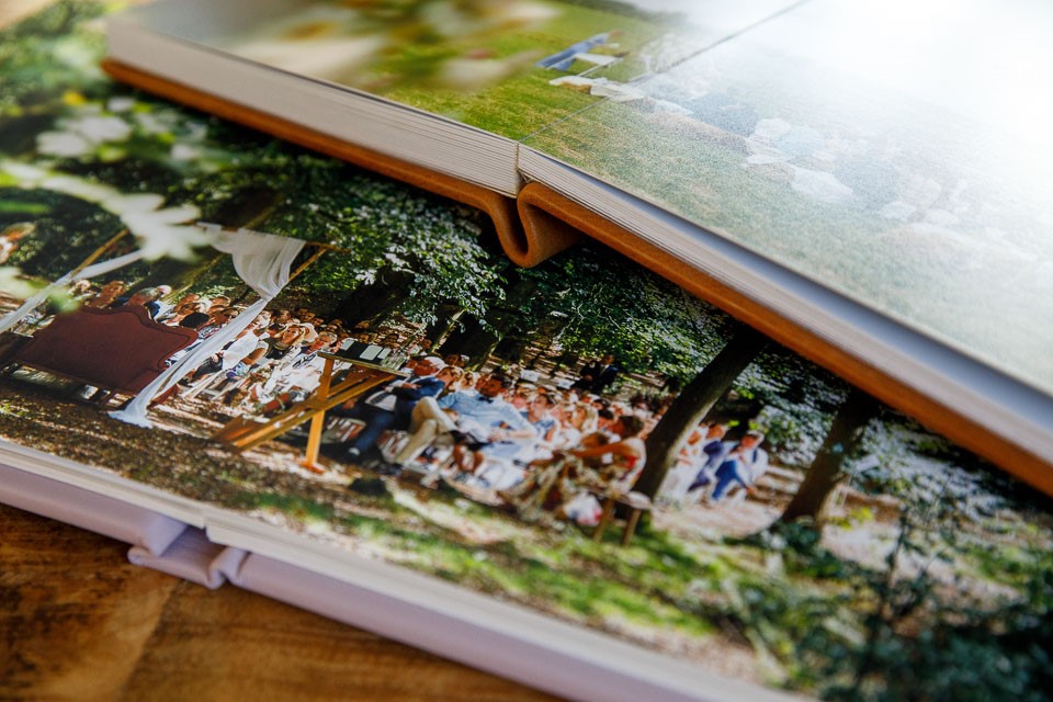
1. Check the fold
If there was one thing my clients asked about at first, it was whether any photo information would disappear into the fold.
We now only supply albums with double-page spreads that lay flat, but this trauma has stayed with me.
My rule: no fold through the eyes.
Ideally, no fold through faces at all.
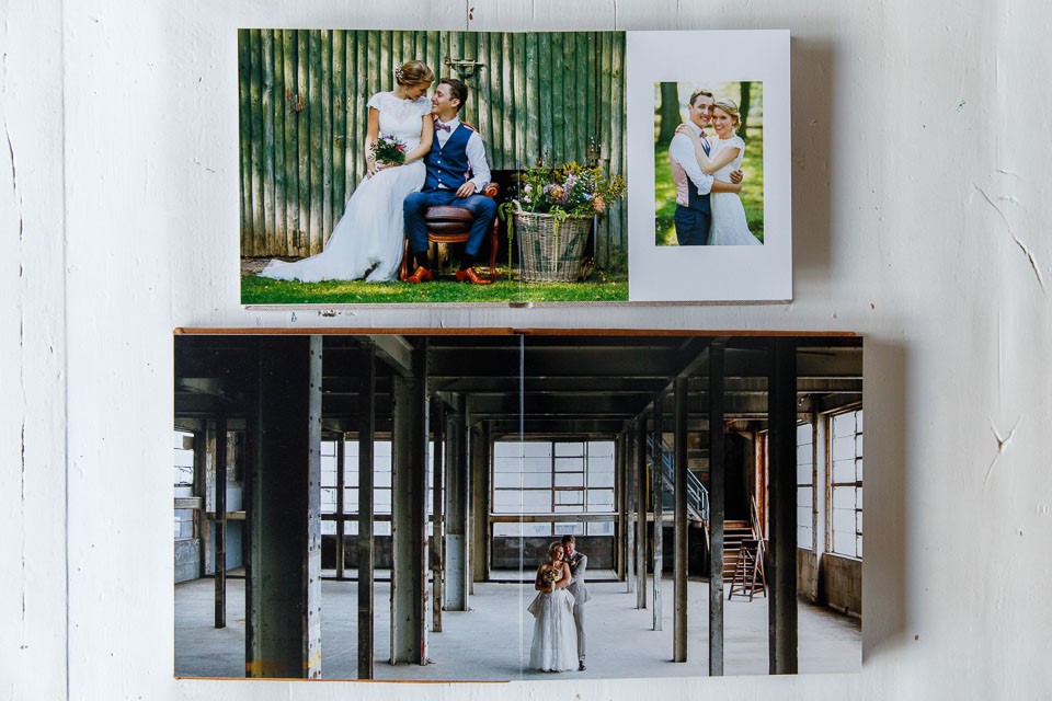
If necessary, I place a separate photo on the left and right of the spread, or I leave some white space to the left of the photo, but I keep shifting things until the eyes are 'out of the fold'.
The only exception is when I have a group photo with lots of people. Unfortunately, someone will often end up in the fold, but preferably not the couple or another prominent guest.
If necessary, I enlarge the photo, so I have a little more room to move things around.
2. Take the bleed of your spread into account
After printing, something is almost always cut off the sides of your spread. So bear in mind that body parts may be cropped, and that does not always suit your layout.
You can prevent this either by taking photos with enough space at the sides, or by using white space. Make sure the white space is large enough that it does not stand out when a few millimetres are also cut off here.
3. Less is more: not too many photos on one spread
Sometimes it is difficult to imagine how a page will look in print. I prefer to use around 3 to 5 photos per spread, so that the design remains calm and interesting to look at.
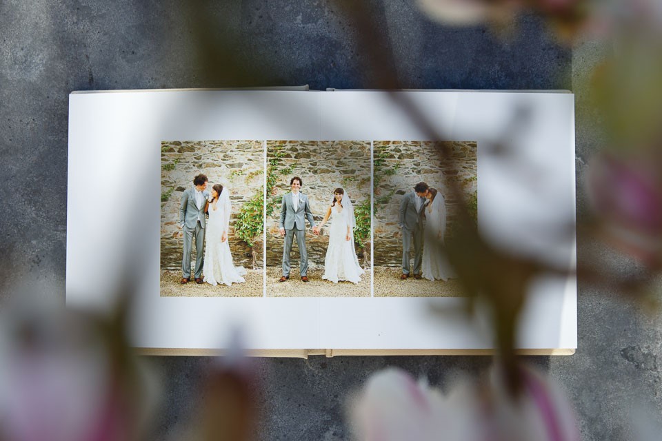
Exceptions are pages with lots of small details that have been photographed separately. Or think of the signing of the register by the couple, the witnesses and the registrar.
One possible solution is to try to capture the entire atmosphere or the complete moment in one photo. A bit of a holy grail for me, secretly, so I am still working on that.
4. Choose consciously whether or not to tell the story chronologically
The albums I design are chronological nine times out of ten. For a wedding album, I start with the preparations, followed by the photoshoot, wedding ceremony and finally the dinner or the party.
But every now and then it is better to deviate from this rule.
For example, when two photographers worked on the day. The photos of the groom and bride can then become mixed up, and it makes more sense to group them.
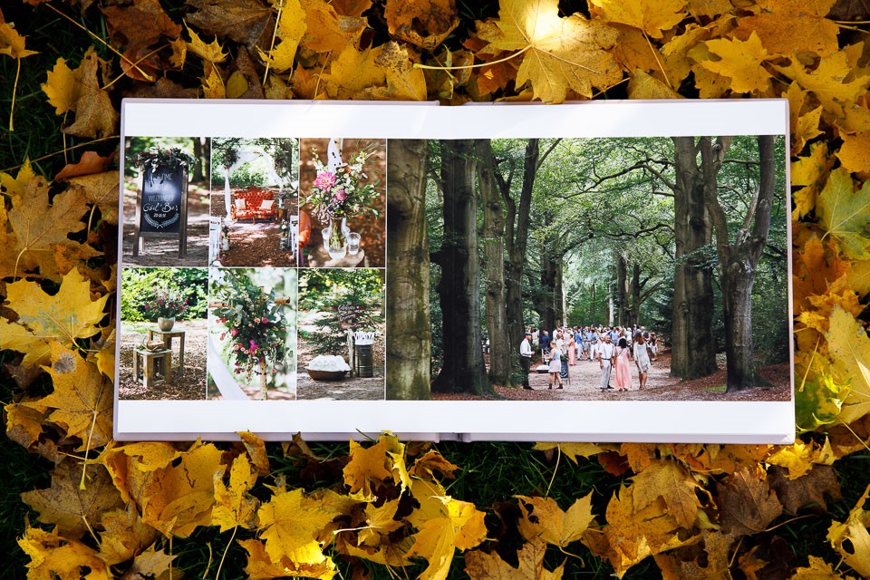
Or the couple may want to open with their favourite photoshoot photo and finish with a photo featuring a sunset.
The same applies to holiday albums: sometimes it is better to combine certain atmospheric images or show them large, while all the foodie photos can go together on one page. In any case, choose consciously what works best in your album.
5. Make sure you do not place the same photo twice in one album
Fortunately, I have not had this happen in a wedding album, but I do have a family album containing the exact same photo of my grandmother with her great-grandchild twice.
Some design programmes can alert you when images appear twice in the album. You can also have someone else check your design, or leave this to the client if there is one.
6. Check your text, size and cover
A colleague recently told me that she had unfortunately had the wrong wedding date printed on a wedding album. You can prevent this by having your client write down the date and then copying and pasting it yourself. This also prevents spelling mistakes in names.
Check one more time that you have the right size and that the chosen cover material is also correct.
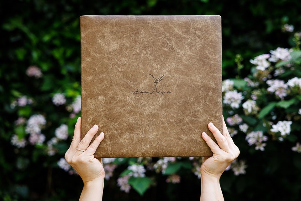
Unfortunately, I once ordered a wedding album that was too small. Fortunately, I was then allowed to use it as a sample album.
Or choose a printer who checks your design as well. We have worked with Folio Albums for a long time, and part of their service is that they always check the design for design errors. This can save you a lot of costs later on.
There are also printers who can replace spreads in the album, for an additional cost, or who can keep the book block and put a new cover around it.
7. Good software makes life easier
Use software such as Pixellu Smartalbums to create a design quickly.
For example, I import all the photos from a wedding shoot into Smartalbums and then use the rating that was exported from Lightroom as well. I have already created a small summary of the assignment in images.
I can then fairly easily turn those selected images into a first draft. I then add highlights that are still missing from my first draft, such as group photos or extra photos of guests, and before long I have finished the first design.
Good software can save a great deal of time. It is even possible to create an automatic design based on the photos you select.
8. Know your limits when it comes to noise and enlargements
Make sure you do not place photos with a lot of noise too large in the album, because you can sometimes see that noise a little too clearly in large photos.
When the rest of your images have little noise, the difference between spreads can be very noticeable. If you are unsure what full-spread photos at 6400 ISO look like in print, ask your printer for a few test prints.
When in doubt, do not print photos with a lot of noise too large.
Bonus tip: Always check your album spreads by exporting them and viewing them at 100 per cent before placing the album order.
We were once told by Jiggy Albums that we still needed to remove some floating dust. Since then, I have checked my files extra carefully before having them printed in an album.
9. Look towards the middle
If you place several photos on a spread, and these are, for example, photos of people watching a ceremony, try to have everyone look 'towards the middle of the spread'. Sometimes you can prevent people from 'looking off the page' by swapping a few photos around.
I often place a large photo of the couple in the middle, without a fold through their faces, and have the guests in the other photos look towards them.
10. The right balance in your spreads
Whether you want to alternate black and white and colour on one spread is a personal preference. Many colleagues choose either everything in colour or everything in black and white. But if you do want a mix, make sure the distribution makes sense.
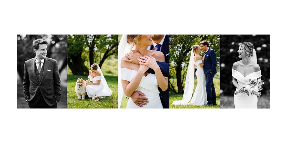
My distribution is often a maximum of 1/3 black and white, evenly distributed. If, for example, only one of the ten photos is in black and white, I choose the colour version instead, because otherwise that one photo attracts all the attention.
A bonus tip here is that you can also take the end result in an album into account when taking photos. For example, I often photograph wedding details against similar backgrounds, so they also work well together on a spread.
You can also consciously choose to photograph separate portraits of the couple in the same place or not, to bring calm to the album here too.
11. Vary your layouts
This is also a personal choice, but I try to use each spread layout at least twice in an album. I also do not often place two exactly the same layouts after each other.
Again, this is to present the story of a shoot in a calmer way. This is less important in a yearbook.
Those are my tips. I hope they help. You may also design your albums in a completely different way. If so, please leave a comment, so I can learn from it again.
About the author
Hermine Snellink is trouwfotograaf. Ze startte samen met Ramon Snellink Mon et Mine en samen fotografeerden ze meer dan 500 bruiloften. Hun kleurrijke trouwfoto’s zijn vaak vol momenten, details en emotie.
You might also like
-
 Finding the Right Light for Wedding Photography
by Elja Trum
-
 Points to consider when photographing weddings
by Nando Harmsen
-
 Review: Wedding Photography by Werner Pellis
by Elja Trum
-
 Create a Photo Album Without Layout Restrictions
by Nando Harmsen
-
 Groom wears Apple Vision Pro at his wedding
by Elja Trum
-
 What happens to our photos when we're no longer here?
by Nando Harmsen
4 comments
-

-
 Hermine wrote on Tuesday 17 January 2023 at 11:38 | reply
@Susan We use Jiggy Albums ourselves for our albums with light-gloss photo paper and Folio Albums for albums with matte paper. Occasionally we also experiment with other types of paper from these suppliers, but so far we keep coming back to these.
Translated from Dutch.
But Profotonet is also on my list to try for the smaller albums we supply. -
 guest wrote on Tuesday 17 January 2023 at 13:48 | reply
May I humbly add a 12th tip. I’m not in the wedding photography sector, but I did need a nice portfolio binder for my own work. And in A3Plus, which my own printer can produce. Nothing exists in that format, so in consultation with Artifact (nowadays Gersteacker) I had a pack of black mat board cut to A2 size, and then punched the 6 holes for the binder myself after making a template. For my Artcare A2 binder. I glue a sheet of barrier paper very thinly to the left side (a protective sheet like the ones also found in photo albums), and I have a "wedding album" in a truly large format. Two fellow photographers have already adopted the idea for their own work. And I use the leftover mat-cutting material to stick some smaller photos onto, when I have to deliver something quickly after all and want to give it "a little more" than the loose print.
Translated from Dutch. -
 Bernadette wrote on Tuesday 17 January 2023 at 18:01 | reply
Actually, I also have 2 tips for making an album.
Translated from Dutch.
1. First select the best photos or the photos that really have to be in it in a separate folder, then you don't have to keep scrolling through all the photos (often 100). After that you can still look for more.
2. Take both horizontal and vertical photos of most subjects, so you can alternate with the page layout.
Have your say
Please note: Articles older than a week can only be commented on by signed-in visitors.Would you still like to comment? sign in or create a free account.
Become a better photographer every week
A practical photography tip in your inbox every week.
39,077 photography enthusiasts already receive the tips! More about the weekly mail. Or keep up to date via  Facebook.

Elja Trum
Photofacts; everything to do with photography!
Would you like to take better photos and keep up with what is happening in photography? Photofacts publishes articles that teach you something about photography — from a product announcement to a practical shooting tip or a look at a website. Photofacts covers photography every day and is a hobby project of Elja Trum's that got out of hand. The articles are written by a team of volunteer authors. If you would enjoy writing one or more articles for Photofacts, do get in touch.More about PhotofactsPhotofacts is made possible in part by
