

Pressing the black and white conversion button is never enough
Sunday 12 November 2023, 20:02 by Nando Harmsen | 2,902 views | 1 commentThis article was translated from Dutch with the help of AI. Read the original.
Sometimes I see black and white photos that were clearly made by pressing the black and white conversion button. Unfortunately, that photo is also often placed next to a colour version with that dreaded question: which one is better?
Converting a colour photo to black and white is a very personal choice. You have to make that choice as a photographer, rather than leaving it to your followers on social media or your friends. Don't be uncertain about whether you want black and white or not. Make the choice.
Once you have chosen black and white, don't just press the black and white conversion button. Usually, this simply removes the colours from the photo, nothing more and nothing less. That almost always results in an uninspired photo.
If you want to convert a photo to black and white, do it with plenty of care. What you should especially do is play with the colour channels in your photo editing programme. Using colours for black and white sounds strange, but it gives you an incredible number of options.
As an example, I chose a field of poppies. In colour, this provides a nice contrast between green and red. The colour version of the photo is otherwise not particularly interesting. It is a field of poppies, nothing more and nothing less. Have a look.
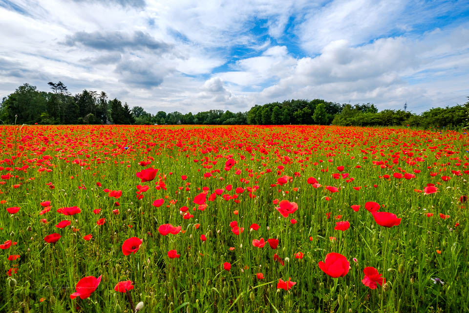
Maybe black and white is a better choice. That way, you might be able to make something more appealing from that not very exciting colour photo.
For this, I converted the photo to black and white in Lightroom Classic. With the black and white conversion button, because that is what it is for. However, the result is very strange. The poppies are basically no longer visible. Both green and red have almost the same shade of grey in black and white.
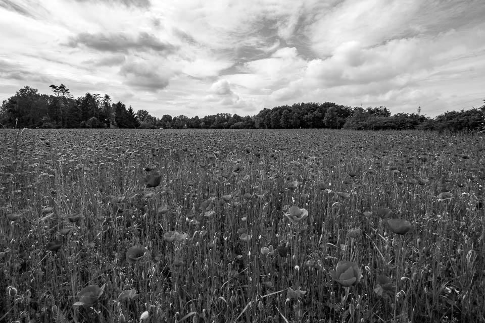
That should be possible to improve, because red and green differ quite a lot in colour. For this, I opened the black and white panel in Lightroom Classic and made the red and orange tones lighter. At the same time, I made the green and yellow tones darker.
I also adjusted the brightness of the blue tones. They were made darker, increasing the contrast with the white clouds. Compare this result with the previous black and white conversion. I think you will find the difference very noticeable.
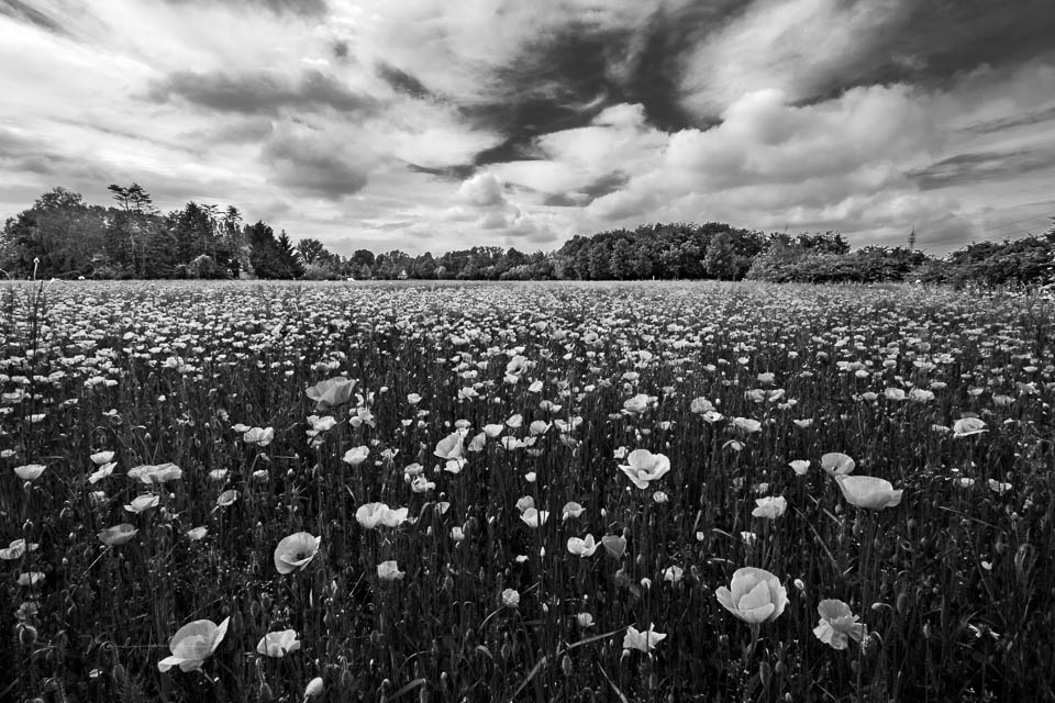
This shows that you can't just quickly do a black and white conversion. You have to give it some attention and play with the colour channels to achieve the best result. Once you see the result, you can simply forget about the colour version. This is infinitely better and more interesting. At least, that is my opinion.
How do you make your black and white photos? Do you also work with colour channels, or have you never used them? If so, give it a try.
About the author
Nando Harmsen has been photographing for more than 40 years. He specialises in wedding photography and landscape photography. Nando also gives talks, workshops, masterclasses and photo trips, and regularly reviews new and interesting equipment.
You might also like
-
 What are groups and channels on your flash for?
by Liesbeth van Asselt
-
 World Press Photo winners announced
by Nando Harmsen
-
 Black-and-white photography tip: Shoot in colour
by Elja Trum
-
 Night photography tip: taking photos without touching the camera
by Nando Harmsen
-
 Photoshop tip: Use a copy of a merged layer
by Nando Harmsen
1 comment
-
 arend van Beek wrote on Wednesday 15 November 2023 at 21:24 | reply
Interesting approach and a nice addition to obvious technique
Translated from Dutch.
Have your say
Please note: Articles older than a week can only be commented on by signed-in visitors.Would you still like to comment? sign in or create a free account.
Become a better photographer every week
A practical photography tip in your inbox every week.
39,080 photography enthusiasts already receive the tips! More about the weekly mail. Or keep up to date via  Facebook.

Elja Trum
Photofacts; everything to do with photography!
Would you like to take better photos and keep up with what is happening in photography? Photofacts publishes articles that teach you something about photography — from a product announcement to a practical shooting tip or a look at a website. Photofacts covers photography every day and is a hobby project of Elja Trum's that got out of hand. The articles are written by a team of volunteer authors. If you would enjoy writing one or more articles for Photofacts, do get in touch.More about PhotofactsPhotofacts is made possible in part by
