

Create a washed-out look in a black-and-white photo
Saturday 23 December 2023, 22:22 by Nando Harmsen | 3,153 views | 5 commentsThis article was translated from Dutch with the help of AI. Read the original.
You have probably seen a black-and-white photo with a washed-out look. The darkest black is not black but dark grey, and white is light grey. This effect is very easy to create, but make sure you do not lose the contrast.
A washed-out black-and-white photo looks like a somewhat older photo that has faded. As if time has made the black fade, and made the white less white. It is a black-and-white style that gives the photo a distinctive look.
Are you looking for this look? Then you need to be careful not to lose the contrast in your photo. It may seem that you can achieve this by lowering the contrast. However, this is not the way to create this effect.
It is important to start with a well-edited black-and-white photo. In other words, edit your photo in such a way that you get a nice, strong contrast. You can have pure black and pure white in your photo.
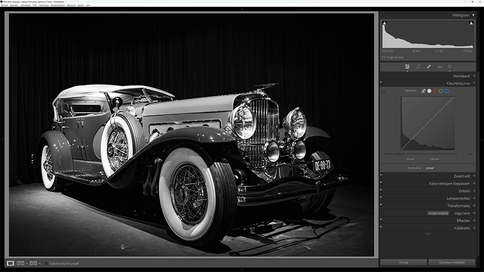
Once you have a good black-and-white photo, you can apply the washed-out black-and-white effect. You do this by adjusting the curve. In Lightroom, this is called the Tone Curve. The curve is a diagonal line across the box. You make this diagonal line flatter.
On the horizontal axis, you see the brightness levels, just as in the histogram. On the vertical axis, you see the output of that brightness. By moving the point that represents pure black upwards, you change the black to a tone that is less black.
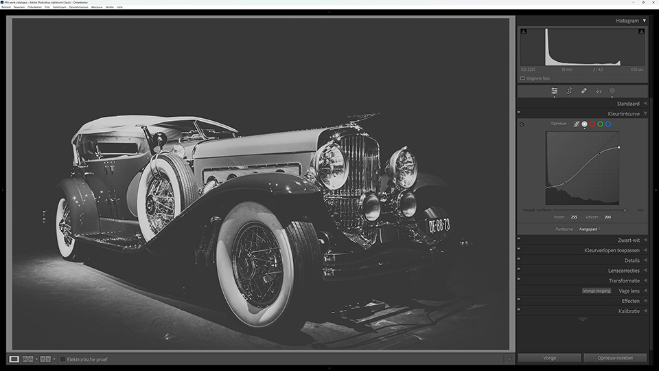
Do the same for pure white. Move the curve downwards so that everything that is white becomes less white. This changes the contrast in the photo to some extent. You can bring this contrast back by creating an S-shape in the same curve. Dark becomes darker, light becomes lighter.
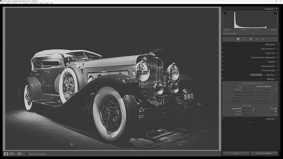
Would you like to complete the mood? Then add a little grain to the photo at the end. This makes the photo look a little rougher. Whether you add grain, and how much, depends on your personal preference. Just play around with it.
About the author
Nando Harmsen has been photographing for more than 40 years. He specialises in wedding photography and landscape photography. Nando also gives talks, workshops, masterclasses and photo trips, and regularly reviews new and interesting equipment.
You might also like
-
.jpg "Use a grey card for accurate colours") Use a grey card for accurate colours
Use a grey card for accurate coloursby Elja Trum
-
 Grey weather? Turn it into a black-and-white photo
by Nando Harmsen
-
 Dull grey weather? Adapt your photography to the conditions
by Nando Harmsen
-
 Sometimes a black-and-white photo needs to be grey
by Nando Harmsen
-
 Do not use a variable grey filter for photography
by Nando Harmsen
-
 Friendship between grey wolf and brown bear captured
by Michelle Peeters
5 comments
-
 wim wrote on Saturday 23 December 2023 at 22:32 | reply
don't you need a black and white point to print your photos?
Translated from Dutch. -

-
 rene wrote on Tuesday 26 December 2023 at 10:59 | reply
At some print labs there is a checkbox for optimizing the photos, it should be unchecked
Translated from Dutch. -
-

 Vbruggeman wrote on Sunday 7 January 2024 at 09:43
| reply
Vbruggeman wrote on Sunday 7 January 2024 at 09:43
| reply
@ Nando, @ Rene
Translated from Dutch.
Thanks for this comment, now I immediately know where my disappointment with some prints comes from! Uncheck optimization!
Have your say
Please note: Articles older than a week can only be commented on by signed-in visitors.Would you still like to comment? sign in or create a free account.
Become a better photographer every week
A practical photography tip in your inbox every week.
39,024 photography enthusiasts already receive the tips! More about the weekly mail. Or keep up to date via  Facebook.

Elja Trum
Photofacts; everything to do with photography!
Would you like to take better photos and keep up with what is happening in photography? Photofacts publishes articles that teach you something about photography — from a product announcement to a practical shooting tip or a look at a website. Photofacts covers photography every day and is a hobby project of Elja Trum's that got out of hand. The articles are written by a team of volunteer authors. If you would enjoy writing one or more articles for Photofacts, do get in touch.More about PhotofactsPhotofacts is made possible in part by
