

Cyanotype: a photographic technique from 180 years ago
Wednesday 7 October 2020, 21:42 by Erik van Rosmalen | 10,353 views | 2 commentsThis article was translated from Dutch with the help of AI. Read the original.
Cyanotype originated in the 1840s. Artists use the technique, but it became better known as the 'blueprint'.
For many decades, it was the only method for copying drawings. By creating designs on semi-transparent paper, so-called blueprints could be made.
How does it work?
You can make cyanotypes relatively easily at home. It is best to order a kit with the ingredients online. You will then receive (a solution of) red prussiate of potash, potassium hexacyanoferrate(III).
You mix this with a solution of ammonium iron(III) citrate. You then coat acid-free paper, such as watercolour paper, with it, in the dark! From this point on, the paper is light-sensitive, so you will have to let it dry in the dark.
Exposure
Exposing the paper is not difficult: place the paper in the sun for a few minutes with your objects or negatives on top. You 'develop' your cyanotypes by then rinsing the paper thoroughly with water. Once dry, your cyanotype is ready!
Because I was curious about this way of 'photography', I ordered a kit and started experimenting. Coating the paper takes some practice to get it nice and even. You are also doing this in very little light, logically.
To get sharp prints, you want to keep the dried paper and your objects as flat as possible. The best way to do this is to use a sheet of glass or an old photo frame. Place the negative or your objects on the paper, then place the sheet of glass on top.
You preferably expose the paper in full sun. You will have to find the right time through trial and error. Five to fifteen minutes is usually enough. During that time, you can see the paper change colour in the sun from yellow to deep blue and back to a darker yellow.
Result
I made my first attempt with some leaves and flowers from the back garden. Things do shift a little when you place the objects, but if you work quickly, you will not see this in the final result. After all, it is only a few seconds in a ten-minute exposure.
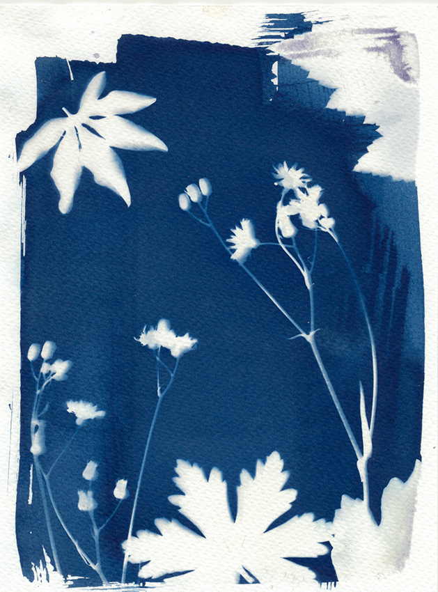
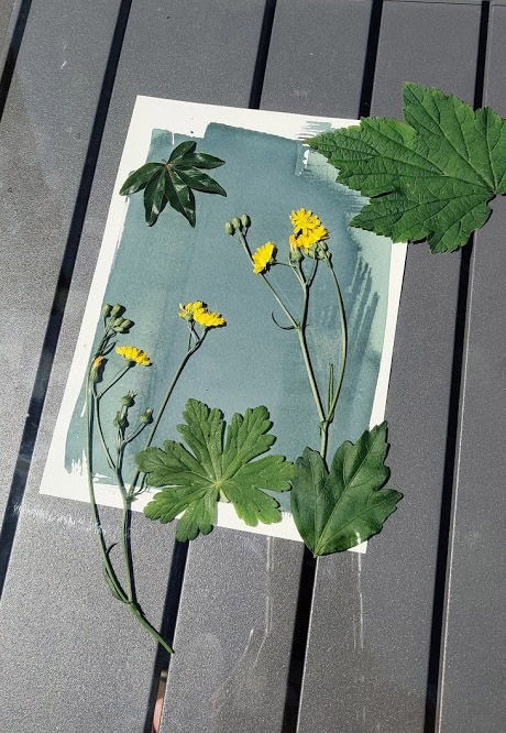
A 'photogram', where you expose the paper with different objects placed on it. Below, the setup in the sun. You have time to create a composition, because the exposure takes about 8 to 10 minutes.
Printing negatives
As well as objects, you can of course also place negatives on the sensitive paper. However, unlike in a darkroom, you cannot enlarge your image. In principle, you will therefore get images ranging from 35mm (small format) to 6 centimetres (medium format).
I experimented with some roll-film negatives. By placing two strips of three images each on the paper, you still get a nice result:
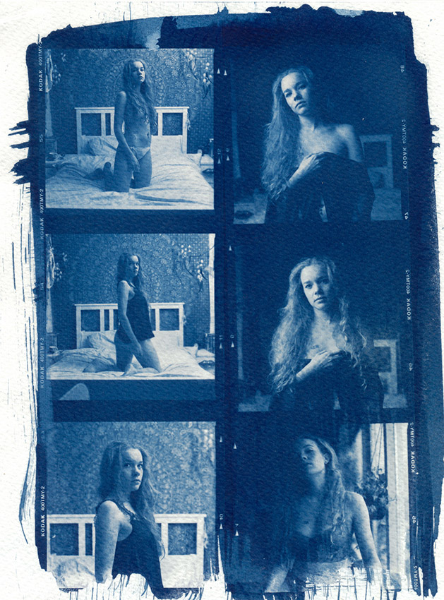
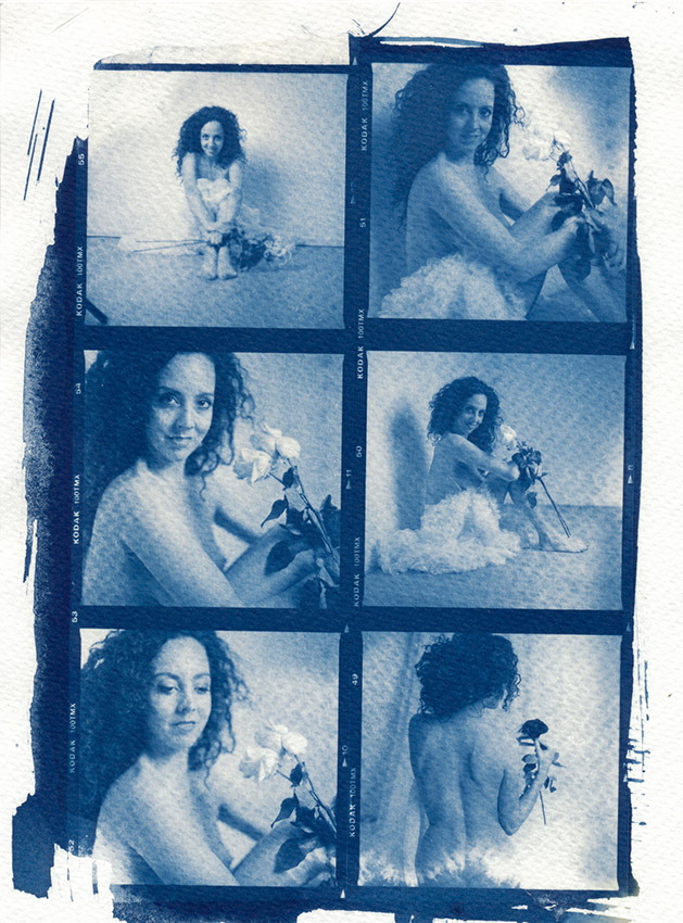
Two sets of two negative strips from shoots with Esther and Valentina Rose. On the light-sensitive watercolour paper, they were exposed in the sun for about 7 minutes.
There is a way to make larger images. You will then have to make your own negatives. You can do this with so-called OHP film, which some people may remember as the transparent sheets used for an overhead projector.
They are still available, and with a suitable printer you can make negatives up to A4 size. Convert a suitable photo to black and white and make it negative (Ctrl-I or Command-I).
I took a number of medium-format negatives that I had scanned, then printed them larger on the film.
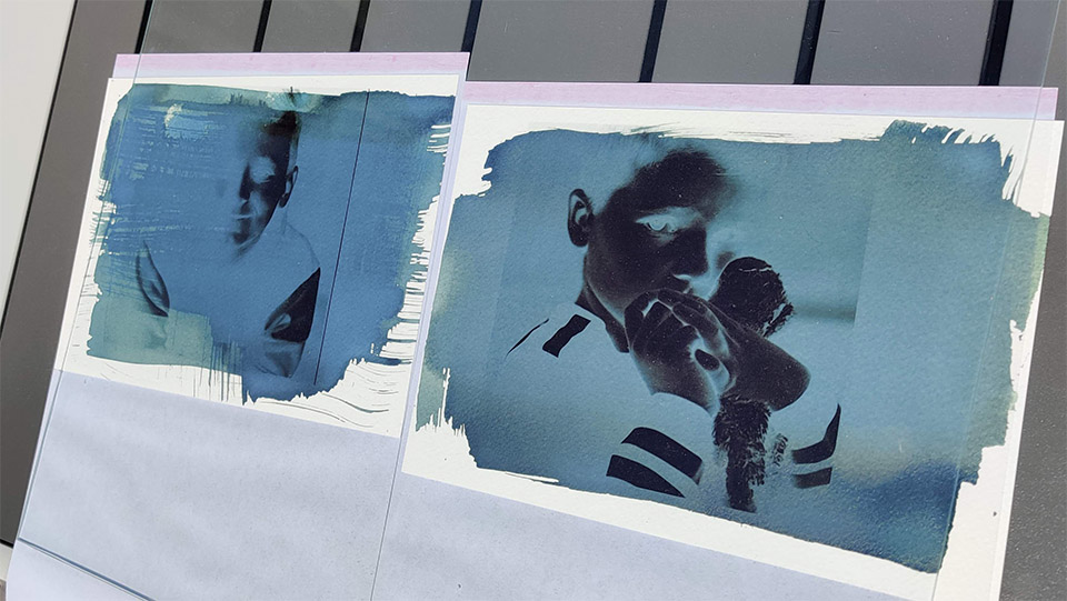
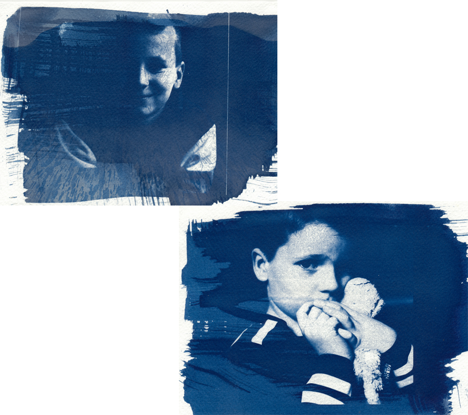
Cyanotype takes some practice. For example, when applying the chemicals to the paper, as you can see in these images. You also need negatives with a considerable range of contrast. It turns out that not every negative is suitable.
For example, Teun's photo (top left) produces a less attractive result than Sepp's (bottom right). It is a matter of doing it often and experimenting. But that is also half the fun of this technique!
Inspiration
If you are interested in cyanotype, take a good look at what is being done online. My modest first attempts are nothing compared with what skilled 'cyanotypists' create.
For example, take a look at the website of Natalia Tchemiak, who combines all kinds of techniques. Or the bleached cyanotypes by Ronni Mae Knepp from her series Dear John Doe.
My favourites? The fairytale-like works by Jonah Calinawan and the portraits by Carlotta Luke.
About the author
Erik werkt als content specialist. Daarnaast is hij freelance tekstschrijver en fotograaf. Mensen vormen daarbij het hoofdonderwerp: portret- en reportage-fotografie. Volg Erik ook op Instagram!
You might also like
-
 Have you ever heard of the Pep Ventosa technique?
by Nando Harmsen
-
 Flash photography tip: shooting through fabric
by Elja Trum
-
 This paper camera takes 16-megapixel photos
by Elja Trum
-
 Review: Analogue Photography
by Erik van Rosmalen
-
 Portrait photography tip: Flashing through fabric
by Elja Trum
2 comments
-

 Laura van der Burgt
wrote on Thursday 29 October 2020 at 21:12
| reply
Laura van der Burgt
wrote on Thursday 29 October 2020 at 21:12
| reply
Interesting! I especially like the first photo. Thanks for sharing.
Translated from Dutch. -
 ErikvanRosmalen
wrote on Friday 30 October 2020 at 16:52
| reply
ErikvanRosmalen
wrote on Friday 30 October 2020 at 16:52
| reply
Thanks Laura. The first is, strictly speaking, a photogram, exposure of the sensitive material with objects on it, so not really a photograph at all. But you can play with it endlessly!
Translated from Dutch.
Have your say
Please note: Articles older than a week can only be commented on by signed-in visitors.Would you still like to comment? sign in or create a free account.
Become a better photographer every week
A practical photography tip in your inbox every week.
39,079 photography enthusiasts already receive the tips! More about the weekly mail. Or keep up to date via  Facebook.

Elja Trum
Photofacts; everything to do with photography!
Would you like to take better photos and keep up with what is happening in photography? Photofacts publishes articles that teach you something about photography — from a product announcement to a practical shooting tip or a look at a website. Photofacts covers photography every day and is a hobby project of Elja Trum's that got out of hand. The articles are written by a team of volunteer authors. If you would enjoy writing one or more articles for Photofacts, do get in touch.More about PhotofactsPhotofacts is made possible in part by
