

Comparison of Profotonet photo papers
Friday 16 October 2026, 13:31 by Nando Harmsen | 114 views | 0 commentsThis article was translated from Dutch with the help of AI. Read the original.
You can print a photo yourself with a printer. You can also send a photo to Profotonet to have a print made. Which paper should you choose? What is the difference?
In collaboration with Profotonet, we set up a comparative test. For this, I selected several different photos to print on different types of paper. This allows us to compare them side by side.
For this comparative test, I chose a colour portrait and landscape photo. For black and white, I chose a portrait and a bird photo. I edited the photos in Lightroom Classic to my own taste.
A calibrated Eizo monitor was used, set to display Adobe RGB colours (10-bit). If a monitor is not good or is not set up correctly, this will immediately affect the print.
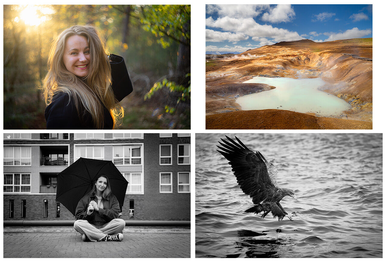
The photos I used for the comparative test
All photos were exported as jpeg with sRGB as the colour space. Although Profotonet has ICC profiles available, I did not use them here. This is how most people will do it.
Overview of the types of paper
All four photos were printed on five different types of paper. For the black and white photos, this was expanded with two Ilford prints, specifically for black and white.
Profotonet describes the types of paper as follows.
Inktjet Lustre
Light satin print, also known as ‘matte’ or ‘satin’. It has a very wide colour gamut and accurate colour reproduction. The paper weighs 240 g/m². The print is classed as Fine Art Inktjet.
Fujifilm Lustre
This is photochemical paper, which means it is a real print rather than an inkjet print. The paper is semi-matte without reflections, suitable for any photo and the most commonly chosen.

Five black and white prints on the types of paper mentioned
The paper has a fine texture and is less sensitive to fingerprints, dust and scratches. The paper weighs 235 g/m².
Fujifilm Glossy
This photochemical paper has a high-gloss finish with a mirrored effect. This makes the colours look intense. It gives the photo extra depth. The paper weighs 250 g/m².
Fujifilm Velvet
A print on this photochemical paper has a unique deep matte surface without any reflection. It has a subtle, velvety Fine Art look.

A colour portrait printed on Fujifilm Velvet.
Fujifilm Velvet is considered suitable for newborn, wedding and portrait photography, among other things. The paper weighs 255 g/m².
Hahnemühle Photo Rag
This is one of the best-known Fine Art paper types. It consists of 100% matte cotton paper with a characteristic, subtle texture. The finish of the print is silky smooth.

Hahnemühle Photo Rag, a print on cotton paper.
This paper complies with the ISO 9706 standard, guaranteeing museum quality. The inkjet paper weighs 308 g/m².
Ilford Lustre and Glossy
These two types of paper are intended exclusively for black and white photos. They give the appearance of a characteristic black and white photographic print. The grey value range is very wide for optimum contrast.

Black and white prints on Ilford photo paper.
Ilford Lustre and Glossy are both photochemical types of paper. They are real prints rather than inkjet prints.
Assessment of the prints
When assessing them, I tried to get as close to reality as possible. So under normal conditions, with both artificial light and daylight coming through a window.
I looked at the colours, the contrast and the extent to which the paper reflects light. The types of paper were held side by side to make the differences as clear as possible.
All assessments were made by eye. Keep in mind that personal preferences and taste will play a major role here. It is all very subjective.
You should also keep in mind that the purpose of the print can play a role. A framed photo looks different from a print in a portfolio folder.
The glossy prints give the deepest colour reproduction of all the paper types. This creates a beautiful 3D appearance. Keep in mind that the mirrored finish can detract from the viewing experience.

Glossy paper reflects light. I find this very distracting.
The glossy finish does not just reflect light, it is also very sensitive to fingerprints. Combined with the reflections, they become visible very quickly. This is something to pay close attention to when handling the print.
The appearance of Fujifilm Lustre is similar to that of glossy paper. The colours are not exaggerated, but they are rich and warm. The advantage is that this paper does not produce reflections. It reflects light as a matte spot.

None of the prints are bad. They are simply different. The choice comes down to personal preference.
Inktjet Lustre looks very similar to Fujifilm Lustre. It has the same appearance, but lacks the deeper colours of Fujifilm Lustre. It is a very good all-round print, but it is not a true photographic print on photo paper.
If this light reflection is absolutely not wanted, Hahnemuhle Photo Rag is a perfect alternative. It comes close to the colours and contrast of Lustre, although it has a slightly more matte appearance.
Keep in mind that Hahnemuhle Photo Rag does not show pure black. It is a very dark shade of grey. The paper does not reflect light in any way, making it extremely suitable for hanging on the wall.
Fujifilm Velvet is similar to Hahnemuhle Photo Rag, but lacks even more contrast. Black is genuinely grey and colours come across less well. There is no reflection of light at all.
Black and white
It was striking how much difference there is between black and white prints. Some types of paper do not produce true pure black and white, but have a colour cast-like appearance.
This colour cast, for want of a better term, is only noticeable when you place the different types of paper next to each other. Viewed separately, it is barely noticeable.

It is difficult to see, but the so-called colour cast in the print is somewhat visible in this image.
The Ilford paper types in particular show this effect clearly. It reminds me very much of the prints I used to make myself in the darkroom. You could call it an authentic print.
Conclusion
It often happens that a physical print is darker than what you see on the screen. These prints from Profotonet, regardless of the type of photo paper, all have the correct brightness.
Apart from the correct brightness, I could not find any colour deviations on any of the papers. There is no colour cast either. The colours are reproduced naturally with every type of paper.

The assessment was made by eye and is also very personal.
The differences between them can be found in the type of paper on which the photo is printed. It is no longer a question of better or worse. They are all of excellent quality.
Many of the points discussed only become noticeable when you place the types of paper next to each other. If you looked at the print without anything to compare it with, some differences would not be noticeable or would barely be noticeable.

The differences only become clear when the photos are viewed side by side. Note the reflection of light in the paper.
My personal preference is Fujifilm Lustre. It does not show fingerprints and light reflections are manageable. In terms of colour, it comes close to the deep colours of glossy paper.
If there should be no glare or reflection of light, I would choose Hahnemühle Photo Rag. It gives a very attractive appearance, with a pleasing rendering of the photo for me. Both colour and black and white.

Fujifilm Velvet is the paper with the lowest contrast. True black does not exist in a black and white print.
Fujifilm Velvet is my least favourite. The photo has a more matte appearance, making it look flatter than all the other types of paper. Of course, this also depends on the photo and its purpose.
Some advice
As I have mentioned several times, this assessment is based on personal preference and taste. It is anything but an objective opinion. Your judgement will be different from mine.
Are you looking for a photo print that is completely to your taste? Then carry out a similar test. Have a photo printed on the types of paper you would like to see and place them next to each other.
Many thanks to Profotonet for providing the prints.
About the author
Nando Harmsen has been photographing for more than 40 years. He specialises in wedding photography and landscape photography. Nando also gives talks, workshops, masterclasses and photo trips, and regularly reviews new and interesting equipment.
You might also like
-
 The search for a digital version of Agfa Record Rapid photographic paper
by Anno Huidekoper
-
 Printing your photos? Which Canon printer should you choose?
by Nando Harmsen
-
 Review: Photo Blocks from Profotonet
by Michelle Peeters
-
 Have Polaroid-style photo cards printed on paper
by Elja Trum
-
 Blown-out white and blocked-up black in your photo print
by Nando Harmsen
-
 Polaroid Hi-Print 4x6 printer announced
by Elja Trum
0 comments
Be the first to share what you think!
Become a better photographer every week
A practical photography tip in your inbox every week.
39,025 photography enthusiasts already receive the tips! More about the weekly mail. Or keep up to date via  Facebook.

Elja Trum
Photofacts; everything to do with photography!
Would you like to take better photos and keep up with what is happening in photography? Photofacts publishes articles that teach you something about photography — from a product announcement to a practical shooting tip or a look at a website. Photofacts covers photography every day and is a hobby project of Elja Trum's that got out of hand. The articles are written by a team of volunteer authors. If you would enjoy writing one or more articles for Photofacts, do get in touch.More about PhotofactsPhotofacts is made possible in part by
