

Don't Be Afraid of True Black and White
Thursday 25 April 2019, 12:24 by Frank Doorhof | 6,085 views | 7 commentsThis article was translated from Dutch with the help of AI. Read the original.
You often hear people talk about how much they love black-and-white photography, but essentially they actually mean creating an image in black and white rather than in colour.
And don't get me wrong, that's fine, I love it too. But sometimes there's nothing wrong with really using your black-and-white approach.
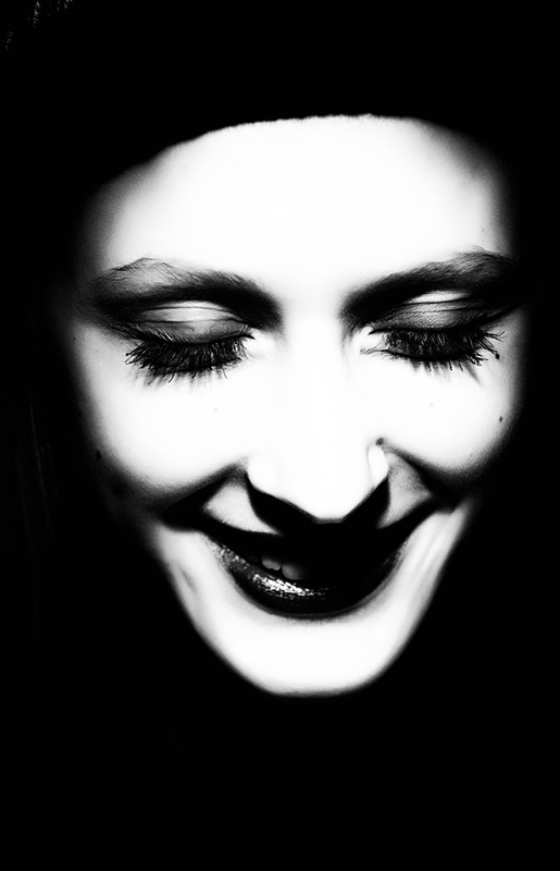
This portrait was taken in colour (of course), but I already knew that I wanted to push the contrast as far as possible, so I chose a rather hard light source, aimed the light from a more directional angle and made sure I had enough detail in the original.
After that, it was a matter of increasing the contrast as far as possible in Photoshop. With the Alien Skin plug-in, you can make the image black and white with as few shades of grey as possible.
Not all images look good with this technique. You really have to photograph with this image in mind. But when you do ... the results can be great too. But to be honest, it is a personal preference!
About the author
Frank Doorhof blogt dagelijks in het Engels op zijn website en geeft wekelijks workshops model fotografie in zijn studio in Emmeloord, maar ook op locatie in binnen en buitenland. Van beginners tot gevorderde, iedereen kan bij Frank terecht. Ook voor specifieke 1 op 1 workshops, of maatwerk voor groepen.
You might also like
-
 Leica Q3 Monochrom announced
by Elja Trum
-
 Ricoh announces the GR IV Monochrome camera
by Nando Harmsen
-
 Landscape photography tip: Don't be afraid to delete
by Nando Harmsen
-
 The Pentax K-3 mark III Monochrome for black-and-white photographers
by Nando Harmsen
-
 Watch: Canon Talks at Home
by Michelle Peeters
7 comments
-
 Mac wrote on Monday 29 April 2019 at 07:53 | reply
Nowadays you hardly see any b&w photos anymore. They're almost all grayscale photos. I do think it's a shame, though, I do like this kind of almost graphic imagery, with lots of contrast.
Translated from Dutch. -
 Ingrid wrote on Tuesday 30 April 2019 at 11:46 | reply
also really love this b&w photography, but it's not always easy to achieve. Is there somewhere an option /setting in NIK Collection to achieve this result as well ?
Translated from Dutch. -
guest wrote on Tuesday 30 April 2019 at 12:46 | reply
Black and white requires higher contrast than color, I certainly agree with that here. Using a plug-in and then saying "This is my image" I don't think is right, especially because Photoshop has tools available such as channel calculations. Just take a look at your red channel for portraits. I think once you're familiar with that, you can actually say that you made that image and with more consistency.
Translated from Dutch. -

-
Ingrid wrote on Tuesday 30 April 2019 at 19:55 | reply
@Peter, I still have the old NIk filters. don't know what you mean by #25. Indeed, your photo from the camera has to be okay, but I read that there are still people who use NIK, hence my question. I also like soft photos, it depends a bit on the light, the atmosphere.
Translated from Dutch.
For me it would be more about street photography/architecture, that's what I currently want to focus on a bit or
@guest, indeed you already start with higher contrast, and that plug-in knows that many people use this, such as with fine art, to get more out of your photo. I don't make portraits. -
guest wrote on Tuesday 30 April 2019 at 23:32 | reply
@Ingrid, Within the NIK filters you have several options. Choose Silver Efex Pro 2. In the left column, choose Preset Library. Then you have 37 variants to choose from. Number 025 gives the most Black / White with little to no gray. Numbers 003 and 004 are also decent and have more gray tones. In general, I am also more of a fan of more nuance, but sometimes nice B/W is best. If you want to see an overview of my photos, take a look at: https://gurushots.com/petervanzwol/photos .
Translated from Dutch.
And portraits really are very fun and nice to do!!
Regards Peter. -
Ingrid wrote on Wednesday 1 May 2019 at 11:22 | reply
@Peter, okay thanks, I already suspected something in that direction. No time now, I'll take a look at the link in the coming days. Yeah but I don't really think it's my thing after all, you have to approach people then. I'd rather be in nature
Translated from Dutch. If you also happen to have the inclination and time, here are my little works http://vandainfotografie.werkaandemuur.nl
Have your say
Please note: Articles older than a week can only be commented on by signed-in visitors.Would you still like to comment? sign in or create a free account.
Become a better photographer every week
A practical photography tip in your inbox every week.
38,938 photography enthusiasts already receive the tips! More about the weekly mail. Or keep up to date via  Facebook.

Elja Trum
Photofacts; everything to do with photography!
Would you like to take better photos and keep up with what is happening in photography? Photofacts publishes articles that teach you something about photography — from a product announcement to a practical shooting tip or a look at a website. Photofacts covers photography every day and is a hobby project of Elja Trum's that got out of hand. The articles are written by a team of volunteer authors. If you would enjoy writing one or more articles for Photofacts, do get in touch.More about PhotofactsPhotofacts is made possible in part by
