

How to create a good colour reference
Thursday 13 December 2018, 12:38 by Michelle Peeters | 11,230 views | 0 commentsThis article was translated from Dutch with the help of AI. Read the original.
If you shoot in raw, you don't really need to worry about colour temperature or colour casts. A raw file doesn't have any colours yet. Only the three separate colour channels, red, green and blue, which the image sensor captures, are stored.
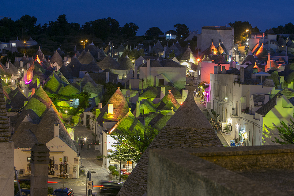
The colour channels have not yet been mixed together. This means you can easily determine the correct ratio between them yourself in an image-editing programme, so you get precisely the right colours.
You can also remove any colour cast without loss of quality. If you shoot in jpg, that's a different story. So you can always bring out precisely the right colours, as long as you work in raw.
Of course, you do need to know what those colours looked like in real life. You can't just rely on your feelings and/or choose the colours that appeal to you. When colour accuracy matters, that is no longer enough. You can no longer rely on your memory. It has to be exactly right.
For example, if you need to photograph clothes for a webshop, a red shirt must not suddenly turn out to be pink when a customer unpacks it. Sometimes even the smallest differences in colour tone can be unacceptable.
But how do you restore the exact colours in post-processing? That only works if you have a reference. Something in the photo that you are 100% certain was white, black, red, blue or yellow. You can take a test photo that also includes a colour chart.
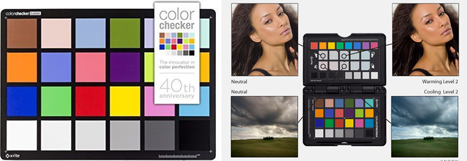
The XRite ColorChecker Passport is one such colour chart. It is a card with all kinds of coloured patches on it, whose exact real-life colours are known. This means you can easily restore them in post-processing, manually, automatically or using correction profiles.
For the average photographer, a colour reference card may be a bit much. It also works perfectly well to simply include a grey card, or even better, a white balance card in your test photo.
In post-processing, click it with the eyedropper of the 'white balance' tool in, for example, Lightroom or Photoshop to determine the best colour correction.
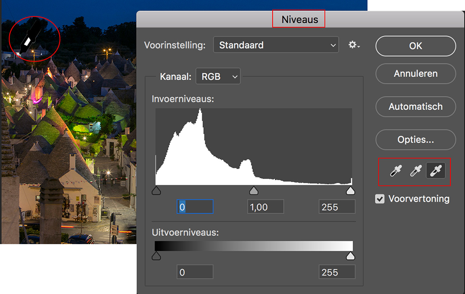
If you don't have a grey card, simply click with the eyedropper on something that you are fairly sure was more or less white, grey or black in real life. At least you then have a good starting point, from which you can fine-tune the white balance if necessary.
Want to learn more about Photoshop image editing?
At Photofacts Academy, our online learning environment for photographers, we have various courses about Adobe Photoshop.
- Photoshop for Beginners (Johan Elzenga)
- Photoshop for Photographers (Piet van den Eynde)
- Photoshop for Advanced Users (Marit Hilarius)
- Photoshop Effects (Elja Trum)
And much more...
You can follow these courses for two weeks with a free trial membership.
About the author
Michelle Peeters is fotografe en oprichter van DeuxBleus Fotografie. Michelle herkent het bijzondere in het gewone en het gewone in het bijzondere. Ze heeft zich nooit willen specialiseren en is daardoor van alle markten thuis.
You might also like
-
 Preview: Fujifilm X-S20
by Elja Trum
-
 Is the Fuji X-Pro1 still relevant?
by Yljas Roeper
-
 Review: Fujifilm X-T50
by Nando Harmsen
-
 Preview: Fujifilm X-HF1 half-frame mirrorless camera
by Elja Trum
-
 Preview: Fujifilm X-H2s
by Elja Trum

0 comments
Be the first to share what you think!
Have your say
Please note: Articles older than a week can only be commented on by signed-in visitors.Would you still like to comment? sign in or create a free account.
Become a better photographer every week
A practical photography tip in your inbox every week.
38,886 photography enthusiasts already receive the tips! More about the weekly mail. Or keep up to date via  Facebook.

Elja Trum
Photofacts; everything to do with photography!
Would you like to take better photos and keep up with what is happening in photography? Photofacts publishes articles that teach you something about photography — from a product announcement to a practical shooting tip or a look at a website. Photofacts covers photography every day and is a hobby project of Elja Trum's that got out of hand. The articles are written by a team of volunteer authors. If you would enjoy writing one or more articles for Photofacts, do get in touch.More about PhotofactsPhotofacts is made possible in part by
