

How do you get emotion into your photo?
Wednesday 30 October 2019, 10:04 by Michelle Peeters | 22,441 views | 10 commentsThis article was translated from Dutch with the help of AI. Read the original.
Emotions are crucial in many photographic genres. Think of wedding photography, portraits, sports or concert photos. In these genres, you try to convey a feeling to the viewer, as if they were standing face to face with the person portrayed.
Emotions such as happiness, anger, sadness or being in love practically leap out of a successful photo. When a photo tells a story, it automatically evokes emotion. But how do you achieve that? In this article, seven techniques for getting emotion into your photos.
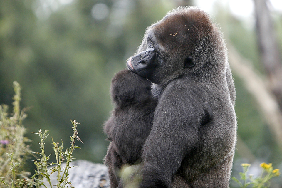
1. Observe first, without a camera
If you are a good photographer, you often have an eye for interesting events, special atmospheres and beautiful compositions. You are often already able to recognise different emotions quickly and respond to them. A kind of sixth sense.
When it comes to emotions, look for sentimental emotions such as pleasure, fear and love. If you are able to spot emotions in everyday life, you will also be able to photograph them more quickly. You need to sense what is going to happen and be able to operate your camera blindfold.
If you practise and observe a lot, you will naturally develop this ability. Recognising, anticipating and sensing are the key words here.
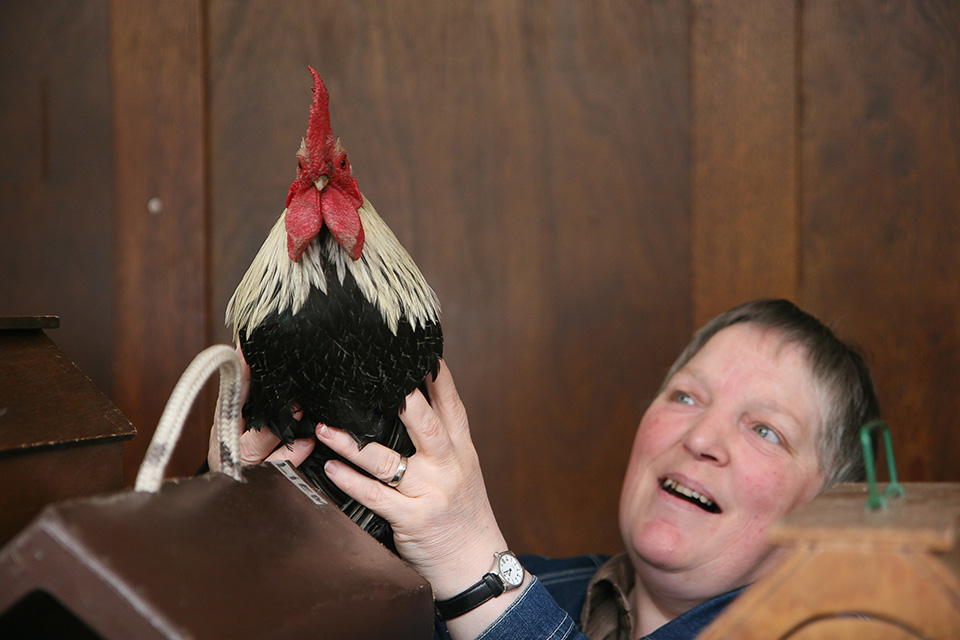
2. Spontaneous emotions
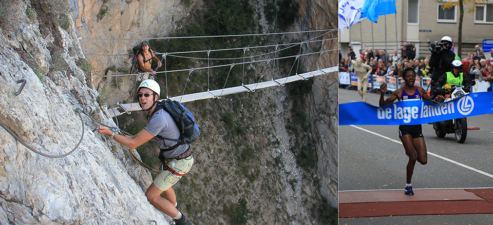
You cannot stage many emotions, so it comes down to taking the shot at exactly the right moment. Think of a runner crossing the finish line in celebration or an anxious toddler on their first day at school.
During sporting events, the exertion and concentration are mainly visible on the faces. You have to be quick, as there is often no second chance.
You can immediately see from the photo whether an emotion is spontaneous or staged. Unless your model has enormous acting skills. So you need to develop a sharp eye and a good sense of timing. And a healthy dose of luck is always welcome!
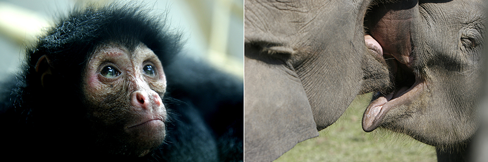
3. Close-ups
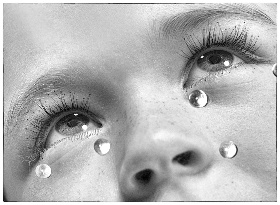
You can naturally read human emotions best from your model's face. If you shoot close-ups, it is easier to read a particular, expressive look. You can strengthen the emotions with good lighting and framing.
4. The right pose
When you are doing a photo session, there is sometimes no time for spontaneous actions. As a photographer, you are then expected to know how to evoke the right emotions. It helps if you already have some poses in mind that you think will suit your model.
Showing them an example photo or moodboard saves a lot of explanation and they immediately see what you mean. Keep talking to them and make jokes to create a relaxed atmosphere.
5. Use of colour
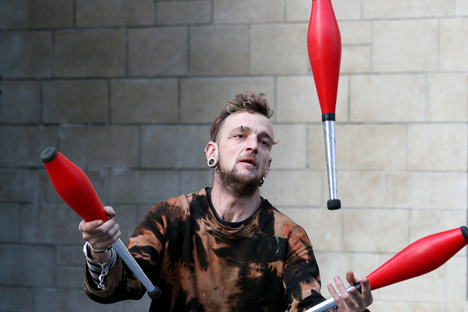
With some basic practical knowledge of how colours strengthen or weaken other colours, you have more control over the emotion your photo conveys. If you master this properly, you can create a range of emotions. Below is a spectrum of examples from the film industry:
- The colour Red stands for: love, passion, violence, danger, anger and strength;
- Purple stands for: sweet, femininity, playful, sympathy and beauty;
- Orange stands for: warmth, cosiness, friendliness, happiness, exotic and youth;
- Yellow stands for: madness, illness, uncertainty, obsessive, idyllic and naive;
- Green stands for: nature, immature, corruption, money, dark and danger;
- Blue stands for: cold, isolated, brain/mind, melancholy, passive and calm;
- Blue-purple stands for: fantasy, ethereal, eroticism, virtual, mysterious and ominous.
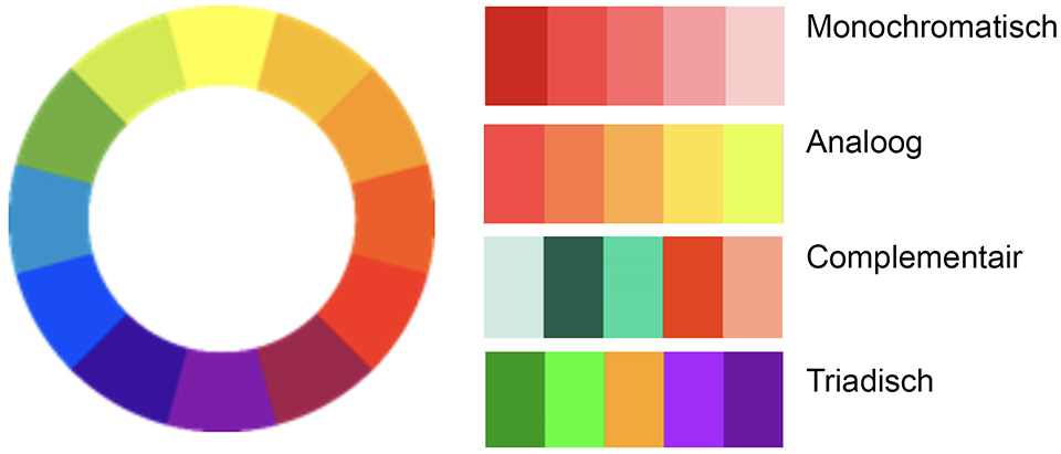
You can then use a colour wheel to arrive at a number of colour contrasts. I previously wrote an article about the use of colour in photography, but it only covered analogous and complementary colours:
- Triadic colour contrast, using only the three primary colours, red, yellow and blue;
- Monochromatic colour contrast, one colour from the colour wheel, from black/dark to light/white
- Analogous colour contrast, adjacent colours on the colour wheel;
- Complementary/simultaneous colour contrast, opposite colours from the colour wheel.
6. Acting
When shooting portraits, you can try to bring out your model's personality by asking them to express an emotion or feeling. During post-processing, you can also emphasise emotion through the use of colour and/or light.
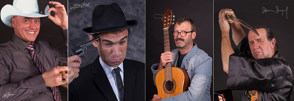
For my 'lookalikes' series, I ask models to look in a certain way or express an emotion. It takes quite a bit of acting and directing talent to achieve the desired result, but it is enormous fun and very educational. It also teaches you to look much better.

7. Atmosphere
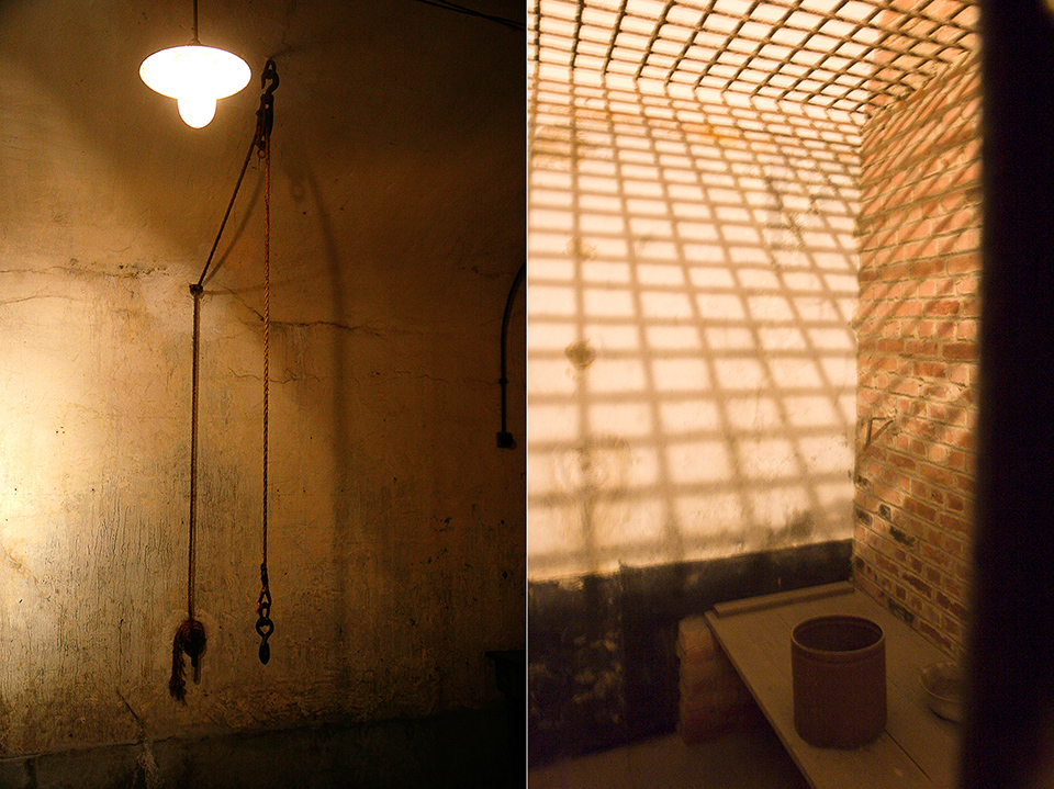
The atmosphere in your photo can also evoke certain emotions. You can create a feeling of loneliness and emptiness in your photos by including lots of people within your frame, but keeping their gaze directed out of shot.
They should at least be looking slightly towards the main subject, or even turn their backs on them. This will guarantee a feeling of isolation and loneliness among the viewers.
Large spaces also create a feeling of loneliness. If there is a person in the frame, you can depict them as small and insignificant.
A low viewpoint can also mean a lot if, for example, you want to capture a feeling of claustrophobia. At normal height, a photo does not have much emotion.
Rows of trees or patterns, the rhythm of repetition, strange shapes as a surprising element in the photo, a leaf photographed from very close up, anything is worth trying to capture an oppressive atmosphere.

Conclusion
A photo only really becomes good when it tells a story and therefore automatically evokes emotion. You can put a lot of your own feelings into photography. What you feel also comes back in your photos, whether you want it to or not. Take photos of things as they really are, and they will naturally come to life more.
Try taking photos of your children or grandchildren when they are not smiling, but also when they are crying or angry. Only taking photos when the sun is shining, or דווקא when it is pouring with rain? Mist, drizzle and storms can also be very beautiful. Just like a dead bird, a drunk beggar and a peeling wall.
You often perform best when you are not feeling quite yourself, or at least I do. Try doing something with that too. If you can connect with your fear, sadness or joy, it cannot help but show in the images you make.
More tips
More tips on this interesting subject are of course more than welcome! You never really stop learning about it. So if you know something, let us know in the comments!
Van Beeld naar Kunst course
In Micky Hoogendijk's Van Beeld naar Kunst course, you also learn how to get emotion into your photo, making the image speak.
You can follow this and other courses for two weeks with a free trial membership.
About the author
Michelle Peeters is fotografe en oprichter van DeuxBleus Fotografie. Michelle herkent het bijzondere in het gewone en het gewone in het bijzondere. Ze heeft zich nooit willen specialiseren en is daardoor van alle markten thuis.
You might also like
-
 6 tips for telling stories with your photos
by Huub Keulers
-
 The story behind the photo: a rainbow
by Nando Harmsen
-
 Add More Story to Your Photos with 5 Practical Tips
by Elja Trum
-
 The story behind the photo: Albert van Heugten's rainbow
by Nando Harmsen


10 comments
-

 eerbeekh wrote on Tuesday 14 August 2018 at 16:41
| reply
Nice, clear article and smoothly written. I understand the section about the use of color, but applying it is difficult for me (especially weak with colors when combining them).
Translated from Dutch. -
 Michelle Peeters wrote on Tuesday 14 August 2018 at 16:50
| reply
@Eerbeekh: you mainly learn this by doing, and often you already do it intuitively. Red, for example, is directly opposite green, and if you combine those 2 you get a 'striking' photo. If you combine green, yellow, brown in 1 photo (for example during a walk in the woods), it results in a calm photo. Sometimes you don't get to choose which colors you have to deal with. If they really clash or make the photo look restless when you actually want a calm photo, then you can always choose to make it black and white!
Translated from Dutch. -
 Roelie wrote on Tuesday 14 August 2018 at 17:15 | reply
Learn to combine colors like Vincent van Gogh did. He had all kinds of samples of knitting wool and combined them. Go play with paint, mix colors. Let yourself be surprised by watercolor. This way you can get to know the colors and the combinations. And apply them in photography.
Translated from Dutch. -
Michelle Peeters wrote on Tuesday 14 August 2018 at 17:24
| reply
The relationships between the central Breaking Bad characters (that successful Netflix series) are analogous to the relationships between colors on the color wheel. The Triadic color contrast is used here with the three primary colors: red, yellow and blue. Just take a look here, it's very interesting to see how meticulously they apply that in this!
Translated from Dutch. -
 Rudy Rosman wrote on Tuesday 14 August 2018 at 20:48 | reply
Be careful with complementary colors. By combining them, the colors can start cancelling each other out.
Translated from Dutch.
A solution could be to choose a less saturated background color (more white in the color). -
Michelle Peeters wrote on Tuesday 14 August 2018 at 21:27
| reply
@Rudy: isn't that monochromatic?
Translated from Dutch. -
Rudy Rosman wrote on Wednesday 15 August 2018 at 02:49 | reply
You are still using two colors. You tone one of them down.
Translated from Dutch.
With monochromatic, you only use one color, right? -
Michelle Peeters wrote on Wednesday 15 August 2018 at 08:11
| reply
@Rudy: yes, that's indeed correct! Does your method also have a name?
Translated from Dutch. -
Rudy Rosman wrote on Wednesday 15 August 2018 at 10:11 | reply
Haha no, it's still complementary contrast.
Translated from Dutch. -
Michelle Peeters wrote on Wednesday 15 August 2018 at 11:49
| reply
@Rudy: okay, thanks! Interesting to try sometime! Making the background less saturated will have to be done in post-processing then, right! Or perhaps you could work with backlighting.
Translated from Dutch.
Have your say
Please note: Articles older than a week can only be commented on by signed-in visitors.Would you still like to comment? sign in or create a free account.
Become a better photographer every week
A practical photography tip in your inbox every week.
38,886 photography enthusiasts already receive the tips! More about the weekly mail. Or keep up to date via  Facebook.

Elja Trum
Photofacts; everything to do with photography!
Would you like to take better photos and keep up with what is happening in photography? Photofacts publishes articles that teach you something about photography — from a product announcement to a practical shooting tip or a look at a website. Photofacts covers photography every day and is a hobby project of Elja Trum's that got out of hand. The articles are written by a team of volunteer authors. If you would enjoy writing one or more articles for Photofacts, do get in touch.More about PhotofactsPhotofacts is made possible in part by
