

Tip: How to Make Social Media Photos Stand Out More?
Monday 11 April 2022, 20:02 by Huub Keulers | 4,493 views | 2 commentsThis article was translated from Dutch with the help of AI. Read the original.
When followers scroll past your photos on Instagram or Facebook, you have a fraction of a second to grab their attention.
Research shows, however, that the colours in your photos can make people more likely to click on your photo instead of scrolling past. So there is a good chance that the colours on your social media profile make a big difference. Make use of this.
Shown by research
Visual analysis and marketing platform Curalate analysed eight million social media photos to see which colours receive more likes than others.
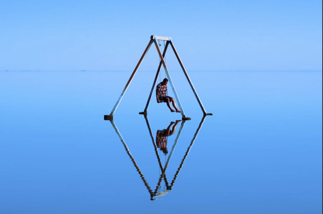
Photos with blue as the prominent colour often received 24 per cent more likes than images with red as the most prominent colour.
Adding a touch of colour is not enough. According to the research, photos with just one dominant colour receive 17 per cent more attention than photos with more than one main colour. Just 10 per cent of the images in the study had a single striking colour.
The colour blue
It also turns out that blue is the favourite colour of most people. We tend to associate blue with openness, so they are more likely to want to stay in contact with that colour. Whatever colour you show as the prominent colour in your photos, it does need to stand out.
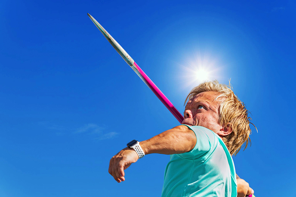

Other colours that make your photos work well
Red represents impulsiveness and warmth

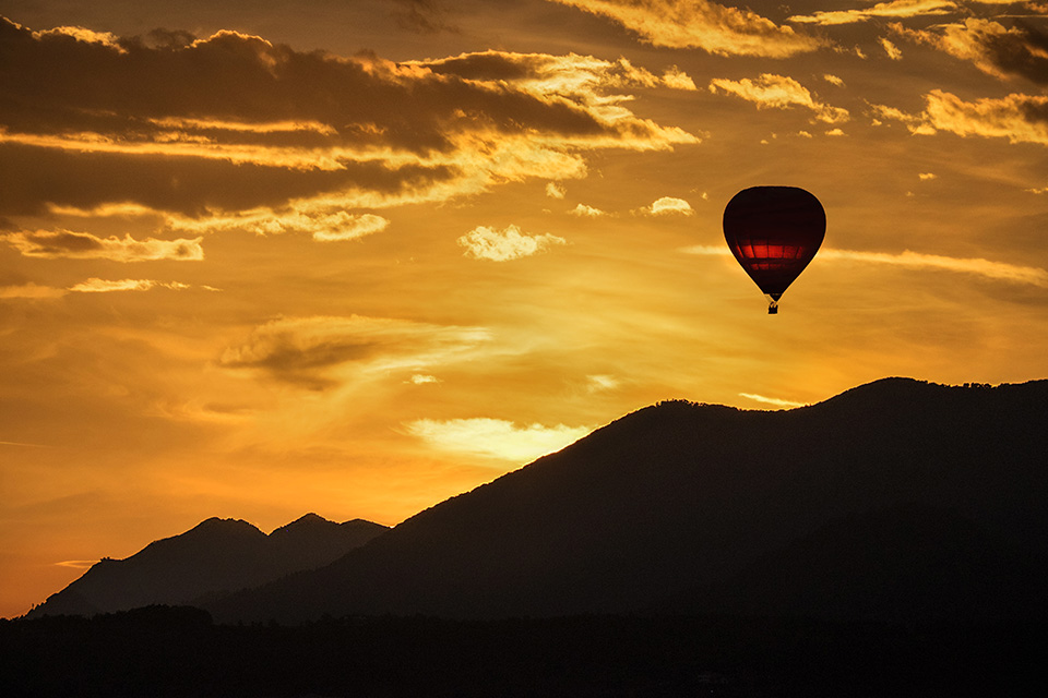
Orange represents happiness and energy
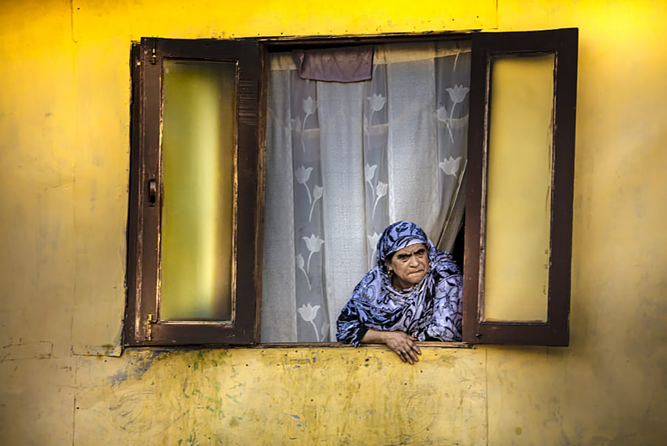
Yellow represents attention
Purple represents inspiration and trust.
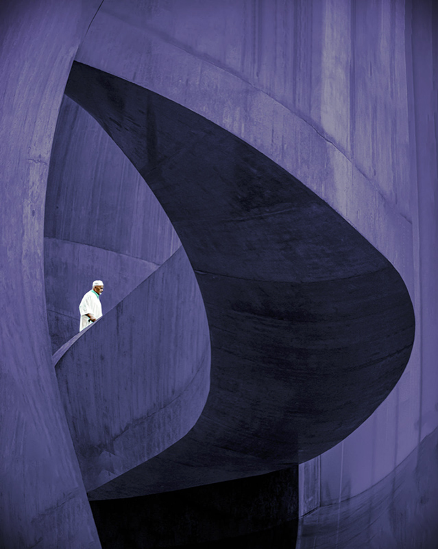
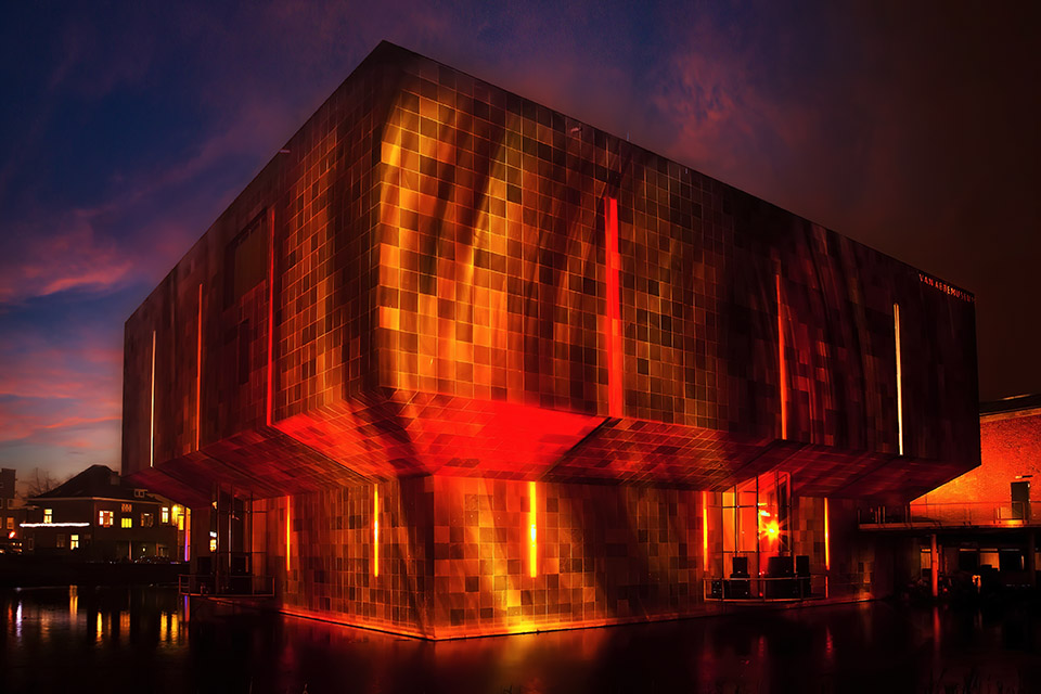
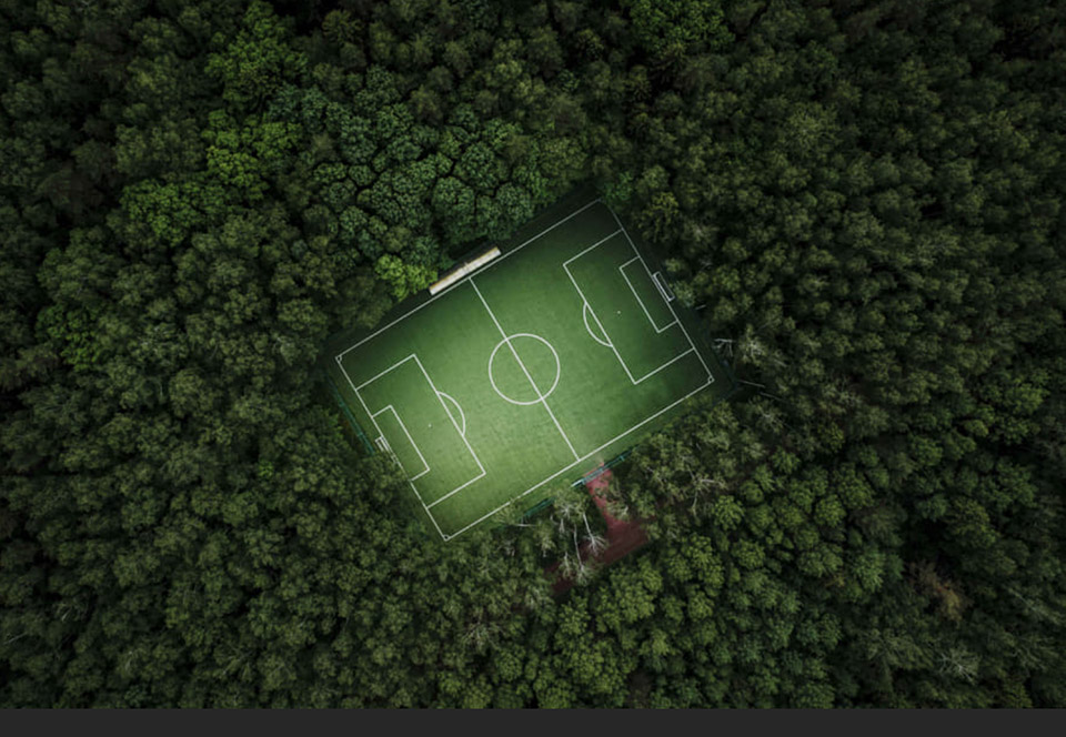
It works best when you use larger areas for a prominent colour. Or areas of two contrasting colours from the colour spectrum. Think of warm and cool colours, yellow, orange or red combined with blue, purple or green.
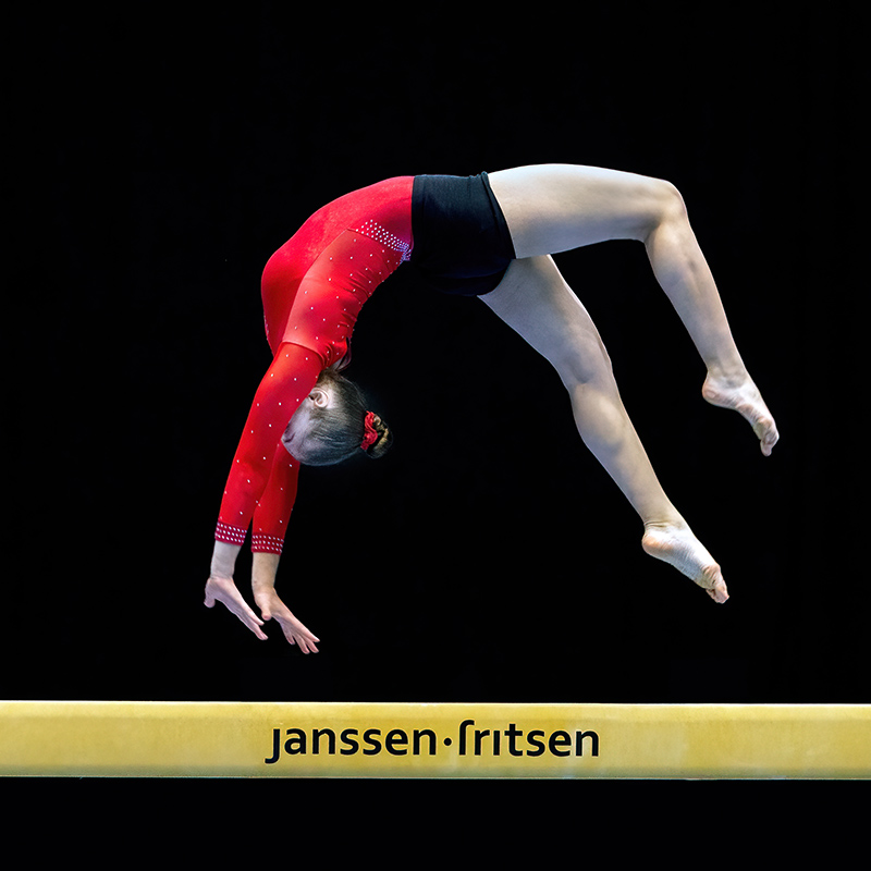
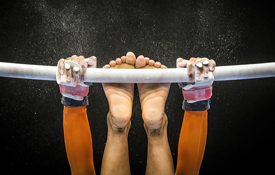
A dark background combined with a prominent colour is also often a good combination. Especially when your colours are strong and vibrant.
But above all, do what makes you feel good
But at the end of the day, I encourage you to simply be creative and post what makes you happy. If the strawberries you ate during lunch were tasty, healthy and downright photogenic, post that photo.
Your Instagram page is about making yourself proud, not about pleasing other people.
Here are a few more examples of the deliberate use of colours in your image.


About the author
Huub Keulers is een enthousiasmerende veelzijdige freelance fotograaf woonachtig in Elsloo (Li). Hij is gespecialiseerd in sport-, bedrijfs-, straat-, honden en portretfotografie. Daarnaast is Huub auteur van diverse educatieve fotografieboeken en verzorgt hij allerlei fotoworkshops, masterclasses en lezingen.
You might also like
-
 The best photo sizes for social media
by Nando Harmsen
-
 What photographers can learn from a net bag of oranges
by Elvira Smit
-
 Why yellow likes blue (and vice versa)
by Martin van Rooij
-
 Capturing the Blue Hour with Your Phone
by Elja Trum
-
 Street photography: a red balloon, a fabric stall and the girl in yellow
by Jan Poldervaart
-
 Review: Sony ZV-E1
by Antonette de Groot
2 comments
-
 Henk-Jan Winkeldermaat wrote on Tuesday 12 April 2022 at 12:01 | reply
Fortunately, many photographers don't blindly follow the like-driven marketing advice, otherwise it would become a beautiful, but also boring affair.
Translated from Dutch. -
 Gerard wrote on Wednesday 13 April 2022 at 11:20 | reply
educational, this mentioning of the associations between color and feeling... especially as we are seeing the Blue/Yellow combo (of Ukraine) a lot these days; Openness, Contact + Attention ...
Translated from Dutch.
Have your say
Please note: Articles older than a week can only be commented on by signed-in visitors.Would you still like to comment? sign in or create a free account.
Become a better photographer every week
A practical photography tip in your inbox every week.
39,024 photography enthusiasts already receive the tips! More about the weekly mail. Or keep up to date via  Facebook.

Elja Trum
Photofacts; everything to do with photography!
Would you like to take better photos and keep up with what is happening in photography? Photofacts publishes articles that teach you something about photography — from a product announcement to a practical shooting tip or a look at a website. Photofacts covers photography every day and is a hobby project of Elja Trum's that got out of hand. The articles are written by a team of volunteer authors. If you would enjoy writing one or more articles for Photofacts, do get in touch.More about PhotofactsPhotofacts is made possible in part by
