

Why yellow likes blue (and vice versa)
Monday 26 October 2020, 14:41 by Martin van Rooij | 10,228 views | 9 commentsThis article was translated from Dutch with the help of AI. Read the original.
There are all sorts of ways to create a great photo. One of the factors that plays a role is colour. Which colour combinations work well, and why?
You know them, of course: complementary colours.
Some colours make happy couples:
- Yellow and blue
- Cyan and red
- Magenta and green
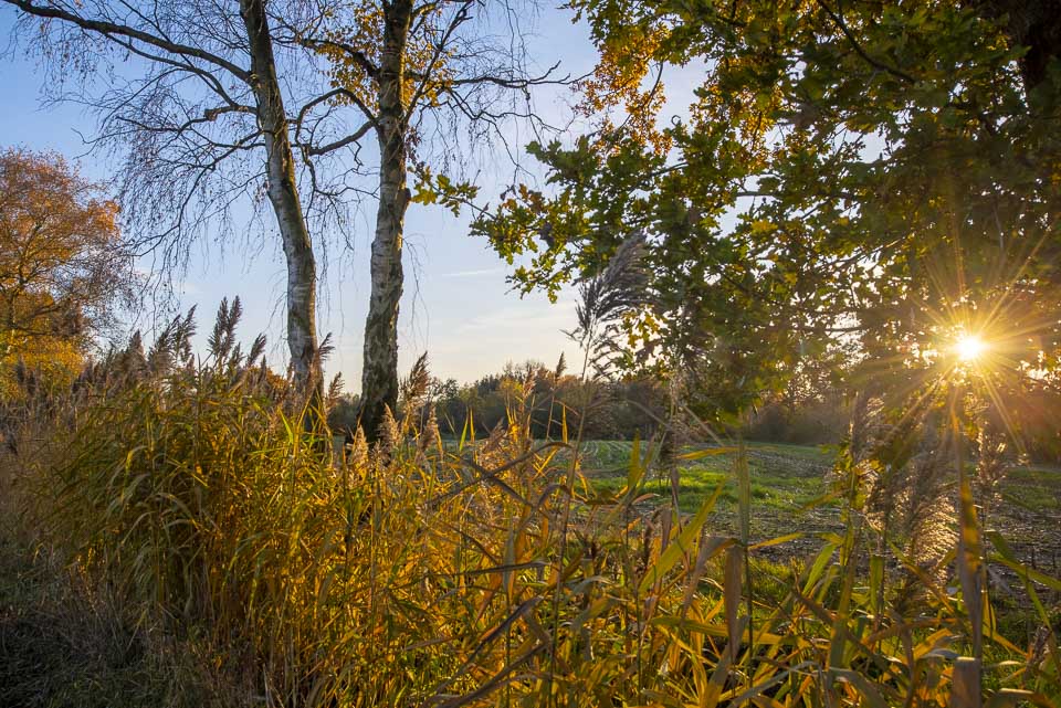
On a bright (and cold) winter's day, you often come across the combination of blue and yellow outside.
This photo was taken in the Gijzenrooise Zegge nature reserve near Eindhoven.
Why do many people find precisely these combinations attractive, and not, for example, brown and yellow? Evolution may play a role.
According to Studio STT, we need to go back to the time of hunters and gatherers for the answer.
Hunters (men) supposedly liked the night (=blue), while gatherers (women) liked red and yellow: the colours of fruit. An intriguing thought, although I wonder whether there is any scientific evidence for it.
Colour = emotion
It is beyond dispute that colours evoke specific emotions. You have warm and cool colours, for example. You make a portrait 'warmer' by making the photo more yellow. This often makes the skin look a little better.
Piet van den Eynde explains how to do this in this video.
What emotion do we associate with blue? Blue is the colour of cold, ice and air conditioning. Just look at the logos of air-conditioning installers and freezers.
Blue also stands for business, reliability and expertise. That's why bankers, lawyers and accountants often wear a blue suit.
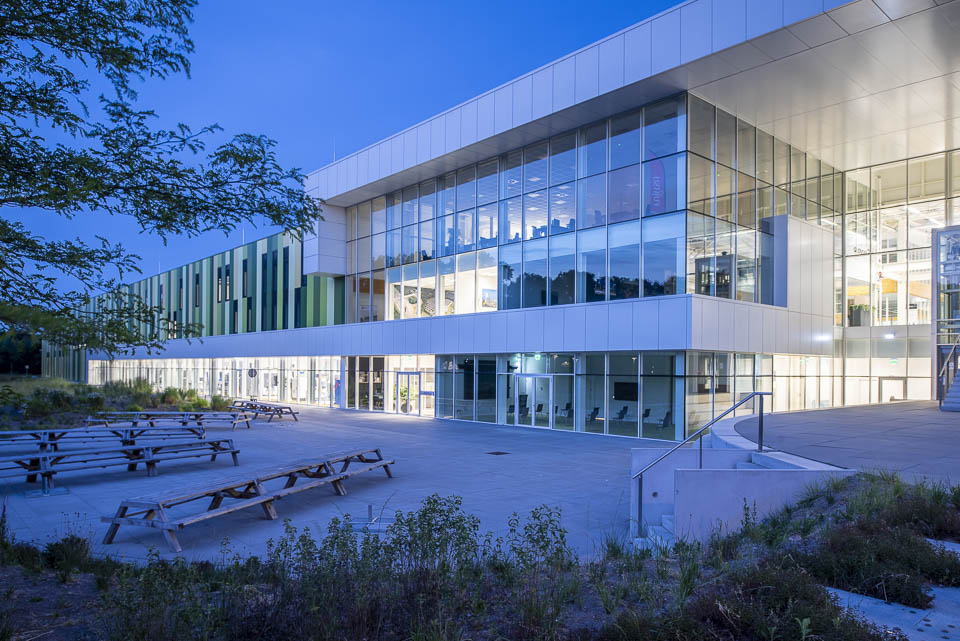
In general, we see blue as a cold and businesslike colour. The yellow light somewhat counteracts that in this photo. Photo of the Brainport Industries Campus, Eindhoven.
Another colour. Red. Red is the colour of blood and war, but also of love and burning passion. It is an excellent colour for attracting attention. But do you want to make a solid impression? Then choose another colour.
Large companies never choose a colour at random. There is an idea behind it. Did you know that using a different colour for a button can make a world of difference to the number of clicks? Welcome to the world of colour psychology.
It is only a small step from colour psychology to neuromarketing: marketing that influences us on an unconscious level.
You and I are influenced very subtly. And we barely notice it.
We think we are rational beings. In practice, that's far from true. We make many decisions very quickly and instinctively. Colours play a role in this.
In the book Overtuigen met neuromarketing in 59 minuten, author Dion van der Vaart devotes a special chapter to the role of colour as a way of influencing people. According to Van der Vaart, you often see the combination of blue and orange on film posters and in film trailers, and orange is close to (warm) yellow.
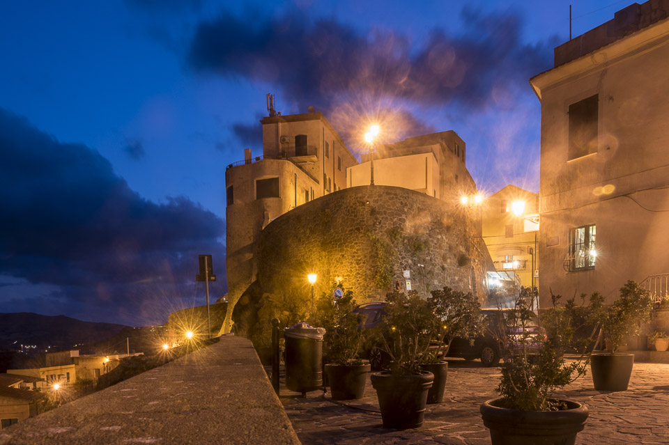
In this photo, taken in Castelsardo (Sardinia), the colours orange and blue dominate
Blue and yellow (or orange): why is that such a happy marriage? It may be because of this.
Yellow (and orange) have a positive effect on the skin. Especially in winter, when your skin is paler and the outdoor light is cooler.
Blue, the colour on the other side of the colour wheel, creates a beautiful contrast and stunning skies on sunny summer days or during the blue hour.
So next time you head out with your camera, see if you can take photos featuring the combinations blue/yellow, cyan/red and magenta/green. You come across the blue/yellow combination everywhere outside. You see the other two much less often.
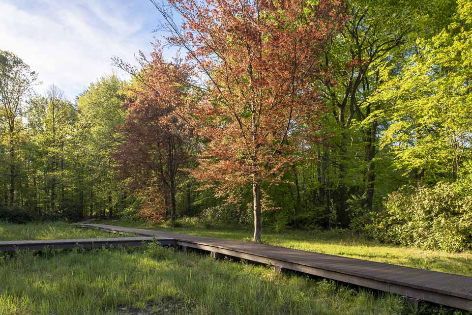
This photo comes close to the magenta/green combination, but perhaps you have a much better example. Post your photo below.
Even better: get out there! In autumn, you can find the magenta/green combination in nature in particular. Do you have a nice photo with cyan and red? Show us!
About the author
Martin is een freelance tekstschrijver die ooit door een uitgever werd gevraagd interviews te combineren met portretfotografie. Die uitgever was tevreden over zijn foto's, hij niet. Martin ging cursussen volgen en investeerde in apparatuur en software.
You might also like
-
 Portrait photography tip: Use complementary colours
by Elja Trum
-
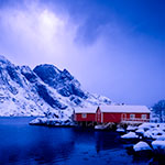 How blue can the blue hour be?
by Nando Harmsen
-
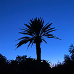 Capturing the Blue Hour with Your Phone
by Elja Trum
-
 5 photography techniques you should know
by Elja Trum
-
 Is theoretical knowledge the basis for creativity?
by Liesbeth van Asselt
-
 Street photography: a red balloon, a fabric stall and the girl in yellow
by Jan Poldervaart
9 comments
-

 Donald Willemsen
wrote on Tuesday 27 October 2020 at 10:29
| reply
Donald Willemsen
wrote on Tuesday 27 October 2020 at 10:29
| reply
Although it is quite a nice article, I really wonder what exactly you are trying to say with it.
Translated from Dutch. -
 Martin
wrote on Tuesday 27 October 2020 at 11:01
| reply
Martin
wrote on Tuesday 27 October 2020 at 11:01
| reply
Hi Donald,
Translated from Dutch.
Thanks for your response. What I mean is that some color combinations work much better than others and that it makes sense to pay attention to what matches and what doesn't.
In addition, I hope I have made it clear that blue and yellow are easy to find and that it can be fun and educational to go looking for those other combinations: cyan and red or magenta and green. -
Donald Willemsen
wrote on Tuesday 27 October 2020 at 11:38
| reply
@Martin, thanks for the explanation. Now I understand you better. What you say is correct. I myself see color more as a means in photography to evoke emotion in the viewer. As such, I also try to use it that way. Many photographers love the so-called 'blue hour'. I'm not a fan of it. Then I'd rather have the 'golden hour'.
Translated from Dutch. -
 A H M Kerkhoff wrote on Tuesday 27 October 2020 at 16:56 | reply
Many thanks Martin for this crystal-clear piece about a difficult subject. And for the very clear examples.
Translated from Dutch. -
 karel derickx wrote on Tuesday 27 October 2020 at 17:16 | reply
Complementary colors reinforce each other, learned at photography school 50 years ago.
Translated from Dutch.
Beautifully and refreshingly expressed in a new way, like many of your topics.
Now 71, but I follow you with great interest and pleasure.👍
Kind regards Karel Derickx -
-
 Inge wrote on Wednesday 28 October 2020 at 18:19 | reply
Not many are able to combine words and images so beautifully. I enjoyed taking it all in. Grtjs Inge
Translated from Dutch. -
-
 Hans van Helden wrote on Thursday 26 November 2020 at 17:02
| reply
Hans van Helden wrote on Thursday 26 November 2020 at 17:02
| reply
Hi Inge
Translated from Dutch.
Blue and yellow are complementary colours, they are opposite each other in the spectrum.
It means that the colours blue and yellow in a photo enhance each other.
Yellow becomes yellower and blue becomes bluer. It isn't really so, but it seems that way; that is how the eye sees it!!!
In short; that applies to all complementary colours.
That is how it was taught at the Fotovakschool in the past.
I like that you explain this phenomenon in a more practical way.
I am 71 years old and read your clear, practical tips with pleasure and interest.
Kind regards Karel Derickx
Have your say
Please note: Articles older than a week can only be commented on by signed-in visitors.Would you still like to comment? sign in or create a free account.
Become a better photographer every week
A practical photography tip in your inbox every week.
39,079 photography enthusiasts already receive the tips! More about the weekly mail. Or keep up to date via  Facebook.

Elja Trum
Photofacts; everything to do with photography!
Would you like to take better photos and keep up with what is happening in photography? Photofacts publishes articles that teach you something about photography — from a product announcement to a practical shooting tip or a look at a website. Photofacts covers photography every day and is a hobby project of Elja Trum's that got out of hand. The articles are written by a team of volunteer authors. If you would enjoy writing one or more articles for Photofacts, do get in touch.More about PhotofactsPhotofacts is made possible in part by
