
Photoshop: colour correction with gradient mapping
Wednesday 12 December 2018, 21:15 by Michelle Peeters | 12,575 views | 0 commentsThis article was translated from Dutch with the help of AI. Read the original.
Sometimes you find the best Photoshop techniques in the most unexpected places. That also applies to this wonderful tool, the Gradient Map (Verloop Toewijzen).
It is the fastest, easiest and most reliable way to create a stunning black-and-white photo with lots of contrast and depth. You can also colourise or improve both your black-and-white and colour photos with just a few mouse clicks, in a subtle way.
Three purposes
You can use the Gradient Map in Photoshop for three different purposes that can make your photos much more interesting during editing:
- Converting an image from colour to black and white. Unlike the other tools for this in Photoshop, the Gradient Map gives you much more control over how your image is converted;
- Colourising a black-and-white image;
- Changing or improving the colours in a colour photo.
How does it work?
Gradient mapping automatically creates an adjustment layer. This adjustment layer only affects the highlights and shadows, not the midtones, in the photo and applies the colours you choose to them. This means, for example, that the skin tones in your photo are preserved well
A Gradient Map therefore works differently from a Gradient Fill, which fills an area with a linear or radial blend of colours.
You first choose a highlight colour and then a shadow colour. You then click the Gradient Map tool and Photoshop automatically creates a Gradient Map, essentially a map for how the selected colours are applied.
The best way to see how the Gradient Map tool works is to try it out. First, I will show you how to use the tool to convert a colour image into a high-contrast, black-and-white photo.
1. High-contrast greyscale conversion
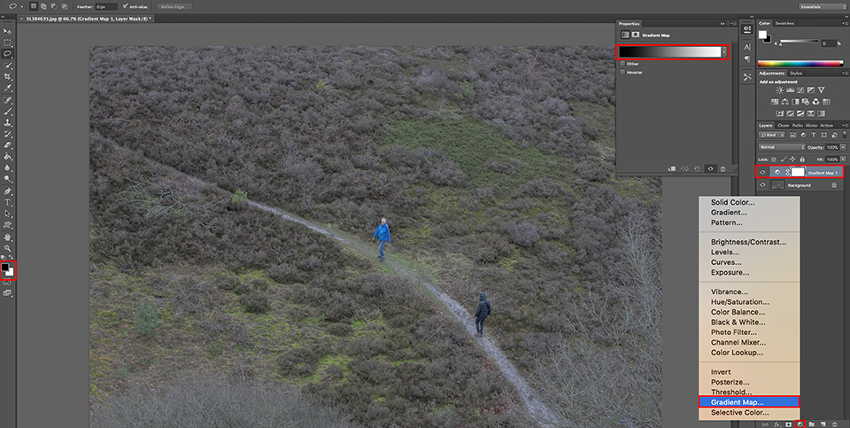
Open a colour photo that you want to convert into a high-contrast, black-and-white photo. Display the Layers palette if it is not already visible (Window > Layers). Set the foreground colour to black and the background colour to white (press the D key).
Then click the Create new fill or adjustment layer icon at the bottom of the Layers palette and choose the Gradient Map option.
The Gradient Map dialogue box displays a gradient from the foreground colour to the background colour by default, so in this case from black to white. You do not need to do anything else now.
Click OK to apply the adjustment layer to the photo. This simple adjustment layer gives you a much better greyscale conversion than the standard option in the menu.
You can already see that the colour photo has now been converted to black and white. If the result is not perfect, there is nothing you can adjust on the adjustment layer either. You need to do that in a new fill or adjustment layer.
Click the Create new fill or adjustment layer icon in the Layers palette again and now choose Channel Mixer. You use Channel Mixer to control the contribution of the individual colour channels to the greyscale image.
In this case, you use Channel Mixer to give your image, which is already in greyscale, the enormous contrast it deserves.
Tick the Monochrome checkbox at the bottom of the dialogue box, otherwise Channel Mixer will produce colour tones instead of adjusted greys.
Now use the Constant slider to choose a value of -12 to make the whole photo darker. Then lower the red channel to about 82%. You can now increase the green and blue channels to create the extreme contrast.
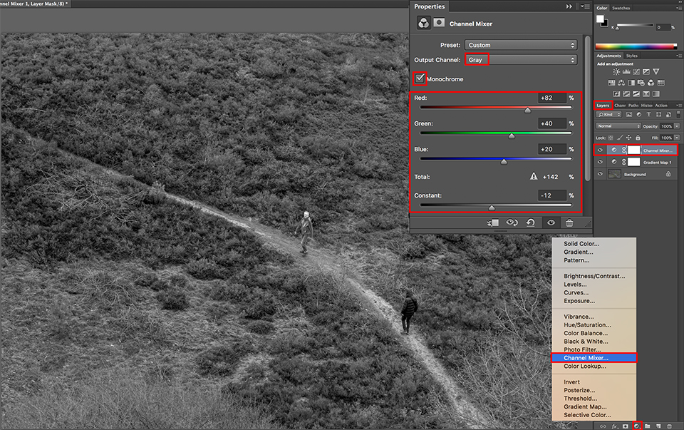
When you get a result that looks interesting, click OK once more and then OK again to apply the newly edited Gradient Map to your image. In the Layers palette, you can use the Flatten Image option to merge the two gradient adjustment layers with your photo and turn them into one whole.
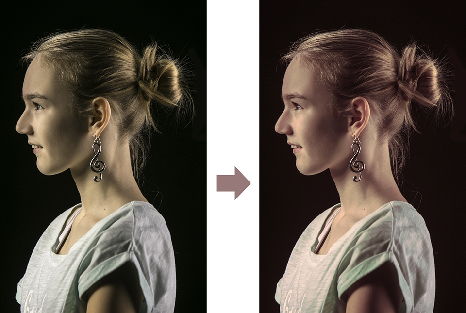
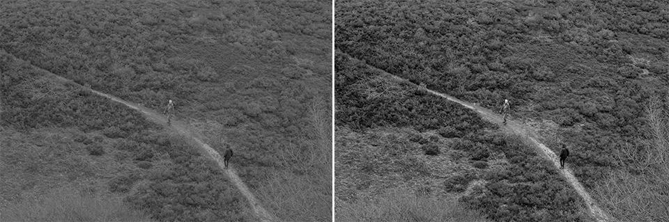
In the photo below, you can see a normal greyscale conversion on the left and a high-contrast greyscale conversion on the right, converted and improved using gradient mapping and Channel Mixer.
2. Colourising a black-and-white photo
You can also add colour to a black-and-white image, or even colourise a colour image, with the Gradient Map tool. Here is how:
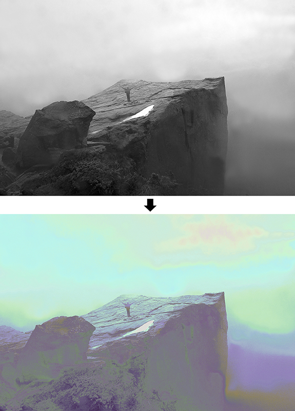
Open the image you want to colourise, in this case a black-and-white image. Then click the Create new fill or adjustment layer (Create new fill or adjustment layer) icon at the bottom of the Layers palette and choose the Gradient Map (Gradient Map) option.
Open the drop-down list with gradients and choose a colour gradient from the displayed colour transitions. If you want to display additional gradients, click the gradient menu and choose a series of gradients that you want to add to the default set, such as Color Harmonies 1, Color Harmonies 2, Photographic Toning or Special effects.
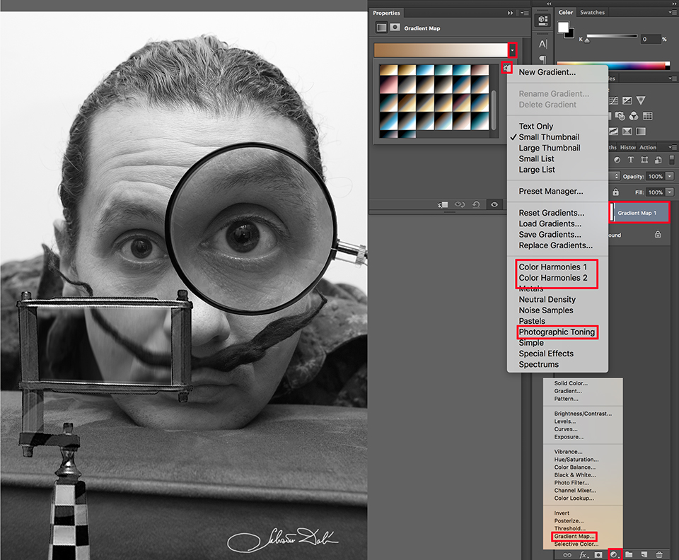
To adjust the settings of a colour gradient, click the gradient in the dialogue box to open the Gradient Editor. Then adjust the colour stops and colour midpoints below the gradient. Click OK twice to apply the gradient to the image.
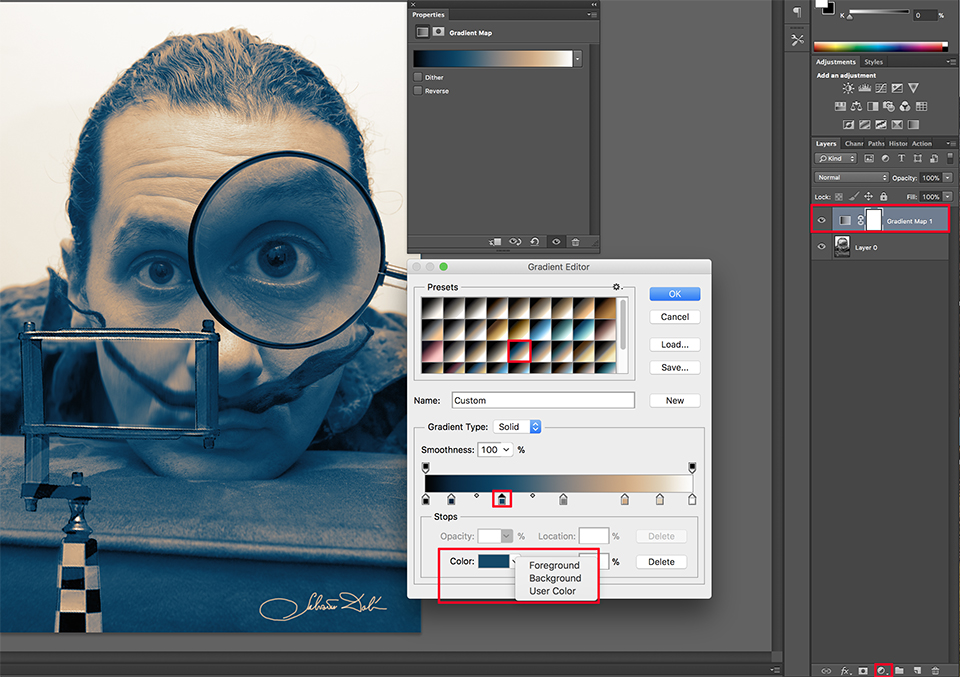
You can now see that the colour tones in this preset no longer run from black to white, but from cyan, in the shadows, to sepia, in the highlights. You can adjust these colours even further by clicking Color, where you can change the foreground colour, sepia, and background colour, cyan.
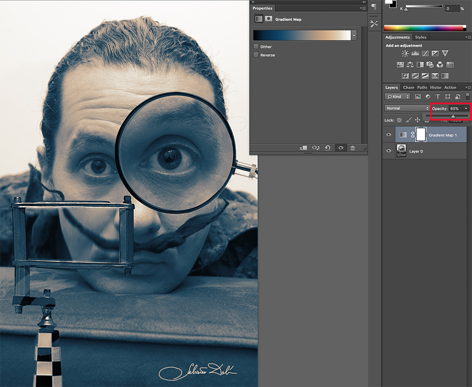
As with any adjustment layer, the Gradient adjustment layer can also be blended with the layers below it by choosing a layer blending mode from the Blending Mode drop-down list in the top left of the Layers palette.
Some blending modes make a big difference to the image, while others hardly do anything. The Color Blend Mode is a good choice for creating a subtler effect for the image.
Other images may work better with the Saturation or Hue blend mode. Your image determines which blending modes look most interesting.
You can blend the effect in the image below by reducing the layer opacity with the Opacity slider in the top right of the Layers palette.
3. Changing colours in a colour photo
You can also make a colour photo more interesting and atmospheric with a gradient map. For this, choose a portrait photo with sufficient contrast between the highlights, midtones and shadows.
You can apply the same actions as with the colourised black-and-white photo and subtly add some colour to your photo, brighten it a little and darken the shadows somewhat, for example by bringing the purple in the shadows closer to black.
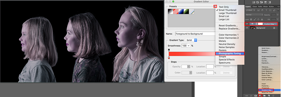
You can also use one of the additional gradients, such as Photographic Toning. You can immediately see more anchor points spread across the entire gradient.
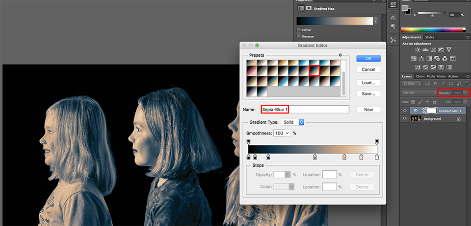
Most of the highlights and midtones have a skin tone selection. This means that the midtones in your photo are preserved well. After applying one of the gradient maps, I chose Sepia-Blue 1, you can lower the opacity again, to 10 or 20 per cent, for a nice and subtle effect.
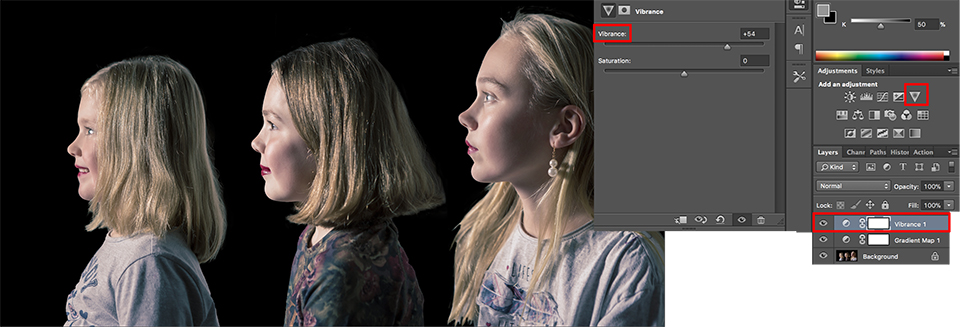
On top of this layer, you can optionally create another adjustment layer, such as Vibrance. This is the inverted triangle at the top right of the Adjustment Table, see the image above.
Other Gradient Map options
Some Gradient Map effects are similar to effects that can be achieved when developing normal film or slide film. You can apply Gradient Map to video. Use this as a starting point for editing the rest of your footage in, for example, Adobe Première.
For this, you need to create a LUT (Lookup Table) which you then load at the beginning of your film.
More tips?
If anyone knows more or other useful tips, or has ideas about how to creatively colourise a colour or black-and-white photo using Gradient Mapping, let us know in the comments!
Want to know more about Photoshop image editing?
At Photofacts Academy, our online learning environment for photographers, we have several courses on Adobe Photoshop.
- Photoshop for Beginners (Johan Elzenga)
- Photoshop for Photographers (Piet van den Eynde)
- Advanced Photoshop (Marit Hilarius)
- Photoshop Effects (Elja Trum)
And much more...
You can take these courses for two weeks with a free trial membership.
About the author
Michelle Peeters is fotografe en oprichter van DeuxBleus Fotografie. Michelle herkent het bijzondere in het gewone en het gewone in het bijzondere. Ze heeft zich nooit willen specialiseren en is daardoor van alle markten thuis.
You might also like
-
 30 most used Photoshop tools in one tutorial
by Michelle Peeters
-
 Zuijderwijk/Vergouwe launch photobook 'Mapping'
by Michelle Peeters
-
 Review: Special Photography Techniques, Panoramas, HDR, Virtual Tours and More
by Michelle Peeters
-
 Photoshop: Create a sun without gradients
by Marit Hilarius
-
 Flash photography tip: A gradient in your background
by Elja Trum
-
 The Most Useful Tool for a Photographer
by Nando Harmsen
0 comments
Be the first to share what you think!
Have your say
Please note: Articles older than a week can only be commented on by signed-in visitors.Would you still like to comment? sign in or create a free account.
Become a better photographer every week
A practical photography tip in your inbox every week.
38,764 photography enthusiasts already receive the tips! More about the weekly mail. Or keep up to date via  Facebook.

Elja Trum
Photofacts; everything to do with photography!
Would you like to take better photos and keep up with what is happening in photography? Photofacts publishes articles that teach you something about photography — from a product announcement to a practical shooting tip or a look at a website. Photofacts covers photography every day and is a hobby project of Elja Trum's that got out of hand. The articles are written by a team of volunteer authors. If you would enjoy writing one or more articles for Photofacts, do get in touch.More about PhotofactsPhotofacts is made possible in part by
