

Two ways to avoid an empty landscape
Monday 28 June 2021, 20:20 by Nando Harmsen | 6,635 views | 8 commentsThis article was translated from Dutch with the help of AI. Read the original.
Have you ever had the problem that a landscape looks less impressive in a photo than it did in reality? That you look at your photo disappointed and wonder what you should have done differently to make it interesting? I have two useful ways to do this.
It is one of the most common complaints among landscape photographers. It does not look as beautiful in the photo. There are many ways to make a photo much more interesting. I will not cover all of them in this article. It would become a very long article.
A different time of day is often recommended, with more colour in the sky. But you do not always have that option available. This is possible if you can easily travel to that place every day, but if you are on holiday or out for the day, it is often not possible.
It then comes down to better composition and image structure. To explain this, I will use three photos I took of the village of Marken. It takes me two hours to travel there, so I do not visit very often. Of course, the one time I was there, it was a glorious day.
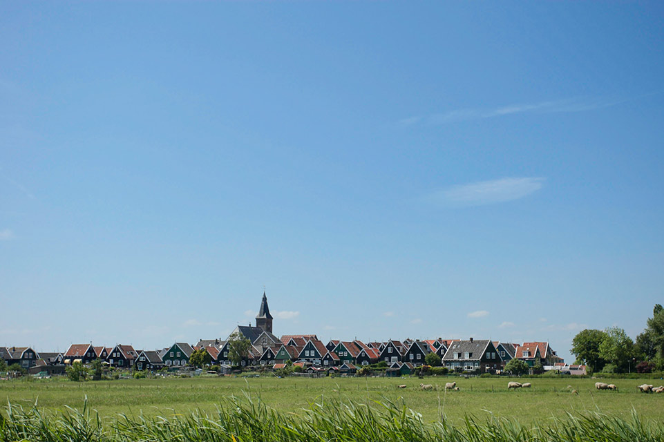
Boring daylight, an uninteresting sky. But these conditions do show what you can do to make a photo much more interesting, without depending on impressive skies.
The first photo shown above is anything but interesting. A boring sky, a meadow, and the village of Marken on the horizon. A skyline that does not come into its own. What now? What can you make of it?
First of all, get closer. Look for a clear subject. Do you want the village with its houses and church spire in the photo? Then go into the village. Find a nice spot, an attractive foreground, and photograph a more intimate view of the village and church.
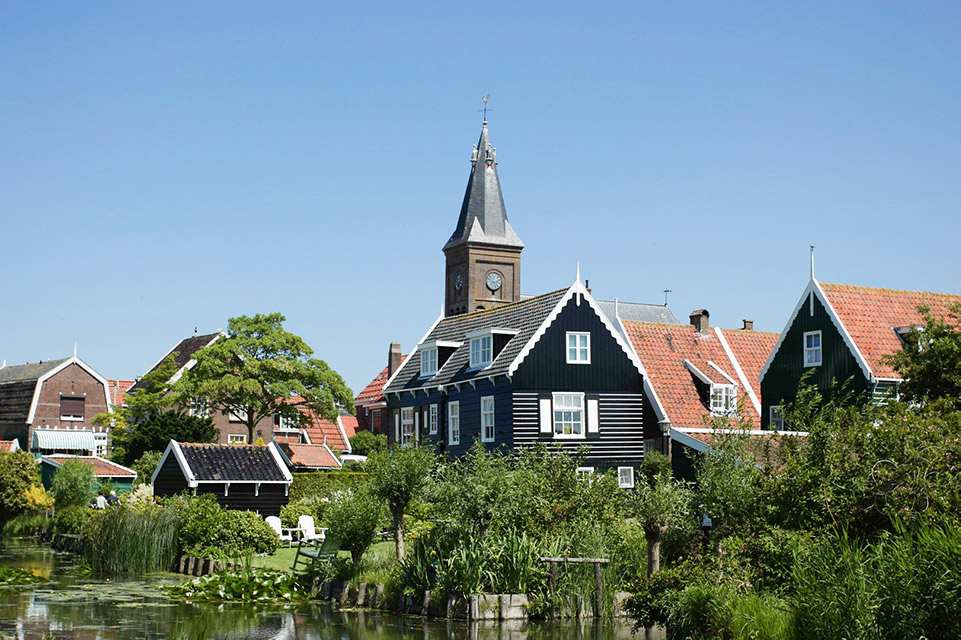
Is that not what you want? Then look for something that can serve as interesting content for the photo. If you look at the first photo, you can see some sheep in the meadow at the bottom right. Could they make an interesting foreground?
In the photo below, I used the sheep as the foreground. In fact, they became the subject of the photo. The village is visible in the background, as a nice element behind them. Suddenly, this is a photo with more content, literally and figuratively.
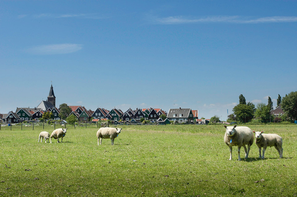
Did you like the skyline of Marken in the first photo? You have now captured it in a much more interesting way, with the sheep in the foreground.
These photos are of course not award-winning photos. But they serve just one purpose: to show that you can make a boring landscape much more interesting with a few simple changes. Even with a boring blue sky and the harsh light of the midday sun.
Imagine that there was also a fantastic sky, such as the one I have manipulated below. Although the photo has a real wow factor at first glance, it is still that empty image. Take away the sky and nothing remains.
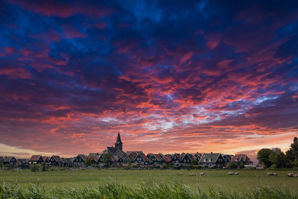
Imagine having this sky in the photo with the sheep in the foreground... I will leave that to your imagination.
There are of course other ways you could think of to make the photos I have shown more interesting. Which ones can you think of? Let me know in a comment below this post. I am curious to see what you would do.
About the author
Nando Harmsen has been photographing for more than 40 years. He specialises in wedding photography and landscape photography. Nando also gives talks, workshops, masterclasses and photo trips, and regularly reviews new and interesting equipment.
You might also like
-
 Composing a Foreground - Part 1
by Nando Harmsen
-
 The added value of a good foreground
by Nando Harmsen
-
Composing a foreground - part 2
by Nando Harmsen
-
Five tips for choosing a foreground
by Nando Harmsen
-
 Avoid unnecessary empty areas in a photo
by Nando Harmsen
-
 A foreground in your landscape photo? Choose something interesting
by Nando Harmsen
8 comments
-
 guest wrote on Tuesday 29 June 2021 at 11:12 | reply
😁😁 👌🏻👌🏻
Translated from Dutch. -
 PixelDude wrote on Tuesday 29 June 2021 at 11:40 | reply
Since it has come up here in passing anyway: I find Luminar too kitschy. You can recognize almost immediately the photos that have been tinkered with in Luminar. Maybe a good program for the non-hobbyist who thinks they can create fantastic photos with it ... but for the more serious photography enthusiast largely a fiasco.
Translated from Dutch. -
guest wrote on Tuesday 29 June 2021 at 12:24 | reply
I think the same as Pixeldude. Just like sunsets that seem to announce the end of the world. Too much is too much.
Translated from Dutch. -

-
PixelDude wrote on Wednesday 30 June 2021 at 11:15 | reply
Nando, you are absolutely 100% right about that. But seeing that cloud cover, I just had to get it off my chest.
Translated from Dutch. -
 Doreen wrote on Wednesday 30 June 2021 at 20:55 | reply
Because the sky isn't interesting, you could perhaps crop most of it out so that you are left with a panoramic image.
Translated from Dutch.
Converting it to black and white might also be an option.
I understand the Luminar sky (for illustration). In Photoshop, you can also add your own sky (with, for example, beautiful little clouds) via "sky replacement". -
PixelDude wrote on Thursday 1 July 2021 at 09:20 | reply
@ Doreen, you said that well.
Translated from Dutch.
A panoramic image seems like a much better solution to me than sticking yet another dramatic and completely kitschy sky onto it. This is not art but a photo for the flea market.
Adding a few clouds to the sky is fine as far as I'm concerned. But then pay close attention to how you do it (lightfall, shadows, light intensity, colour, ..., and so much more. The sky has to 'fit' the photo. The photo that Nando shows us (fortunately) purely by way of illustration is laughable in my eyes. To mention just one flaw: when you're in the blue hour, the landscape is already much darker. A big 'boo' to everyone who wishes to make such concoctions.
It becomes a very different story when you can clearly see that the photographer has a 'specific intention' in delivering such photos, which can lead to a higher form of art. That is not the case here. Simply sticking something on to try to turn an ordinary photo into a better photo ... simply doesn't work. -
 Nando
wrote on Thursday 1 July 2021 at 09:23
| reply
@Doreen:
Translated from Dutch.
Thanks for your suggestions.
Cropping out the sky still gives the same boring image. I don't see that as an option.
Converting to black and white is never a solution for a failed photo. Your photo simply remains... failed.
An uninteresting composition and image structure cannot be corrected in post-processing, which I demonstrate by adding a sky to it.
Have your say
Please note: Articles older than a week can only be commented on by signed-in visitors.Would you still like to comment? sign in or create a free account.
Become a better photographer every week
A practical photography tip in your inbox every week.
38,982 photography enthusiasts already receive the tips! More about the weekly mail. Or keep up to date via  Facebook.

Elja Trum
Photofacts; everything to do with photography!
Would you like to take better photos and keep up with what is happening in photography? Photofacts publishes articles that teach you something about photography — from a product announcement to a practical shooting tip or a look at a website. Photofacts covers photography every day and is a hobby project of Elja Trum's that got out of hand. The articles are written by a team of volunteer authors. If you would enjoy writing one or more articles for Photofacts, do get in touch.More about PhotofactsPhotofacts is made possible in part by
