

Avoid unnecessary empty areas in a photo
Monday 18 May 2026, 20:02 by Nando Harmsen | 1,936 views | 4 commentsThis article was translated from Dutch with the help of AI. Read the original.
Good composition is a carefully considered collection of image elements brought together with an attractive division of space. Make sure you do not have unused empty areas in your image.
Everything you include in the frame contributes to the composition. You should not include anything that you do not want in the image. Otherwise, it is like a wrong note in a piece of music.
But it also means that you should not introduce unnecessary emptiness into the composition. That is like a silence in a piece of music that disrupts the rhythm. You can have empty space in a photo, but it must add value.
So make sure you think carefully about the placement of the image elements in the photo. Especially when you use a foreground, make sure it says something. As an example, I have this field with a village on top of a hill
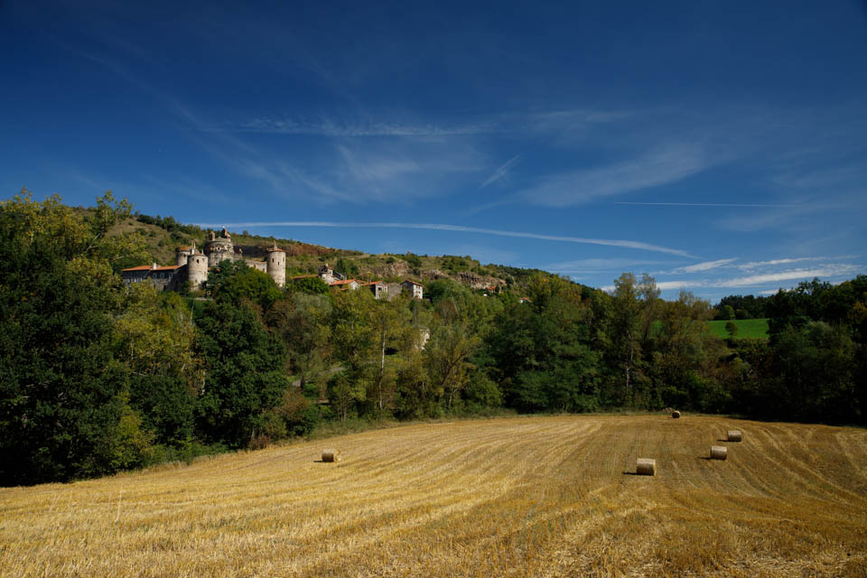
The grass (grain?) has been mown and rolled into bales. At least, if the grass is grain. Maybe it was another crop. If you know what it is, tell us in a comment below this post.
The field is empty and the rolls are somewhere in that area. That takes up one-third of the total photo. That is not a problem, but there is nothing that makes this area interesting. The thing that could be interesting is terribly small in the image. That is a shame.
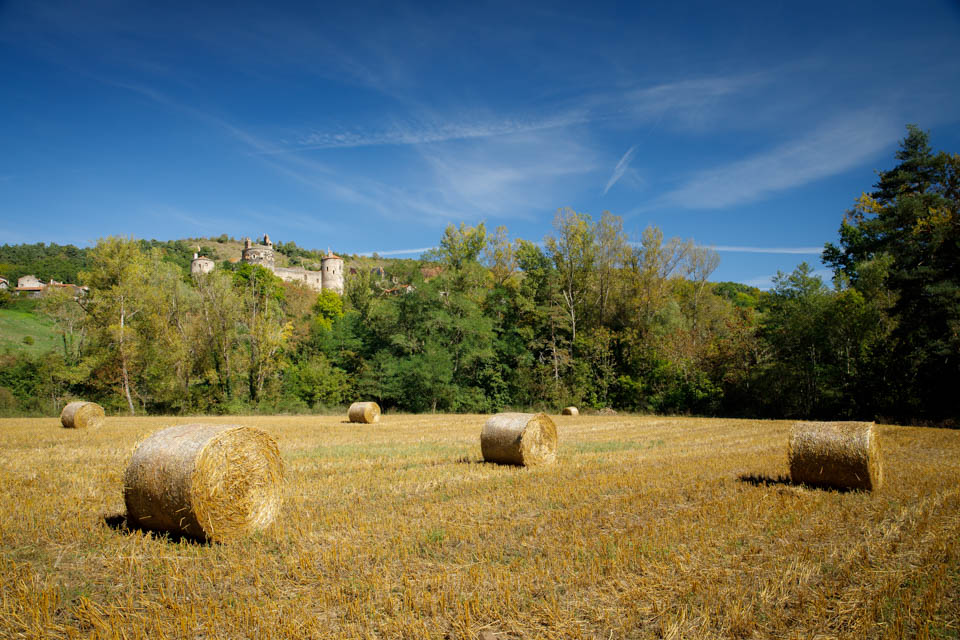
You can solve this by giving the field more content. Choosing a different position changes the foreground, making the rolls part of the composition. It also prevents that rather meaningless emptiness in the image area.
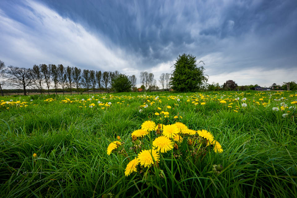
You can do this in many ways. By including dandelions in a grass field, for example, or by using a path as a leading line. Look carefully at what can be used and use it to your advantage.
By thinking carefully about how to fill the foreground, you can make the photo richer. If there is nothing that can fill an unnecessary empty area in the photo, consider keeping that emptiness out of the frame. Zoom in, or use a different viewpoint.
About the author
Nando Harmsen has been photographing for more than 40 years. He specialises in wedding photography and landscape photography. Nando also gives talks, workshops, masterclasses and photo trips, and regularly reviews new and interesting equipment.
You might also like
-
 Five tips for choosing a foreground
by Nando Harmsen
-
 The added value of a good foreground
by Nando Harmsen
-
 A foreground in your landscape photo? Choose something interesting
by Nando Harmsen
-
 Using a foreground as a view through in landscape photography
by Nando Harmsen
-
Composing a Foreground - Part 1
by Nando Harmsen
-
 Two ways to avoid an empty landscape
by Nando Harmsen
4 comments
-
 guest wrote on Tuesday 19 May 2026 at 13:30 | reply
Still, I didn't think the first photo was bad either. Isn't it a matter of taste?
Translated from Dutch.
Paul -

-
 Ton Brosse wrote on Tuesday 19 May 2026 at 14:13 | reply
In the first photo, a reasonably large piece could be cut off at the bottom, and a smaller piece on the left and right sides as well. That would make the photo a bit better. I think that is what Paul means.
Translated from Dutch. -
 Nando
wrote on Tuesday 19 May 2026 at 14:46
| reply
Nando
wrote on Tuesday 19 May 2026 at 14:46
| reply
Why crop on the right and left? Cropping on the right means that you no longer have the roles on the field in the frame, cropping on the left means that you have the castle against the edge of the photo, or half of it in it.
Translated from Dutch.
This doesn't really seem like a good choice to me. It even detracts from the image.
Have your say
Please note: Articles older than a week can only be commented on by signed-in visitors.Would you still like to comment? sign in or create a free account.
Become a better photographer every week
A practical photography tip in your inbox every week.
38,982 photography enthusiasts already receive the tips! More about the weekly mail. Or keep up to date via  Facebook.

Elja Trum
Photofacts; everything to do with photography!
Would you like to take better photos and keep up with what is happening in photography? Photofacts publishes articles that teach you something about photography — from a product announcement to a practical shooting tip or a look at a website. Photofacts covers photography every day and is a hobby project of Elja Trum's that got out of hand. The articles are written by a team of volunteer authors. If you would enjoy writing one or more articles for Photofacts, do get in touch.More about PhotofactsPhotofacts is made possible in part by
