

Using colour in photography
Wednesday 12 December 2018, 14:43 by Michelle Peeters | 28,732 views | 29 commentsThis article was translated from Dutch with the help of AI. Read the original.
Using colour is an important part of a photo's overall composition. The way you use colours and make them stand out against each other can either strengthen the feeling of action or make a situation feel calmer.

People are attracted to colours for different reasons. Often, it is simply because they like a particular colour.
In many cases, choosing colours based on personal preferences can result in garish combinations. Just look at the text and background colours you come across on websites.
You can use colour to evoke emotions in your audience. Green and red, for example, create a mysterious effect, black feels threatening, yellow or orange radiate warmth and blue has a cool effect. Keep this in mind in your photos. Such considered use of colour can greatly improve a photo's impact.

You can also use colour itself as the subject of an abstract photo. Think of extreme close-ups of flowers. Because the shape, structure and recognisability of the subject disappear, the colours themselves become the most important element in your photo!
With some basic practical knowledge of how colours strengthen or weaken other colours, you have more control over the emotion your photo conveys.

Complementary colours
When you look at this colour wheel, you can see that red is opposite green. Colours that are directly opposite each other are called 'complementary colours'.
They are used to strengthen each other, and the contrast between the colours makes them stand out as dynamically and vividly as possible.
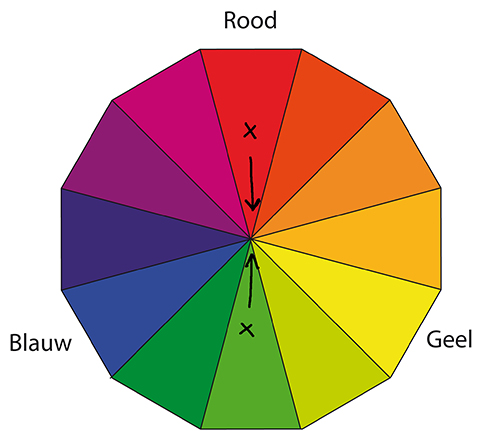
If you want the colour red to stand out in your photo, place a complementary colour near the red, such as green or blue. The dynamism of complementary colours can strengthen the feeling of action and movement.
Imagine, for example, a mountain biker in yellow clothing with a green forest in the background. Now imagine the same image with a cyclist wearing purple clothing.

Analogous colours
The colours that sit next to each other on the colour wheel are called 'analogous colours'. These include red and orange, blue and green, or pink and purple.
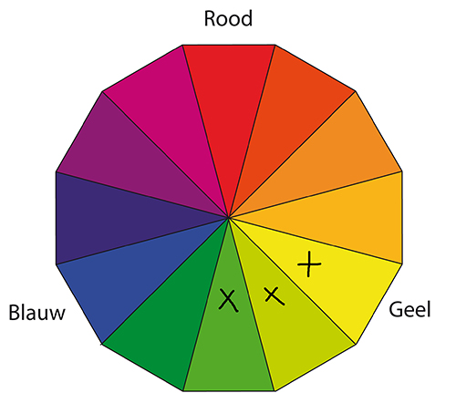
These colours do not contrast with each other and can be used to express calm. When seeing analogous colours, the viewer feels calm and at ease.

Want to know more about colour management in photography?
At Photofacts Academy, our online learning environment for photographers, we have a complete course on Colour Management. You can follow this course for two weeks with a free trial membership.
About the author
Michelle Peeters is fotografe en oprichter van DeuxBleus Fotografie. Michelle herkent het bijzondere in het gewone en het gewone in het bijzondere. Ze heeft zich nooit willen specialiseren en is daardoor van alle markten thuis.
You might also like
-
 Portrait photography tip: Use complementary colours
by Elja Trum
-
 30 techniques for using colour in your photos
by Michelle Peeters
-
 Why yellow likes blue (and vice versa)
by Martin van Rooij
-
 Colourful fashion shoot with Lindsay Adler
by Elja Trum
-
 5 Reasons for an L-bracket, and 5 reasons against one
by Nando Harmsen
29 comments
-
 Bram van Maas wrote on Tuesday 21 March 2017 at 11:48 | reply
Clear and comprehensible story.
Translated from Dutch. -

 Arthur Wittendorp
wrote on Tuesday 21 March 2017 at 11:55
| reply
Michelle,
Translated from Dutch.
Your explanation regarding complementary colors isn't entirely correct. Basically, we know 3 primary colors; Red - Green - Blue (or RGB (Red Green Blue)). If we look at the complementary colors in the color wheel, we see that the complementary color of red is cyan (cyan is a mix of green and blue) instead of green. The complementary color of green is magenta (a mix of red and blue) and the complementary color of blue is yellow (a mix of red and green). Complementary colors are also called the CMY(K) colors (Cyan - Magenta - Yellow (Black)) -
 elbee wrote on Tuesday 21 March 2017 at 13:14 | reply
A handy mnemonic:
Translated from Dutch.
the complementary color of Red is Cyan (R first letter of RGB,C first letter of CMYK)
the complementary color of Green is Magenta (G second letter of RGB,M second letter of CMYK)
the complementary color of Blue is Yellow (B third letter of RGB,Y third letter of CMYK) -
 Ketelbinkie wrote on Tuesday 21 March 2017 at 14:58 | reply
The color wheel used by Michelle is indeed not the right one. For digital photography, the physical color wheel applies. RGB versus CMY, then.
Translated from Dutch.
That makes the whole article, including the example photos, collapse. But that is not the first time and, in the absence of competent critics, it will not be the last time either. A logical consequence of this site's policy, whereby anyone who voices criticism is barred. -
 Michelle Peeters wrote on Tuesday 21 March 2017 at 15:40
| reply
@Arthur, so what is wrong with this color wheel then? You say that the complementary color of Red is Cyan (green/blue), that of Blue is Yellow and that of Green is Magenta (a kind of purple). They're perfectly opposite each other in this wheel, aren't they?
Translated from Dutch. -
 Arend Jan Bolhuis wrote on Tuesday 21 March 2017 at 16:09 | reply
If you say that for digital photography the physical color wheel applies and that as a result the foundation beneath the entire article disappears, you should, for example, also say that the foundation beneath the statement 'the sun rises' disappears. From a physical point of view, after all, the sun does not rise above the earth at all. Nevertheless, it is a perfectly correct statement, because that is how we experience it. In the same way, Michelle is indeed standing on solid ground with the color wheel she uses. This wheel was used for centuries in painting and forms, among other things, the basis of Johannes Itten's theory of color. That is a more psychological system, in which, for example, blue and orange are complementary. Precisely the colors of the golden and blue hours, which photographers are so delighted by.
Translated from Dutch.
Michelle is clearly talking in her article about the way we experience colors, not about the way colors come into being physically. I therefore find the criticism above rather simplistic. -
Michelle Peeters wrote on Tuesday 21 March 2017 at 16:11
| reply
@Arend Jan: perfectly worded, that was indeed what was intended!
Translated from Dutch. -
 Pixeldude wrote on Tuesday 21 March 2017 at 17:42 | reply
Complementary colors are indeed a different story.
Translated from Dutch.
You can find the right circles, for example, at
https://www.google.be/webhp?sourceid=chrome-instant&rlz=1C1GGGE_nlBE590BE591&ion=1&espv=2&ie=UTF-8#q=complementaire+kleuren&*
or
http://www.em-ha-em-art-productions.nl/amateurschilder/tag/complementaire-kleuren/ -
Michelle Peeters wrote on Tuesday 21 March 2017 at 17:48
| reply
@Pixeldude: explain what exactly is different about this?
Translated from Dutch. -
 Bart wrote on Tuesday 21 March 2017 at 18:06 | reply
@ ketelbinkie: Michelle writes an interesting piece about the use of colour and the effect colours can have on each other. She shows that effect using photos. The fact that she does not use the correct colour wheels does not detract from her story at all. After all, it is about the effect of using complementary colours, or precisely non-complementary colours.
Translated from Dutch.
I therefore think it is rather unnuanced to say that the foundation under the article disappears, and I do not agree with that either. -
pixeldude wrote on Tuesday 21 March 2017 at 18:16 | reply
Perhaps it is the examples that are not entirely complete or not quite appropriate. I cannot express exactly ‘what’, but something is lacking in the explanation. Maybe not clear enough?
Translated from Dutch.
Example
1. If you want the colour red in your photo to shine, place a complementary colour near the red colour, such as green or blue.
- Should be supplemented with ‘yellow’, because that is just as important (it is as far from red as blue is).
2. For example, imagine a mountain biker in yellow clothing with a green forest in the background. And now imagine that same image with a cyclist in blue clothing.
- Green and blue are too close to each other to have a good picture of what is meant. Better would be: a yellow mountain biker against a green forest or a cyclist in ‘red’ clothing (not blue) against the green forest.
In photographic terms I would describe it as follows: It is without a doubt a good composition but insufficiently ‘sharp’. -
elbee wrote on Tuesday 21 March 2017 at 18:28 | reply
It is a somewhat simply written piece and poorly substantiated. You could call it that too, and Pixeldude already makes that clear.
Translated from Dutch.
At photography school, one learns that the complementary colors are CMY, so I think you shouldn't mention any other colors here. A painter has a different palette of colors at their disposal than a digital camera -
Michelle Peeters wrote on Tuesday 21 March 2017 at 18:41
| reply
Maybe the fact that a blue-cloud background was always used in school photography in the past (it contrasts nicely with skin tones, so they are complementary colors!) is a good example to illustrate what you can do with colors. It's really just about learning to see it. Painters do indeed use this color wheel too. Just a tool!
Translated from Dutch. -
 Gerard wrote on Tuesday 21 March 2017 at 20:34 | reply
What a shame ... the subject is very interesting and topical. Then make sure the article is good..
Translated from Dutch. -
Gerard wrote on Tuesday 21 March 2017 at 21:12 | reply
Michelle Dan Bailey has posted a good article on his webblog about "Making the Image" that goes is a nice and fascinating article with the same points of contact.
Translated from Dutch. -
Arend Jan Bolhuis wrote on Wednesday 22 March 2017 at 07:33 | reply
Elbee, in the teaching material I have from the Photography School there are two chapters on color: Color Theory (in the Digital Workflow module) and Color Science (in the Location Photography module). Color Theory covers the scientific color wheel (RGB/CMY), while Color Science covers the color wheel used in painting. Michelle is talking about the second wheel in her article. In my opinion, completely rightly so, because ultimately it is about how we experience colors, not about how the camera produces colors.
Translated from Dutch. -
FrankT wrote on Wednesday 22 March 2017 at 10:14 | reply
There are different systems for defining (mixing) colors and placing them in a circle. Depending on whether you start from paint, printed matter, light or a screen. Each have different primary colors. In painting (the pigment circle used in this article), different ones apply again. It just depends on how the colors are built up.
Translated from Dutch.
Read this article on Wikipedia, for example: https://nl.m.wikipedia.org/wiki/Kleurencirkel
https://nl.m.wikipedia.org/wiki/Subtractieve_kleurmenging
https://nl.m.wikipedia.org/wiki/Additieve_kleurmenging.
Besides how you create/compose colors, the most important point Michelle raises in this article is of course: when making a photo, pay attention to which colors you bring back in the composition, and think about how people see and experience the colors. A matter of looking, then.
-
 Jacko wrote on Wednesday 22 March 2017 at 17:19 | reply
Nice article Michelle. Thank you.
Translated from Dutch.
If you want to make a photo "pop" then you have to look for contrast. That can be in light versus dark or in opposing colors. What the color wheel is called is not that relevant to me.
Photography is about "seeing" and that is what you draw our attention to. So, great! -
Michelle Peeters wrote on Wednesday 22 March 2017 at 17:22
| reply
@Jacko: that's exactly how it is! Look for contrasting colors or simply for contrast. Or don't do that at all. It's about what you want with your photo. You can use this to influence that, among other things.
Translated from Dutch. -
 Donald Willemsen
wrote on Wednesday 22 March 2017 at 22:31
| reply
A photo needs to contain sufficient contrast. Whether that is in color or in b/w, that does not matter. A lack of contrast can make a photo enormously boring. As a photographer, you use contrast not only to give an impression of reality, but also to want to tell something with the image or convey a certain atmosphere that does not only interest the photographer but also the viewer. Color is merely a tool that can either make an image or break it. Color wheels and whatever they are called do not have much to do with that. The feeling with which you put together a composition is much more important to me.
Translated from Dutch.
By working in b/w, you only learn how to deal with colors. In b/w you MUST work with contrast to create an appealing image. That way you learn much better how to deal with color.
Finally, let us not forget one thing: 'Photography is writing with light'. -
Michelle Peeters wrote on Wednesday 22 March 2017 at 22:48
| reply
@donniebelg: those specific mist photos, they actually lack contrast, don't they? I don't really think it's a must, it's just a matter of what the photo is supposed to convey.
Translated from Dutch. -
Donald Willemsen
wrote on Thursday 23 March 2017 at 10:39
| reply
@Michelle, mist in itself is also a contrast.
Translated from Dutch. -
Ketelbinkie wrote on Thursday 23 March 2017 at 14:35 | reply
As always, it becomes laughable content-wise when the stream of reactions goes on long enough. Fog, contrast, photography schools.... pffff.
Translated from Dutch.
It was about the use of color and the color wheel as an aid. If you then use an aid that has nothing to do with digital photography (and its display), then you simply miss the point. What some painters use is irrelevant. In digital photography, the physical color wheel applies. Those who don't want to believe that would do well to delve into the theory of color reproduction on a monitor and in print. -
Arend Jan Bolhuis wrote on Thursday 23 March 2017 at 15:20 | reply
What stands out to me so much in your response (and the previous one) is the certainty with which you proclaim your opinion, without really addressing what others, including me, have to say. You don't get any further than 'you’re simply missing the point' and 'it doesn’t matter'.
Translated from Dutch. -
mv wrote on Thursday 23 March 2017 at 15:24 | reply
I think one is on a different level than the other
Translated from Dutch. -
Ketelbinkie wrote on Thursday 23 March 2017 at 18:09 | reply
What am I supposed to address then? Blue and orange, the colors of the golden and blue hour? And that those colors are therefore such beautiful complements? Just delve into the theory instead of spouting nonsense. It probably isn't nice to hear, but that is more often the case with the truth.
Translated from Dutch.
And I don't think I'm the only one who has criticism of this article and the way the author arrives at her advice. -
Arend Jan Bolhuis wrote on Thursday 23 March 2017 at 19:00 | reply
You don't seem to understand what I'm actually trying to say. The theory of the physicist's color wheel is very interesting if you want to know how colors arise from light waves, but it does not determine the way people experience colors. That works differently. That's what Michelle is talking about in her article.
Translated from Dutch.
And now I'm done talking about it. -
Michelle Peeters wrote on Friday 24 March 2017 at 07:49
| reply
@Arend Jan: I think Ketelbinkie is indeed referring to color management, color spaces and how you get colors to match on your camera/browser/printer print. And how these basic colors are mixed in different ways. Not relevant to this article indeed. But perhaps interesting to devote a completely different article to that sometime!
Translated from Dutch. -
Ketelbinkie wrote on Friday 24 March 2017 at 08:14 | reply
Not relevant? Then why are you talking about complementary colors? And how do you view your photos then? On a painter's canvas?
Translated from Dutch.
How people experience colors is completely subjective. No eye is the same. What you see as red, someone else may experience as orange. Is that really what the article is about?
Have your say
Please note: Articles older than a week can only be commented on by signed-in visitors.Would you still like to comment? sign in or create a free account.
Become a better photographer every week
A practical photography tip in your inbox every week.
38,764 photography enthusiasts already receive the tips! More about the weekly mail. Or keep up to date via  Facebook.

Elja Trum
Photofacts; everything to do with photography!
Would you like to take better photos and keep up with what is happening in photography? Photofacts publishes articles that teach you something about photography — from a product announcement to a practical shooting tip or a look at a website. Photofacts covers photography every day and is a hobby project of Elja Trum's that got out of hand. The articles are written by a team of volunteer authors. If you would enjoy writing one or more articles for Photofacts, do get in touch.More about PhotofactsPhotofacts is made possible in part by
