

30 techniques for using colour in your photos
Monday 29 June 2020, 20:02 by Michelle Peeters | 35,625 views | 1 commentThis article was translated from Dutch with the help of AI. Read the original.
There have already been several articles on using colour in photography on Photofacts. Yet there is still plenty more to say about it. Colours can be warm or cool, strong or weak. They can work well together or contrast, and range in tone from vivid primary colours to subtle supporting colours.
One thing is certain: using colour can make or break a photo, because it has a strong impact on the viewer. In this article, around thirty techniques for using colour in your photos.
1. The colour wheel
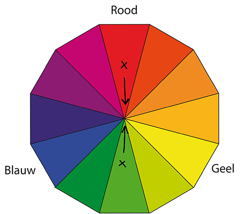
Light is formed by the colours of the spectrum, which you can also see in rainbows. Arranging these colours in a wheel is a good way to map out their relationship with one another.
On one side you see warm colours (magenta, red and yellow), and on the other side cooler colours (green, cyan and blue) and their supporting colours (cyan, magenta and yellow). Colours opposite each other contrast, while colours that are close together harmonise.
2. Light quality
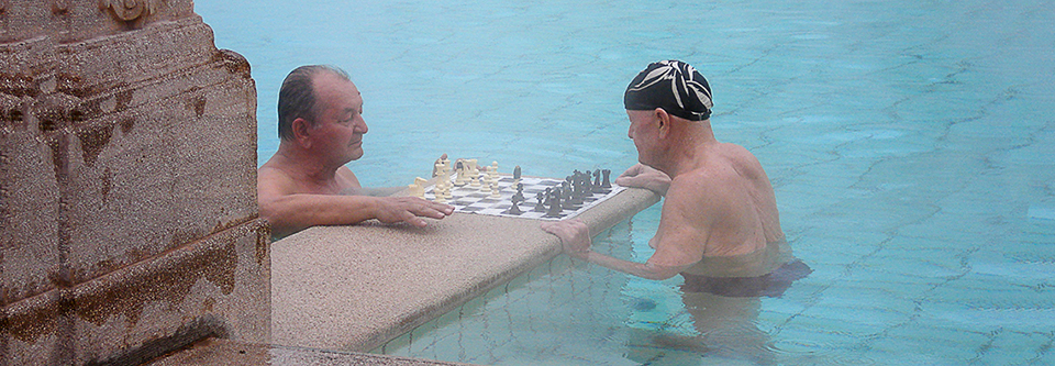
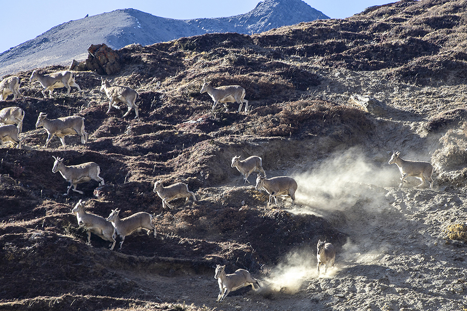
The way colours are captured outdoors is influenced by the quality of the light. In the morning and afternoon, the light is warm, so colours also become warmer. Around midday, the sun is high in the sky, the light is somewhat cool and colours are also colder.
Colour saturation is highest when the light is slightly diffuse. Colours are particularly vivid in partial shade, because the light is soft and the contrast is low. Backlight reduces colour saturation.
3. Weather conditions
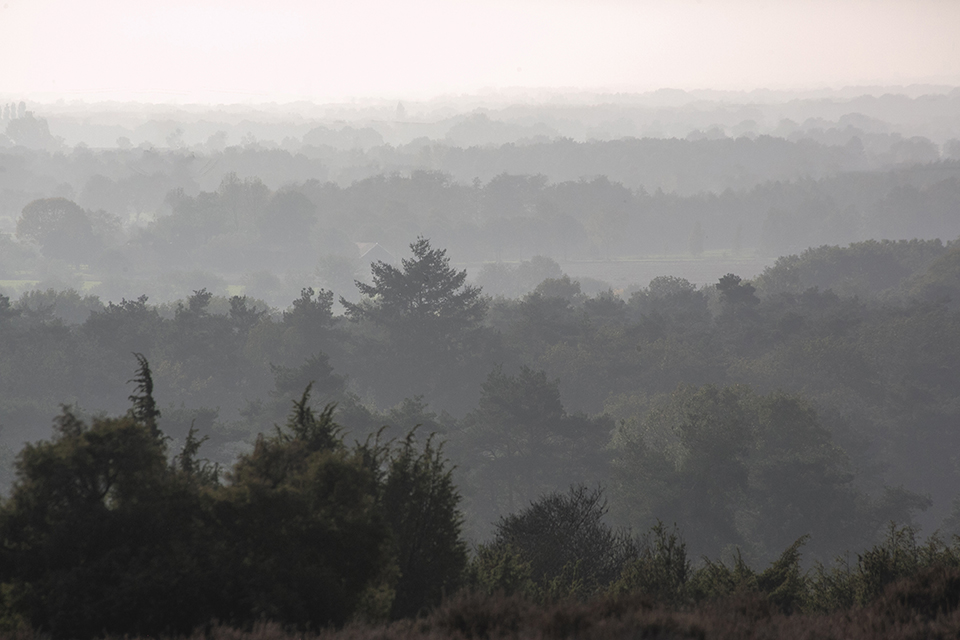
The weather has a major influence on the quality of the light. When it is clear and sunny, colours are bright and saturated. Different colour tones are clearly visible. When it is cloudy, colours are much softer.
In mist, colours blend into each other, reducing the difference between warm and cool colours. Thick mist can make a normally colourful scene look monochrome.
4. Contrasting colours
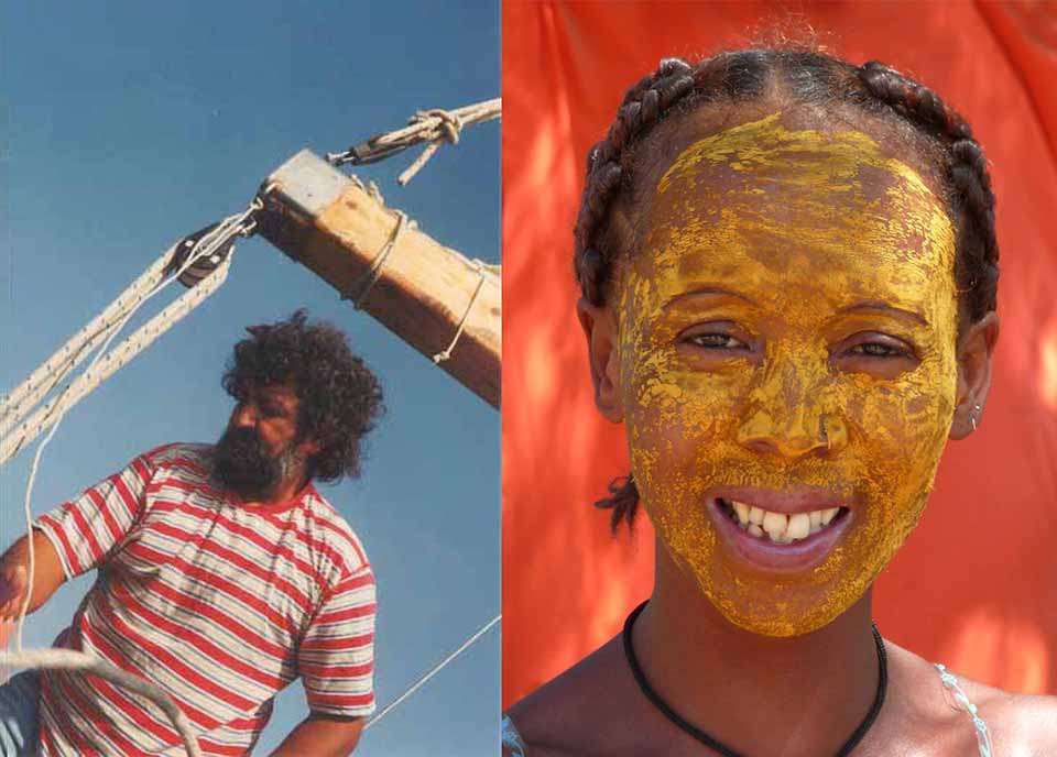
Colours opposite each other on the colour wheel contrast with each other. These are complementary colours, such as yellow and blue or red and green. Including these colours in one photo can work well, because they attract the viewer's attention and stimulate the senses.
For the best result, photograph in strong light and give all the colours an equal amount of space, so that no single colour dominates.
5. Harmonious colours
Colours that are close together on the colour wheel harmonise. These are analogous colours, such as yellow and red, yellow and green, green and blue and so on. Colour harmony is useful in compositions, because it allows you to create visually easy-going images. Think of the warm colours of a forest in autumn or the glow of a sunrise or sunset.
6. Colour temperature
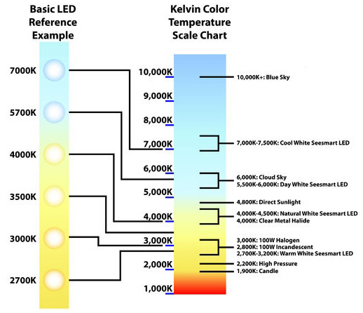
To identify differences in light colour precisely, instead of saying that something looks a bit blue or orange, photographers use the Kelvin scale (K). This refers to light in terms of colour temperature.
Normal light, the light on a clear, sunny afternoon, has a colour temperature of around 5500 K, with colours captured naturally. If the temperature rises above 5500 K, the light becomes cooler and colours take on a blue cast, as if it were cloudy.
If the temperature drops below 5500 K, colours become warmer, with an orange-yellow cast, as at sunset.
Your eyes adjust to this temperature, so colours always look more or less natural. Digital sensors cannot do this, however, so you will need to do something to prevent an unwanted colour cast. On your camera, you can use Auto White Balance (AWB) or set the white balance yourself.
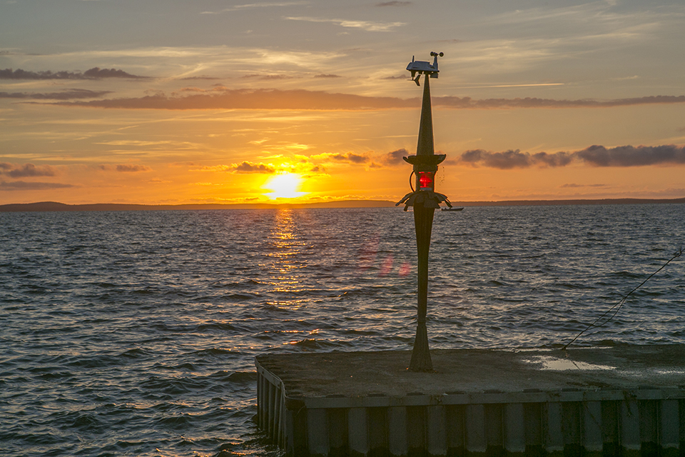
A colour cast is of course not always unwanted. The colour temperature of a sunset can drop to 3000 K, but you often want to retain this warmth because it makes the photo much more attractive.
Light source and colour temperature
Shadows under blue skies: 7,000 K
Normal daylight: 5,500 K
Flash light (has a 'daylight' colour temperature): 5,500 K
Midday sun: 4,500 K
Early morning or afternoon sun: 3,500 K
Sunrise and sunset: 3,000 K
Incandescent bulb: 2,800 K
LED lighting: available in different colour temperatures.
7. A single colour
You can take stunning photos of scenes that consist of just one colour or one colour in different shades. In nature, this effect is caused by soft backlighting, but people can also be responsible for it through the use of certain building materials or paint colours.
8. Increasing colour saturation
Slightly underexposing the photo gives you more colour saturation. This works with both film and digital cameras. Make sure you do not go too far, however, as the colours will otherwise take on a dark and muddy tint.
9. The Saturation slider in Photoshop
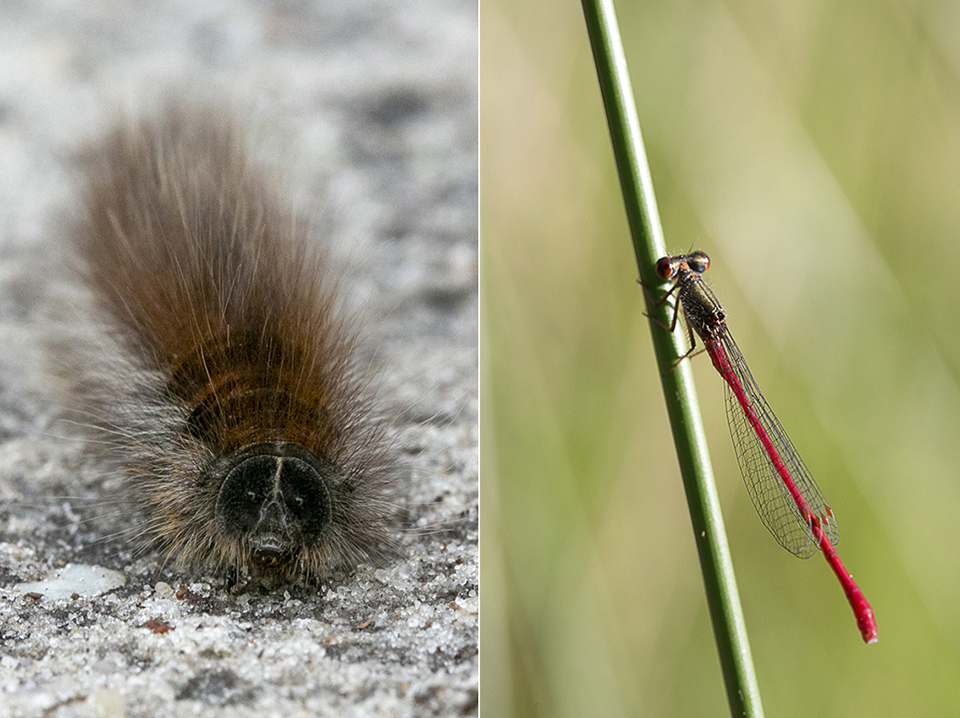
It makes sense that the colours become stronger when you increase the saturation with the Hue/Saturation slider in Photoshop or Lightroom. Used in moderation, at around 10%, this works well, but if you go too far, the colours quickly become oversaturated. So do not be tempted!
10. Warm colours
Warm colours, such as orange and yellow, give photos a calm, soothing effect, especially when the colour tones are soft and subtle. This is why nature photographers like to work at sunrise or sunset, when daylight is naturally warm.
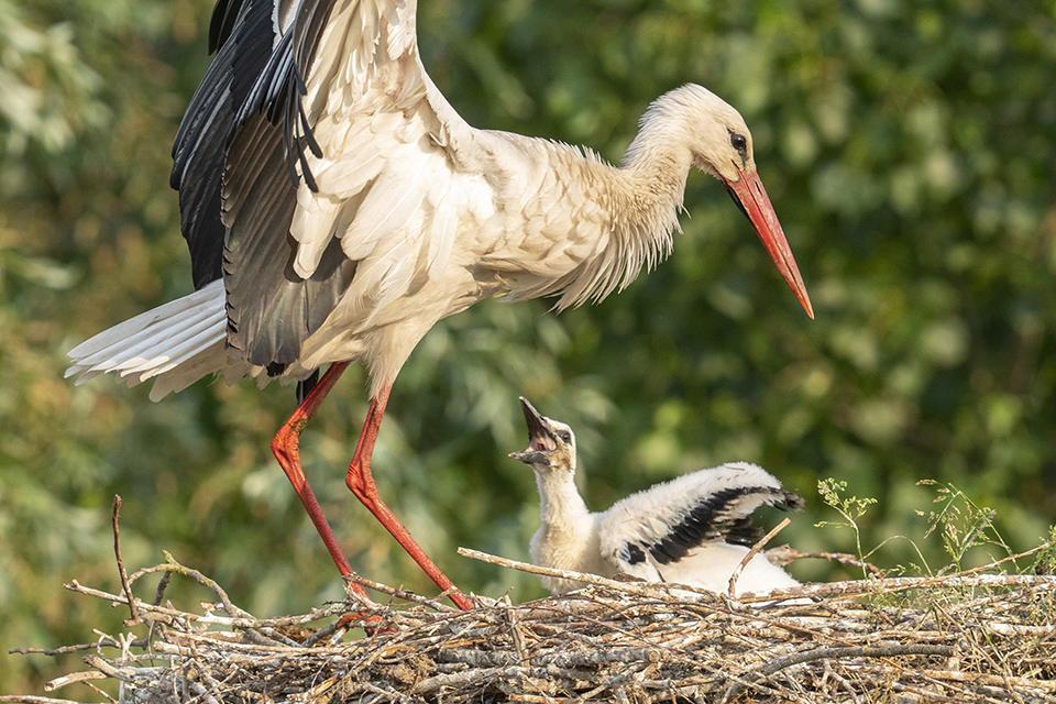
11. Monochrome colours
When a scene or subject consists of a single colour or different shades of the same colour, we call it a monochrome image. A hazy atmosphere and dust encourage this, especially at sunrise or sunset, when you photograph into the light and everything gets a beautiful, warm glow.
This colour palette can produce very atmospheric photos.
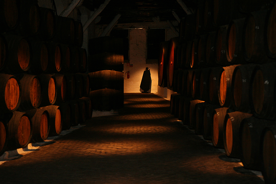
12. Cool colours
In cold or grey weather, the colour palette tends towards blue and photos take on a completely different mood. You get a gloomy, melancholic atmosphere, which can work just as well as warm colours.
13. Graduated filters
Add colour to dull skies by using a graduated filter. Pink, purple, red and orange can give photos taken at sunrise or sunset something extra. Do not go too far, though!
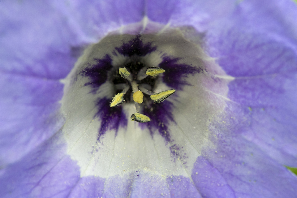
14. Abstract colours
You can create striking, abstract colours by using areas of vivid colour and composing a scene or subject in which colours, rather than shapes, are emphasised. Try leaving part of the subject out or capturing it from an unusual angle.
15. Schwarzschild effect
If you use a long exposure of 30 seconds or more, the Schwarzschild effect can occur, capturing unusual colour tones. This can be surprising, but at the same time interesting and effective.

16. Striking colours
Colours in the 'warm' part of the spectrum usually attract the most attention. Red is the strongest colour in this respect, which is also why it can dominate a photo even when it occupies only a small area. Yellow and orange are also strong.
17. Unobtrusive colours
Cool colours, shades of blue and green, are less noticeable. They are particularly suitable as background colours and make other colours stand out more. This is why a blue sky works so effectively in photos.
18. Dominant colours
Do not always try to fill the frame with bright, contrasting colours. A photo often works better when there is one dominant colour that attracts most of the attention. The more intense the colour, the more dominant it is, especially when placed against a background of a more neutral or soft colour.

19. Colour symbolism
The primary colours have strong symbolic value, which you can use well in your photos.
- Red suggests anger, danger, love, passion, blood and fire;
- Blue is more calming, a symbol of light, water, purity and open spaces, but it can also be cold and depressing, and symbolise bad weather, loneliness and sadness;
- Green is the colour of nature: trees, meadows and hills. Green symbolises the outdoors, new life and freshness;
- Yellow is light, the sun and pure gold. Yellow is a happy, positive colour that gives photos a calming and relaxing atmosphere.

20. Isolating colours
Use a zoom or telephoto lens to isolate attractive areas of colour and keep unwanted details out of the frame. By changing your camera position, you can bring interesting colour contrasts into the image.
21. Colour and polarising filters
You can use colour filters to add colour to your photos. A soft, yellow-brown filter, for example, is ideal for improving photos of a sunrise or sunset. A soft blue colour filter enhances cool colours and is ideal for photos taken in grey, misty conditions.
A polarising filter removes reflections from non-metallic surfaces and gives colours more saturation. Do not limit its use to bright sunlight, however. Reflections become more intense in grey, damp weather.
So bear in mind that this is well suited to a polarising filter. Keep the sun at around 90 degrees to the lens to make a blue sky bluer.

22. Extra atmosphere
When the light is soft and hazy and the colours are somewhat faded, you can take stunning, atmospheric photos. To enhance this atmosphere, you can use a soft-focus filter or breathe on your lens. This works particularly well when photographing into the light.
23. Something from nothing
Try taking a series of photos in which colour is the only subject... You can choose a particular colour as a theme and look for all kinds of interesting subjects in that colour. A good way to develop your photographic eye.
24. Create your own image
You can take strikingly colourful photos by collecting interesting objects and creating still lifes yourself. For example, place bright yellow flowers against a blue background for a powerful colour contrast. Toys and colourful objects such as plastic picnic sets are also good subjects for close-ups.
25. Colouring by hand
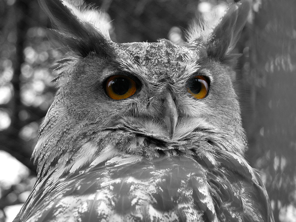
A colour photo does not necessarily have to start out as a colour photo. Why not colour a black-and-white photo by hand, using Photoshop for example?
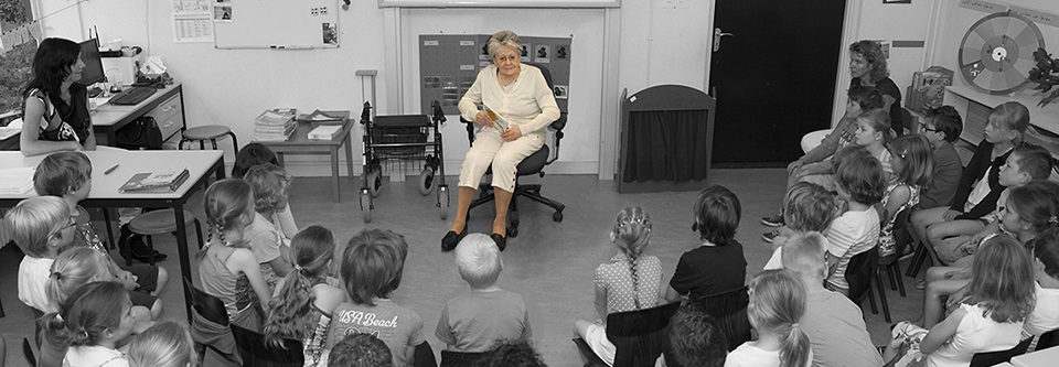
The same effect can be achieved digitally by removing the colour from certain parts of the photo or removing all colour and then adding selected colours, making it look as if the photo was coloured by hand.
26. Twilight
Before the sun has risen or after it has set, the landscape is illuminated by light reflected by the sky. Everything then gets an unreal, atmospheric blue glow. You see this best in coastal areas, where the colour of the sky is reflected by the sea. Use a long exposure to blur the movement of the waves.
27. Sunrise
Before sunrise, and after sunset, the cloud cover often breaks up. The sky takes on a wonderful colour. When the sun is just above the horizon, it casts a golden-yellow glow over the landscape and long, cool shadows that emphasise textures and shapes.
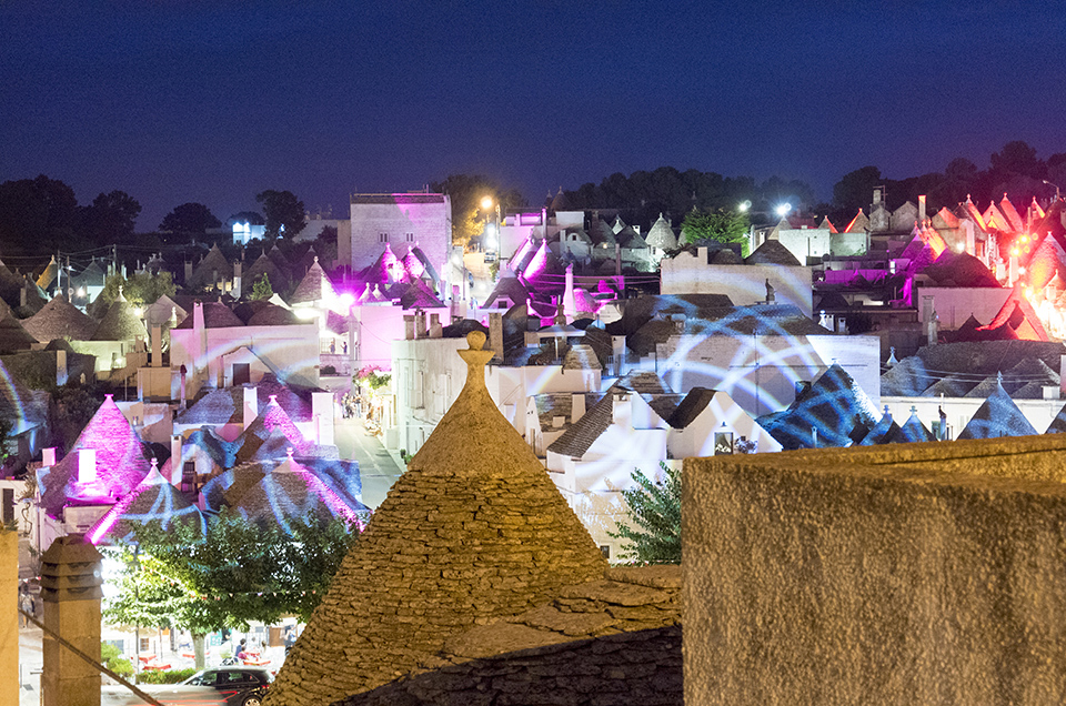
28. Artificial colours
Different forms of artificial light, sodium, fluorescent, mercury and tungsten, create a vivid colour glow and surprising effects, because our eyes adapt to these colours and we do not realise that the glow is there at all.
These colours are best captured in urban areas at night, when we are surrounded by different light sources, each with its own colour glow.
29. Correcting colour glow or cast
You can use filters and/or Photoshop or Lightroom to remove a colour glow, but do not do this too quickly. Strange and vivid colours can often improve a photo, as you will discover when photographing cityscapes at night. Read the article Boosting a single colour in Photoshop to find out how best to do this.
30. Adjusting the white balance
instead of having AWB, automatic white balance, set on your camera at all times, it can be worthwhile experimenting with different settings.
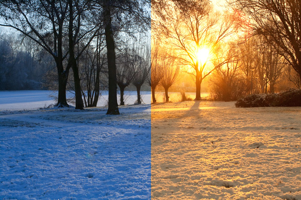
Choose Tungsten when photographing during the day if you want a cool blue glow. Choose Cloudy for warmer photos. If you photograph in RAW, you can still adjust the white balance completely to your liking in post-processing. This is not the case when photographing in JPG.
Read the article How to create a good colour reference to find out what the original colours actually looked like.
About the author
Michelle Peeters is fotografe en oprichter van DeuxBleus Fotografie. Michelle herkent het bijzondere in het gewone en het gewone in het bijzondere. Ze heeft zich nooit willen specialiseren en is daardoor van alle markten thuis.
You might also like
-
 Portrait photography tip: Use complementary colours
by Elja Trum
-
 7 reasons not to use a graduated ND filter, and one reason why I do
by Nando Harmsen
-
 5 photography techniques you should know
by Elja Trum
-
 Flash photography tip: Match the colour temperature
by Elja Trum
-
.jpg "15 practical tips for sharper panning photos") 15 practical tips for sharper panning photos
15 practical tips for sharper panning photosby Huub Keulers
1 comment
-

 Donald Willemsen
wrote on Tuesday 30 June 2020 at 22:55
| reply
Donald Willemsen
wrote on Tuesday 30 June 2020 at 22:55
| reply
Een boeiend artikel. Ik zelf vind het leuk om bij kleurenfoto's de verzadiging te verminderen. dat geeft een mooi effect. Als je dat dan ook nog eens combineert met een z/w achtergrond, kan je heel goed de aandacht trekken naar het feitelijke onderwerp.
This comment was written in another language and has not been translated yet.
Have your say
Please note: Articles older than a week can only be commented on by signed-in visitors.Would you still like to comment? sign in or create a free account.
Become a better photographer every week
A practical photography tip in your inbox every week.
39,031 photography enthusiasts already receive the tips! More about the weekly mail. Or keep up to date via  Facebook.

Elja Trum
Photofacts; everything to do with photography!
Would you like to take better photos and keep up with what is happening in photography? Photofacts publishes articles that teach you something about photography — from a product announcement to a practical shooting tip or a look at a website. Photofacts covers photography every day and is a hobby project of Elja Trum's that got out of hand. The articles are written by a team of volunteer authors. If you would enjoy writing one or more articles for Photofacts, do get in touch.More about PhotofactsPhotofacts is made possible in part by
