

How do you create depth in a photo?
Monday 6 August 2018, 16:32 by Michelle Peeters | 23,879 views | 19 commentsThis article was translated from Dutch with the help of AI. Read the original.
How often does it happen that you are overwhelmed by a breathtakingly beautiful landscape, get your camera out and start taking photos enthusiastically? But then those fantastic impressions fail to come across in the photo at all.
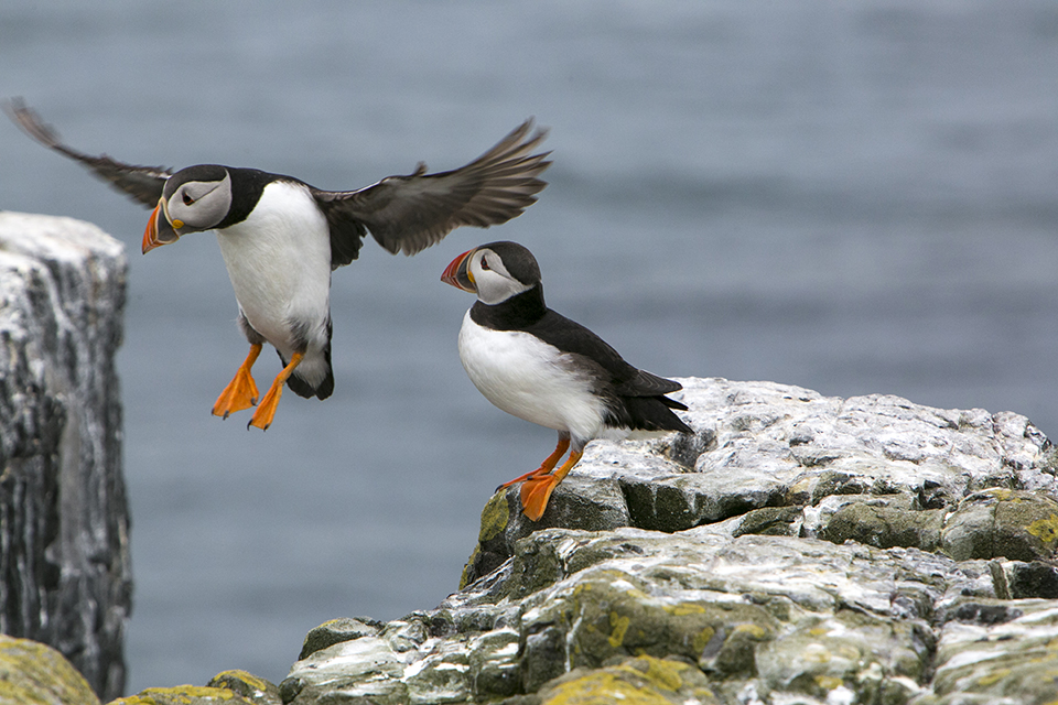
Did you do something wrong? Not really, you wanted to capture your impressions as well as possible, yet something still went wrong.
Remember that a photo is a two-dimensional representation and that the landscape is shown as a flat surface. To create the illusion of depth, it is often better to place a subject in the foreground. This could be a tree, a stone, a wall...
In that case, you do need to stand closer to the subject in the foreground and preferably work with a wide-angle lens.
Other ways to add depth to your photo are:
1. Perspective
Make use of visible or imaginary lines. Straight or visible lines are often found in urban areas. Think of roads, house roofs, buildings or bridges. Straight lines are less common in nature, but you can find lines there too.
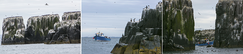
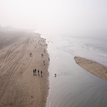
Both an actual line, such as a fence, and an imaginary one, such as along a row of people, will do. You can also think of a horizon, the boundary between water and land, or the lines of a shadow.
You can imagine lines between different objects, for example between several trees or a row of stones.
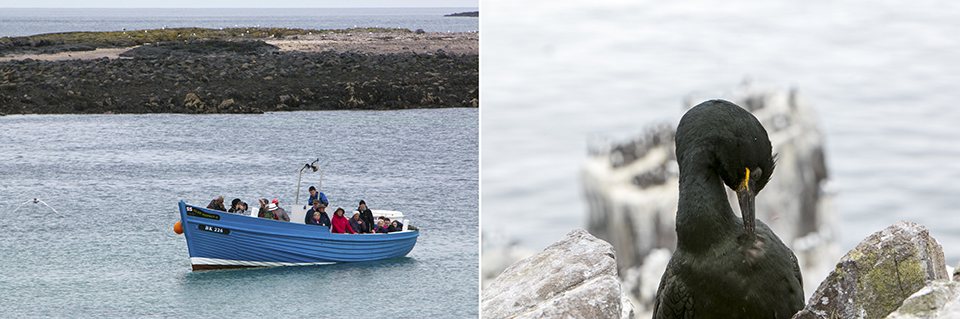
The line does not have to be perfectly straight; a photo of a country lane winding into the distance also creates a strong sense of depth.
Our eyes are sensitive to diagonal lines; a line running from the left or centre foreground towards the right side of the photo draws your gaze into the image, as it were. When you look at a photo, your eye naturally follows this signpost.
2. Foreground
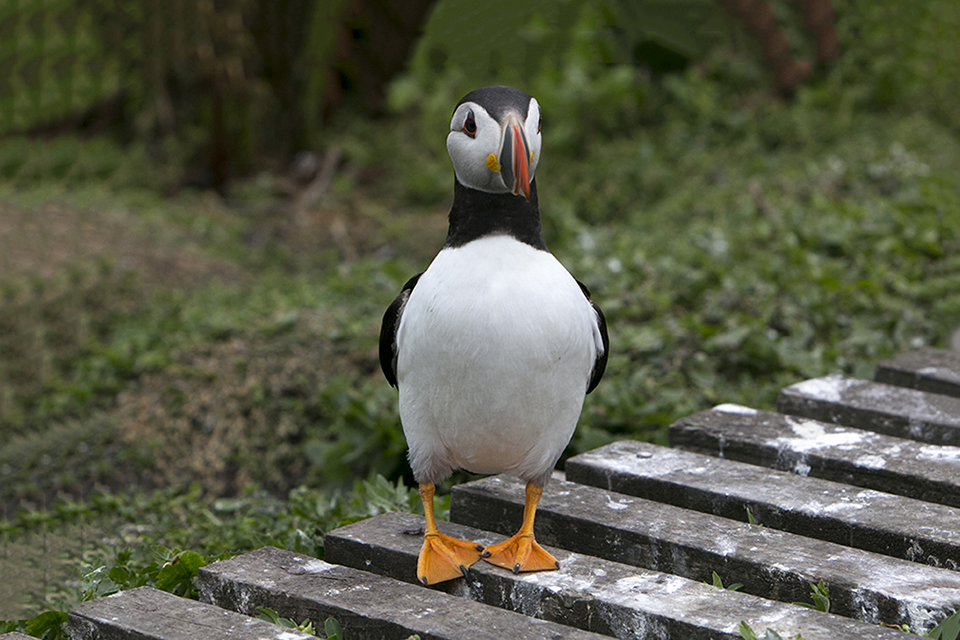
By placing something in the foreground, you create depth in your landscape photos. Especially if the colour of the thing you place in the foreground differs slightly from the background.
If that large object in the foreground also forms the boundary along the bottom of your photo, you are doing very well.
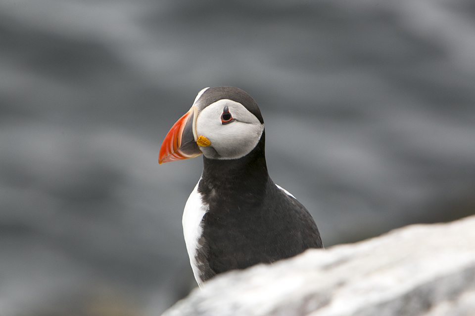
3. Midground
Make sure there is a midground with smaller objects, with a view through to the lighter background between them.
A bright element in the distance naturally attracts our eye. Light at the end of the tunnel, an opening in a dark forest, a room door letting in a strip of light: real eye-catchers.
By deliberately keeping the foreground dark, you create a pleasant tension in the photo.
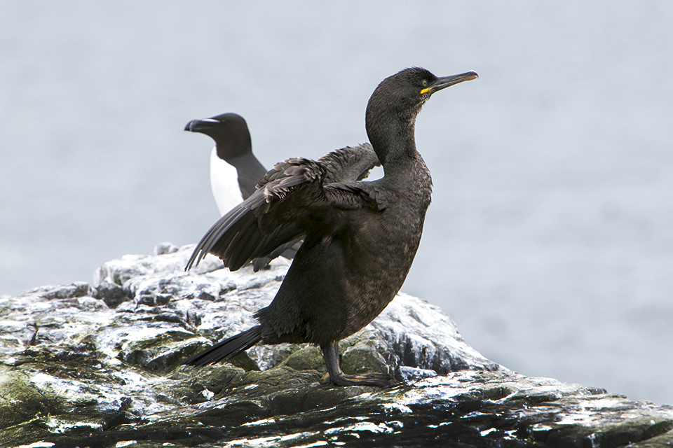
4. Contrast
Light and shadow often cannot be controlled very much. Yet the contrast between light and dark areas, or between foreground and background, is an effective tool for making a photo more lively and giving it more depth.
Strong contrasts come forward. Use less powerful contrasts on areas in the background, or on the background itself.
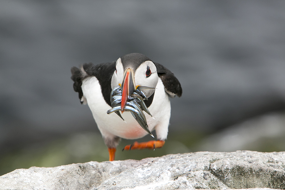
5. Depth of field
Another way to add more depth to your photo is to work with a shallow depth of field. The greater the difference in sharpness between your subject and the background, the more the subject will stand out from it.
A wide aperture, a small number, creates a blurrier background. The focal length and the distance to the background also have an influence here. Finally, the amount of zoom you use also helps create a blurred background.
Would you like to know exactly how that works again? Then also read the article Aperture; control over depth of field.
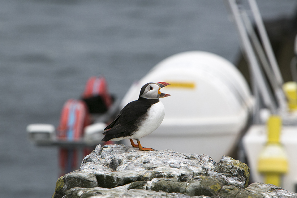
6. Modelling light
When the sun is low, for example at 45 degrees from the left, as side light, you get long shadows. This makes shapes easier to see. This is also called modelling light. With this lighting, you can suggest depth..
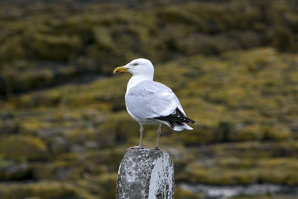
7. Dark or brightly coloured
Place something dark or colourful in the foreground. To depict a three-dimensional object or a three-dimensional space on a flat surface, creating a suggestion of depth, painters often work with colours and contrasts.
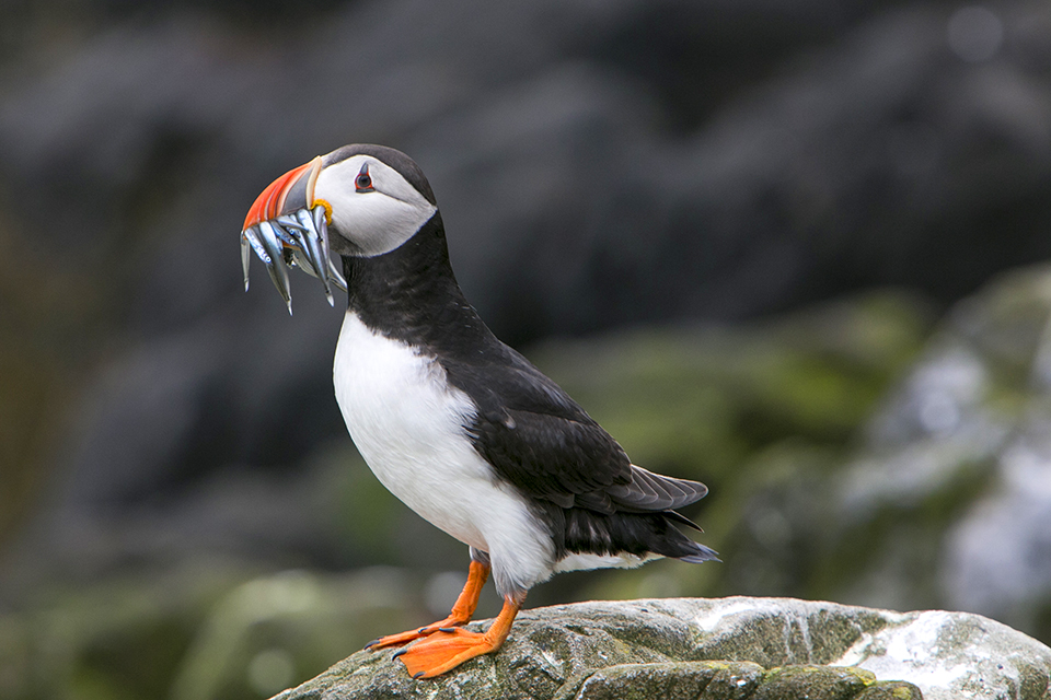
Warm colours, like light colours, come forward compared with cool and dark colours respectively. By using less vivid or lighter colours in the background than in the foreground, you bring your main subject forward.
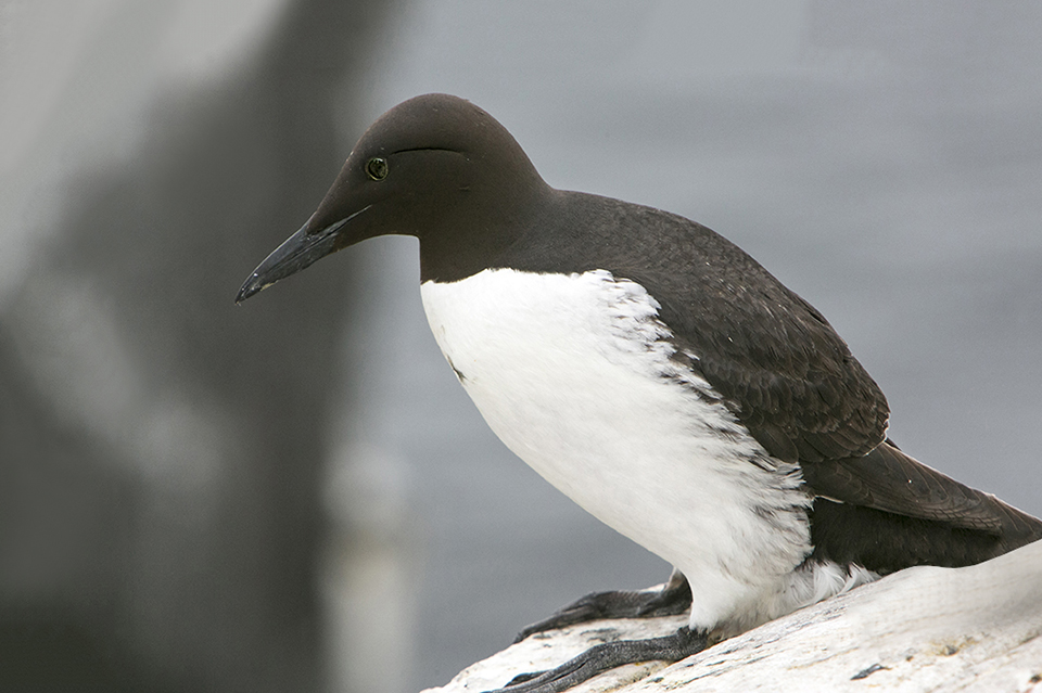
About the author
Michelle Peeters is fotografe en oprichter van DeuxBleus Fotografie. Michelle herkent het bijzondere in het gewone en het gewone in het bijzondere. Ze heeft zich nooit willen specialiseren en is daardoor van alle markten thuis.
You might also like
-
 Choose the right perspective
by Nando Harmsen
-
 Landscape photography tip: Choose the right perspective
by Nando Harmsen
-
 How do you find a cool perspective?
by Frank Doorhof
-
 The influence of position and perspective on composition
by Nando Harmsen
-
 Play with perspective to influence lines
by Nando Harmsen
19 comments
-
 Betty-Lou Luijken wrote on Tuesday 7 August 2018 at 14:40 | reply
I don't want to nitpick and I understand that this is about a different subject, but what strikes me is that almost all the birds are positioned in the middle, or even that the space in the direction they're looking is smaller than the space behind the bird. In terms of composition, it could therefore still be better. Of course, you don't always have to stick to the rules, but then there should be a purpose to it and I don't see that here. Of course, that could be me, but then I'd be happy to hear the reason.
Translated from Dutch. -

 Michelle Peeters wrote on Tuesday 7 August 2018 at 14:44
| reply
@Betty-Lou: that space in the direction of the gaze is a compositional rule that I often deviate from myself. As long as you don't really 'confine' the subject in the frame, I don't think it's such a problem. And besides, it's quite an art to frame a flying or moving bird properly.. You're often already happy if you get it sharp! Framing a bit wider is safer though!
Translated from Dutch. -
Betty-Lou Luijken wrote on Tuesday 7 August 2018 at 14:53 | reply
@Michelle: This isn't about flying birds. I understand that isn't always easy, but the puffins and the gull are just sitting somewhere, and then I only understand why the one in the middle is the puffin with the little fish in its beak, keeping its head low and walking towards you. With the other photos I would have made a different choice, but that is of course personal.
Translated from Dutch. -
Michelle Peeters wrote on Tuesday 7 August 2018 at 14:56
| reply
@Betty-Lou: in this chosen photo series (all taken on the Farne Islands) I indeed applied the 'rule of thirds' very little! This selection is purely and solely to illustrate the subject (how do you create depth in your photos).
Translated from Dutch. -
 Denny wrote on Tuesday 7 August 2018 at 16:56 | reply
The photo series is not about composition but about achieving depth in your photos. You were able to explain that theory clearly with these photos. Clearly explained and that is useful to me. Thank you !
Translated from Dutch. -
 Lauran van Schilt wrote on Tuesday 7 August 2018 at 16:57 | reply
Pfffff.....I really hate those know-it-alls. Your photos are just good Michelle.
Translated from Dutch. -
Michelle Peeters wrote on Tuesday 7 August 2018 at 17:03
| reply
@Lauran: discussion is fine, of course, it's only educational!
Translated from Dutch. -
Betty-Lou Luijken wrote on Tuesday 7 August 2018 at 17:04 | reply
@Lauran: Why always so defensive right away. I didn't mean to act like a know-it-all, but simply pointed something out, and a photographer is never done learning.
Translated from Dutch.
@Denny: I clearly wrote that I understood that it isn't about composition, but I do believe that you should also think about other aspects of photography in whatever article you write. I'm sure that Michelle didn't see it as an attack on her photography and that wasn't how it was intended. -
Michelle Peeters wrote on Tuesday 7 August 2018 at 17:09
| reply
@Betty-Lou: I really don't see it as a problem! At least now I know that the article was viewed properly! And indeed, the chosen photos were meant to illustrate how to create depth in your photos, so other (composition) techniques take a bit of a back seat. By the way, I'm not an absolute advocate of consistently applying those composition techniques either. Sometimes it's actually fun to go completely against them.
Translated from Dutch. -
Lauran van Schilt wrote on Tuesday 7 August 2018 at 17:40 | reply
@Betty-Lou: you ask me why always so defensive. I can't remember ever having had a discussion with you. In fact: I don't even know you. I did take the trouble to look at your photos. And with all due respect: they don't exactly stand out in terms of sharpness. Certainly not bad photos but not standouts. But to stay on-topic, Michelle's photos do a good job of showing what this is about. Respect and regards !
Translated from Dutch. -
 freewilly wrote on Tuesday 7 August 2018 at 17:44
| reply
Great article and also nice photos...even in the middle which I think is possible.
Translated from Dutch. -
Michelle Peeters wrote on Tuesday 7 August 2018 at 17:49
| reply
@Freewilly: having the subject in the middle is definitely 'allowed'! That is your own, free choice. Especially if the surroundings have enough to offer in terms of depth and drop-offs. With that photo with the plastic lighting (the seagull on the post), it could perhaps have been done differently. But even there I personally don't really find it distracting. If there had been something special to see on the left-hand side, you could have positioned the bird on the right-hand side. But that wasn't the case.
Translated from Dutch. -
 Toni De Groof wrote on Tuesday 7 August 2018 at 20:40 | reply
Something different now. I’m considering going to the Farne Islands next year for about 6 or 7 days. Alone. Is that doable?
Translated from Dutch.
I don’t want to drive myself. Two questions: where would be best to stay and is there sufficient public transport? -
Michelle Peeters wrote on Tuesday 7 August 2018 at 22:40
| reply
@Toni: yes, absolutely doable! You book a boat from IJmuiden to Newcastle (preferably with the car, otherwise the rest of the journey can also be done by public transport, there are buses) and you drive to Seahouses in about an hour. From there you can arrange a boat trip to the islands. Next year I’m going there with a group of photographers. If you want, you can join us. I found accommodation in Alnwick myself. Beautifully rural, a half-hour drive from Seahouses. There’s also plenty of accommodation to be found in Seahouses. A car is practical though because all of Northumberland is beautiful. Also perfect for photographing the Milky Way because it’s very dark!
Translated from Dutch. -
 Ronald Boot wrote on Wednesday 8 August 2018 at 00:04 | reply
I thought it was a great explanation where you really don't have to look critically at a composition.. the story is clear and so are the photos to illustrate it..
Translated from Dutch.
I’ve only been photographing for about 6 years and luckily continue to learn.
Thanks for this article! -
Toni De Groof wrote on Wednesday 8 August 2018 at 08:30 | reply
Where can I find more info about that trip you're organizing?
Translated from Dutch. -
Michelle Peeters wrote on Wednesday 8 August 2018 at 10:39
| reply
@Tony: that'll be on my site before too long.
Translated from Dutch. -
 jlmeijndert wrote on Tuesday 14 August 2018 at 13:55
| reply
I would like to know which focusing was used for the first photo (the two birds)
Translated from Dutch. -
Michelle Peeters wrote on Tuesday 14 August 2018 at 13:59
| reply
@Jilmeijndert: single focus, with one focus point in the center.
Translated from Dutch.
Have your say
Please note: Articles older than a week can only be commented on by signed-in visitors.Would you still like to comment? sign in or create a free account.
Become a better photographer every week
A practical photography tip in your inbox every week.
38,886 photography enthusiasts already receive the tips! More about the weekly mail. Or keep up to date via  Facebook.

Elja Trum
Photofacts; everything to do with photography!
Would you like to take better photos and keep up with what is happening in photography? Photofacts publishes articles that teach you something about photography — from a product announcement to a practical shooting tip or a look at a website. Photofacts covers photography every day and is a hobby project of Elja Trum's that got out of hand. The articles are written by a team of volunteer authors. If you would enjoy writing one or more articles for Photofacts, do get in touch.More about PhotofactsPhotofacts is made possible in part by
