

Where should you place your horizon according to the golden ratio?
Monday 30 July 2018, 15:51 by Michelle Peeters | 18,374 views | 19 commentsThis article was translated from Dutch with the help of AI. Read the original.
The golden ratio creates balance in your image. The rule of thumb is to place your subject one third or two thirds into the frame. So never put your horizon in the middle of the image, as this often produces a dull result.
For landscape photos, you can use the following as a guide for where to place the horizon: place the horizon one third from the top if the landscape is the main focus, or one third from the bottom if the sky plays an important role.
This works well for general landscape photography.
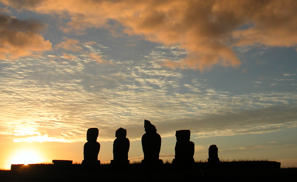
If you place your horizon low in your photo, at about one third, you create a feeling of freedom and space, and it is more pleasant to look at. You can do this, for example, when there is a beautiful sky or sunset.
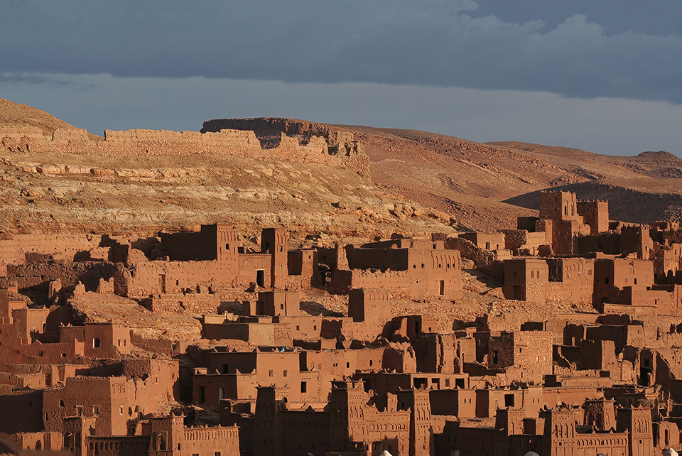
You do precisely the opposite by placing your horizon high, at about two thirds from the top. A high horizon can create a feeling of being cramped or trapped, but it is more exciting than a horizon in the middle.
You can do this, for example, when the sky is dull.
Similar to the rule of thirds
This golden ratio rule is very similar to the rule of thirds and is often confused with it. Here too, two horizontal and two vertical lines divide an area into nine sections.
The difference is that the sections are not all the same size: compared with the rule of thirds, the lines are positioned more towards the centre of the image. Here too, placing image elements on the lines or intersections makes an image more exciting.
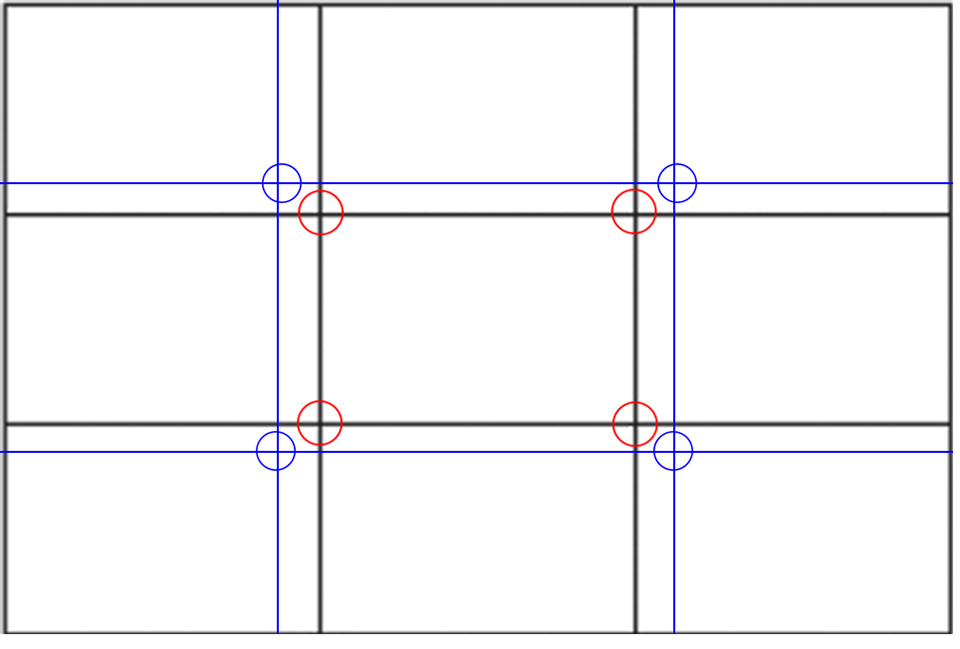
The golden ratio positions image elements in a specific proportion that seems pleasing and logical to people.
When to put the horizon in the middle
You can surprise your viewers by doing things 'differently'. That is no excuse, however, to neglect the rest of the composition.
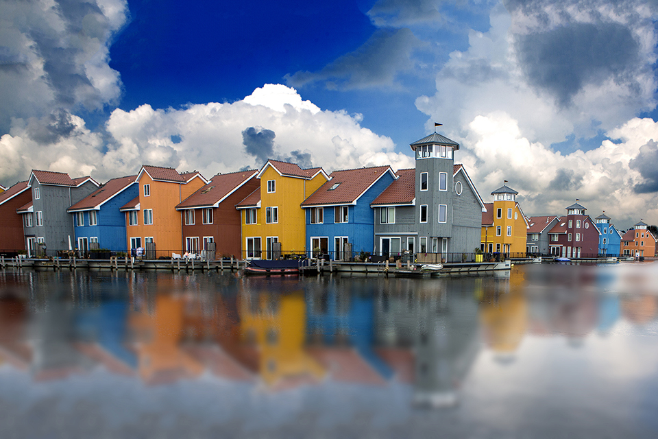
With a perfect reflection, it is actually a good idea to put the horizon in the middle of the image, so that it looks as if the image has been mirrored.
Not a straitjacket
The golden ratio has a mathematical background and follows from the way most people see and assess their surroundings. You can use it as a starting point for creative landscape photography.
Make sure, however, that it does not limit or even block your creative process! It is mainly a matter of feeling, so experiment like mad and see for yourself what works best.
If you have any nice ideas and/or reasons for placing your horizon somewhere completely different, please let us know in the comments!
About the author
Michelle Peeters is fotografe en oprichter van DeuxBleus Fotografie. Michelle herkent het bijzondere in het gewone en het gewone in het bijzondere. Ze heeft zich nooit willen specialiseren en is daardoor van alle markten thuis.
You might also like
-
 The Golden Ratio rule of thumb
by Michelle Peeters
-
 Where do you place the horizon in a landscape photo?
by Nando Harmsen
-
The Rule of Thirds Rule of Thumb
by Michelle Peeters
-
Rule of thumb: Central composition
by Michelle Peeters
-
 Learn the Rule of Thirds So You Don't Have to Use It
by Nando Harmsen
-
 Landscape photography tip: Balance in your photo
by Nando Harmsen
19 comments
-
 Huub wrote on Tuesday 31 July 2018 at 10:44 | reply
Very nice photos for illustration Michelle.
Translated from Dutch. -

 Koen Van de moortel
wrote on Tuesday 31 July 2018 at 14:15
| reply
That's not correct: the division according to the golden ratio is approx. 38%-62%, so CLOSER to the middle than the division into thirds!
Translated from Dutch. -
 Michelle Peeters wrote on Tuesday 31 July 2018 at 14:18
| reply
@Koen: you're right, compared to the rule of thirds, the lines are more 'in' (and not 'out') from the center of the image. I've adjusted it.
Translated from Dutch. -
 Fernand de Canne wrote on Tuesday 31 July 2018 at 14:33 | reply
I think that in modern photography placing the horizon at 1/3 is no longer so important
Translated from Dutch.
Although that rule is still strongly adhered to by a group of amateur photographers there are
dozens of very well-known professional photographers of world class where the horizon is absolutely no longer placed at 1/3 e g for instance your famous Rineke Dijkstra
I really think that rule is outdated in modern photography
Kind regards,
Fernand -
 Enno Achterhof wrote on Tuesday 31 July 2018 at 14:34 | reply
I think it is a good explanation.
Translated from Dutch.
Emphasize what is interesting about a photo and place the horizon accordingly. It has to feel right, I suppose.
The ending is good: “No straitjacket. The rule of thirds has….”
It is how I apply it too. -
 guest wrote on Tuesday 31 July 2018 at 14:43 | reply
Nice article with the right way of composing the photo 👍
Translated from Dutch.
And...... indeed everyone has their own taste and that's a good thing. -
 Bernard wrote on Tuesday 31 July 2018 at 17:39
| reply
Hello Everyone. Classic rules are good to know and to work with every now and then. My own idea about this, and apparently that of more photographers, is that the horizon is the result of the composition and not the other way around. What's funny is that Michelle explains the rule of thirds and as her first illustration posts a photo showing menhir silhouettes with a horizon that absolutely does not conform to the golden rule, but also does not conflict with it. I have no problem at all with keeping the horizon at 1/4 or 1/5 if the composition calls for it. I like to turn it around and let the composition determine where the horizon ends up. Regards, Bernard
Translated from Dutch. -
 Theotje wrote on Tuesday 31 July 2018 at 17:52
| reply
The photo with those colored houses does show that when it comes to color, a sense of saturation nowadays is kind of a form of color porn. You’ve gone a bit overboard with some kind of cobalt blue pot of ink over the sky in the top left. What’s the next step? As for the photo itself, it’s okay, but the colors....
Translated from Dutch. -
 martinphili wrote on Tuesday 31 July 2018 at 19:34
| reply
Theotje probably feels a lot better now that he has been able to vent his frustration. It remains to be seen, however, whether kicking down also causes an upward movement.
Translated from Dutch.
I think Fernand describes it well.
Something that many people also forget is that the golden ratio rule is a derivative. The golden ratio is a constant that was discovered after comparing a whole lot of paintings that people experienced as beautiful. A derivative cannot always be reversed. And very often, that is exactly what is done. -
Michelle Peeters wrote on Tuesday 31 July 2018 at 19:44
| reply
@martinphili: and then you also have the golden spiral as part of the golden ratio technique.
Translated from Dutch. -
 Marco wrote on Tuesday 31 July 2018 at 21:18 | reply
A sky photo without foreground or a horizon also creates confusion. Then the sky can be as beautiful as you like
Translated from Dutch. -
Theotje wrote on Tuesday 31 July 2018 at 21:35
| reply
Come on Martinphili, I don't want to vent. I just get annoyed by overly unrealistic use of color to stand out. If people like this kind of oversaturated blues then that's up to them, it's just a shame that they start copying each other as if this is how it's supposed to be.
Translated from Dutch. -
 Dick de Roos wrote on Tuesday 31 July 2018 at 21:47 | reply
Rules are meant to be broken.
Translated from Dutch.
The golden ratio is not a law; more of a (memory) aid for composition.
If you have the choice to place an image at an intersection or on a line of the golden ratio / rule of thirds, that is better for the composition in my opinion.
To each their own. One person likes Beethoven; another prefers Heavy Metal.
As long as you (or the one undergoing it) feel something with it -
martinphili wrote on Tuesday 31 July 2018 at 22:21
| reply
@ michelle: and this too: Diagonaalmethode_(fotografie)
Translated from Dutch.
Here too, by the way, the sentence: The diagonal method originated from an analysis of how artists intuitively compose details
So the diagonal method is also not a 'rule' that one must follow in order to arrive at a good composition. No more than the golden ratio, the rule of thirds and the spiral of Fibonaci. Your feeling is what guides you here. -
Michelle Peeters wrote on Tuesday 31 July 2018 at 22:25
| reply
@martinphili: That's right! And deviating from those rules can be so refreshing sometimes!
Translated from Dutch. -
 @carmen wrote on Tuesday 31 July 2018 at 23:22 | reply
For an absolute beginner, it's funny to read all this. But it's educational. I simply remember, lots of sky if it makes the photo prettier, e.g. clouds... If not, less sky.
Translated from Dutch. -
 willy duvel wrote on Wednesday 1 August 2018 at 14:45 | reply
Exceptions prove the rule, right? Cheers
Translated from Dutch. -
 Philippe D wrote on Wednesday 1 August 2018 at 19:55 | reply
In general I apply the rule of thirds but I regularly break the rule to get away from monotony, and that makes a photo album fun or not, in my humble opinion.
Translated from Dutch.
If I take a photo that I like, I probably won't change it to fit the rule. -
 Gerard wrote on Saturday 4 August 2018 at 14:52 | reply
It's incredibly annoying that all those pop-ups appear! It makes me leave here again quickly!
Translated from Dutch.
Have your say
Please note: Articles older than a week can only be commented on by signed-in visitors.Would you still like to comment? sign in or create a free account.
Become a better photographer every week
A practical photography tip in your inbox every week.
38,890 photography enthusiasts already receive the tips! More about the weekly mail. Or keep up to date via  Facebook.

Elja Trum
Photofacts; everything to do with photography!
Would you like to take better photos and keep up with what is happening in photography? Photofacts publishes articles that teach you something about photography — from a product announcement to a practical shooting tip or a look at a website. Photofacts covers photography every day and is a hobby project of Elja Trum's that got out of hand. The articles are written by a team of volunteer authors. If you would enjoy writing one or more articles for Photofacts, do get in touch.More about PhotofactsPhotofacts is made possible in part by
