

Is theoretical knowledge the basis for creativity?
Monday 2 October 2023, 14:41 by Liesbeth van Asselt | 3,124 views | 8 commentsThis article was translated from Dutch with the help of AI. Read the original.
To avoid having to think about how to achieve a particular effect, I believe knowledge of the theory is essential. Once you understand how something works, the effect makes sense...
That gives you much more room for creativity! And you can repeat certain effects, so they don't remain lucky shots.
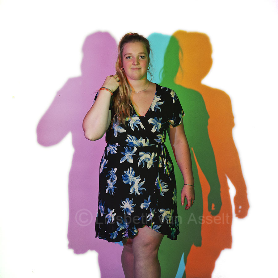
Model Daphne is standing in front of my camera here, with three flashguns aimed at her. Each flashgun has a coloured filter. In red, green and blue.
How is it, then, that she has retained her normal colour, while green, magenta, cyan and orange can be seen in the background? And no red or blue?
This is where colour theory comes into play. If you look at the colour wheel for light, you can see that all colours together form white light.
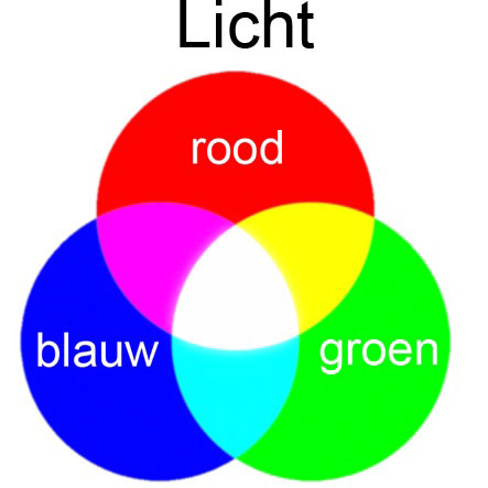
Daylight is white light too. You have probably seen that when this light passes through glass or crystal, you get a rainbow. All the colours are then separated and become visible. Once they come together again, the light is white again.
Back to the photo. The reason Daphne remains neutral in colour is that red, green and blue light all fall on her face. Those three colours together form white.
But what about the background with all its little colours? In the diagram with the three primary colours, red, green and blue, you can also see the secondary colours. Magenta, cyan and yellow.
Magenta is created when blue and red light overlap. Cyan is created when blue and green come together, and yellow is a combination of red and green light.
Because not all filters and lamps consist of 100% red, green or blue, and there is always some of another colour in them, variations occur in the magenta, cyan and yellow. In Daphne's photo, for example, the yellow has become more orange.
I made a short video showing how this works in practice. We photograph a white polystyrene head, often used in opticians' shop windows.
On the left is a flashgun with a blue filter, the flashgun left of centre has a green filter, and on the right is a flashgun with a red filter. You can see that the head has really remained white.
To the left of the head, you can see cyan, a combination of blue and green. And that makes sense: there is blue light on the far left, and green light left of centre. Those two colours overlap on the background. The red light creates the shadow shape, as this red light is blocked by the white head.
On the right, you first see magenta, the combination of blue and red light. The blue light on the left passes behind the model, while the red light is on the right and therefore overlaps with this blue. The green light creates the shadow shape here.
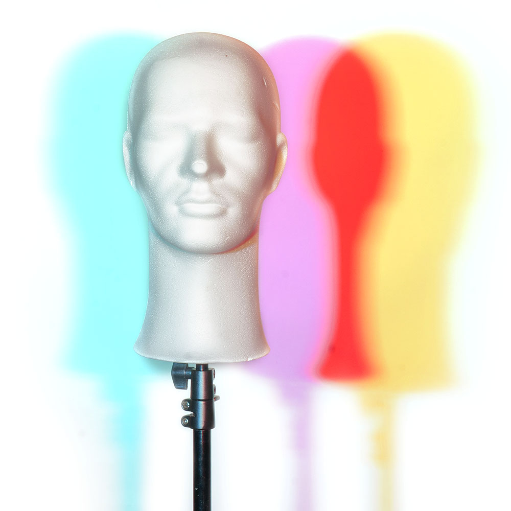
On the far right, you can see yellow, the combination of the green light in the centre and the red light on the right. Here, it is the blue colour that causes the shadow, as the blue does not reach the white background here.
Where neither blue nor green light reaches the background because the head blocks the light in those colours, you see only red light.
You can use the video to experiment with this yourself. You don't have to use flashguns, you can also use LEDs or torches with a coloured filter in front of them. Have fun!
About the author
Liesbeth fotografeert met haar bedrijf stapfoto.nl voor websites van bedrijven. Daarnaast verzorgt ze al sinds 2004 (vooral creatieve) workshops zoals lightpainting, flitsen in de natuur, fine art, frozen flowers, paintsplash, infrarood, icm en multi exposure. Daarnaast is er een Stapfoto vakgroep voor de meer gevorderde fotografen.
You might also like
-
 Taking creative portrait photos
by Elja Trum
-
 Dreamy, creative nature photography with a Lensbaby
by Laura van der Burgt
-
 Creative photography with a Lensbaby
by Laura van der Burgt
-
 Creative portraits with old background rolls
by Elja Trum

8 comments
-
 Donald Willemsen wrote on Tuesday 3 October 2023 at 10:29 | reply
I am currently taking the course. I can already say that this course is very good. Liesbeth, in the course you explain everything very clearly and distinctly, with clear instructions on how to achieve your goal in Photoshop.
Translated from Dutch.
You also explain why it is better to use Adobe RGB as the color space than sRGB.
During post-processing, I personally use the ProPhoto RGB color space, because it shows even more colors, as it has an even larger color space than sRGB and Adobe RGB.
Liesbeth, why don't you use ProPhoto RGB? -

 Liesbeth van Asselt
wrote on Tuesday 3 October 2023 at 11:16
| reply
Liesbeth van Asselt
wrote on Tuesday 3 October 2023 at 11:16
| reply
Hello Donald, thank you for the compliment! Why not ProfotoRGB? Because there is (as far as I know) no monitor that can handle ProfotoRGB. Even my Eizo stops at AdobeRGB. So I don't see what actually happens to the colors when I edit the photos in ProfotoRGB.
Translated from Dutch.
What I could do is load the photo in Photoshop in ProfotoRGB for the first major color edits. And then convert the profile to AdobeRGB for the fine-tuning/adjustment. And then to sRGB to export . The fact that I don't see what happens has held me back from doing that until now. But good point, I'll try it that way!
 -
 RAWshooter wrote on Tuesday 3 October 2023 at 11:36 | reply
My partner shows time and again that knowledge of the theory isn't needed at all to make creative and beautiful shots. She doesn't understand a thing about aperture, depth of field, etc. But that doesn't matter at all.
Translated from Dutch. -
Liesbeth van Asselt
wrote on Tuesday 3 October 2023 at 12:41
| reply
Ha, ha, I was already waiting for this comment. The provocative title was chosen for a reason
Translated from Dutch.. Because of course you can take creative photos without understanding anything about photography! Just look at how many beautiful photos are taken with a mobile phone...
The only thing is that they are often flukes. If you want to take that photo the same way again, you often have a problem because you don't know how you did it. Because the camera was set to automatic, for example. And that one time, on that cloudy day, the camera chose a large aperture and therefore gave you a nice blurry background. But the next time it's sunny and the camera chooses a small aperture. So how do you still get that blurry background if you don't have a firm grasp of the exposure triangle?
For many people, it's not a problem at all not being able to take successful photos the same way again. Or not being able to figure out beforehand how to achieve something when someone asks you to take a particular photo of them. And of course that's perfectly fine!
If you want to progress in photography (my course on color theory and color grading at the Photofacts Academy isn't aimed at advanced photographers for no reason), then understanding the theory is necessary to be able to take steps forward. -
 Lauran wrote on Tuesday 3 October 2023 at 18:17 | reply
Photography requires a thorough education. Only after that will you actually start learning it. But without creativity? Then forget about it.
Translated from Dutch. -
Liesbeth van Asselt
wrote on Thursday 5 October 2023 at 12:16
| reply
Hi Lauran, in my experience it has less to do with following a multi-year course than with the drive to want to figure things out, to want to learn. To be willing to make time to practise. Of course, that can also be during or after a course. But many self-taught people I meet at my workshops have really built up a mountain of knowledge and experience that way.
Translated from Dutch. -
 Liesbeth Verkade wrote on Sunday 15 October 2023 at 10:33
| reply
Liesbeth Verkade wrote on Sunday 15 October 2023 at 10:33
| reply
Hi namesake,
Translated from Dutch.
in the meantime I have watched a large part of your course on Photofacts Academy and learned an incredible amount from it.
Your explanation is clear and easy to understand. Easy to follow despite the rather complicated subject. I had already watched several courses on Photoshop, but somehow I always missed something there, so I couldn't manage to get anything voo elkaar.
Thanks to your explanation, I finally managed to adjust colors in Photoshop. (I usually work in Lightroom because I find that easier.) This will certainly help me delve even further into Photoshop. And to take a really good look at the color composition of my photos. Because I think there is a lot to gain there with small adjustments.
Thank you -
Liesbeth van Asselt
wrote on Sunday 15 October 2023 at 16:32
| reply
Hi Liesbeth
Translated from Dutch., good to hear, thank you!
Have your say
Please note: Articles older than a week can only be commented on by signed-in visitors.Would you still like to comment? sign in or create a free account.
Become a better photographer every week
A practical photography tip in your inbox every week.
39,079 photography enthusiasts already receive the tips! More about the weekly mail. Or keep up to date via  Facebook.

Elja Trum
Photofacts; everything to do with photography!
Would you like to take better photos and keep up with what is happening in photography? Photofacts publishes articles that teach you something about photography — from a product announcement to a practical shooting tip or a look at a website. Photofacts covers photography every day and is a hobby project of Elja Trum's that got out of hand. The articles are written by a team of volunteer authors. If you would enjoy writing one or more articles for Photofacts, do get in touch.More about PhotofactsPhotofacts is made possible in part by
