

Editing a high-key photo
Saturday 20 December 2025, 16:32 by Nando Harmsen | 2,420 views | 5 commentsThis article was translated from Dutch with the help of AI. Read the original.
High-key is the name for a photo in which mainly light tones are present. Or rather, where light tones dominate. I show you how I edit a photo into a high-key photo.
For this high-key edit, I chose a photo taken during a misty morning. The mist and soft backlighting help when editing a photo into a high-key image. In other words, the photo needs to be suitable for it.
A photo that mainly consists of dark tones is not suitable for high-key. If you want to create a high-key edit, choose the right starting point. And remember: overexposure is not high-key. That is an overexposed photo.
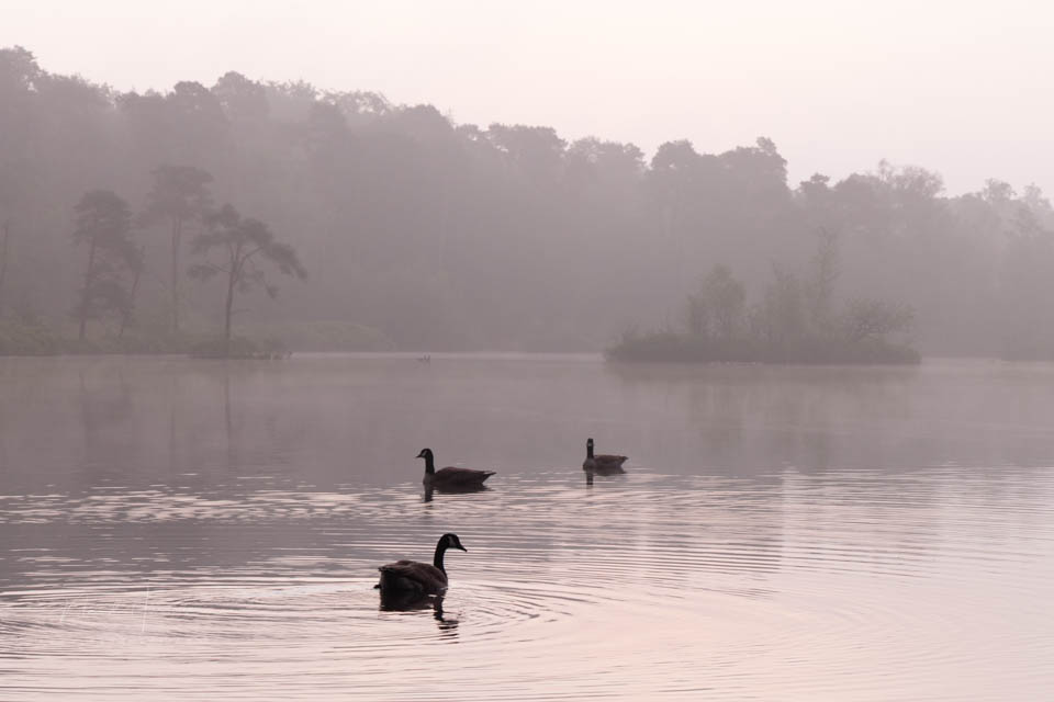
I chose a photo with mist, soft backlighting and a clear subject: three Canada geese. Their black plumage stands out nicely against the light areas that will dominate the photo. This contrast strengthens the high-key effect.
Especially with a landscape in which the subject, the three geese, is small in the frame, this contrast with the dark animals works well. If your subject is also light in tone, it will disappear completely and there will be nothing to look at.
However, if the subject were very large in the frame, mainly light tones would work, as long as the subject contains no black or almost black. In that case, a high-key image can have low contrast. In this case, the strong contrast is necessary.
I choose black and white for this photo. This is not a requirement for high-key, but because there is already little colour present, I choose it anyway. I make sure the entire photo is light without causing any significant overexposure.
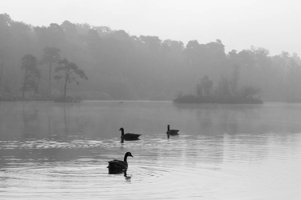
The aim is to keep seeing the background, but vaguely in the background. It does not need to be completely white either. Light grey tones are enough to retain a sense of the surroundings and landscape. After all, the geese have to exist somewhere.
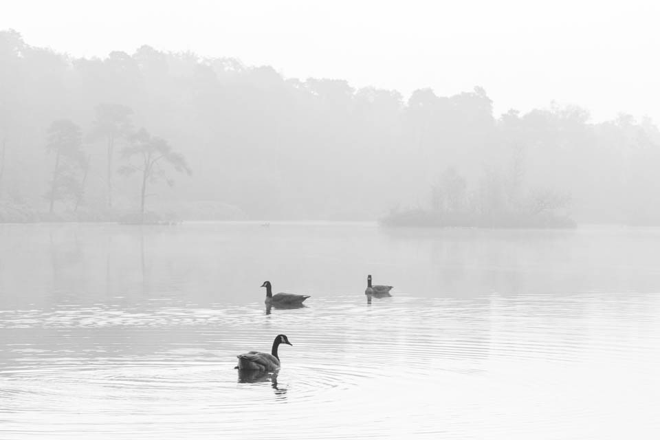
I try to maintain a balance between completely light and light grey. I want to make the line of trees bordering the white sky as soft as possible. It should barely be visible, but still be 'felt' as present. This has made the brightness above and below almost symmetrical.
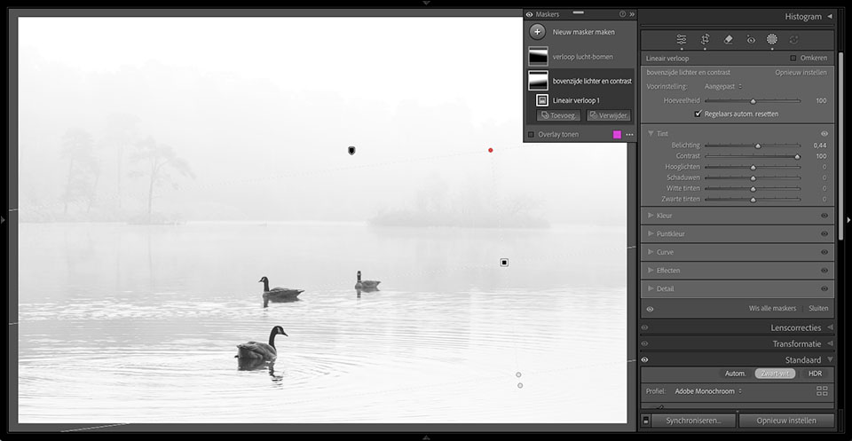
I do make sure that the three Canada geese stand out clearly against their surroundings. Although their plumage is black, I keep it dark grey. This creates a sense of distance from the geese in this misty landscape.
Some blown-out white has appeared as a result of the edits I made. I do not want that, so I open the tone curve panel and make sure the curve is pulled down slightly on the right. A subtle S-curve optimises the contrast.
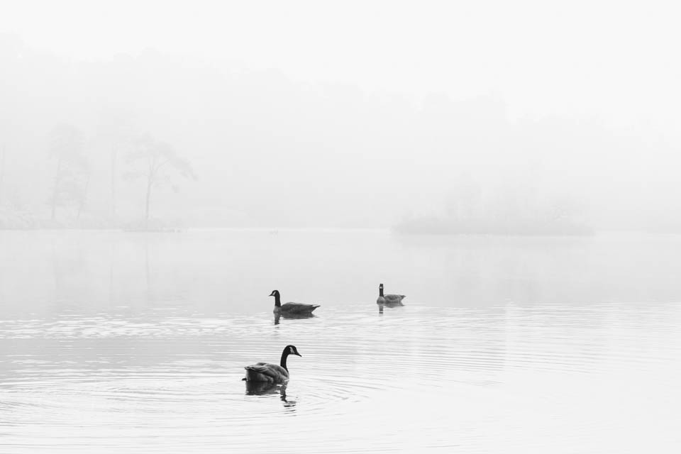
To convey the soft character of the moment properly, I reduce Clarity slightly and add a little more Texture. This has given me a high-key photo that suits my preferences.
The result of an edit like this depends very much on your own wishes and preferences. This is what I prefer. Your high-key edit may turn out very differently. Perhaps this edit can provide some inspiration.
About the author
Nando Harmsen has been photographing for more than 40 years. He specialises in wedding photography and landscape photography. Nando also gives talks, workshops, masterclasses and photo trips, and regularly reviews new and interesting equipment.
You might also like
-
 Low-key is an edit, not underexposure
by Nando Harmsen
-
 When Is a Dark Photo Not Low-Key?
by Nando Harmsen
-
 Black and white photography tip: High-key black and white
by Nando Harmsen
-
 Creating high-key portraits with Gavin Hoey
by Elja Trum
-
 Be careful that low-key does not turn into underexposure
by Nando Harmsen
-
 Creating high-key portraits with LED lighting
by Elja Trum
5 comments
-
 Donald Willemsen wrote on Saturday 20 December 2025 at 17:13 | reply
Nando, I mainly gained experience with highkey back in the analog era and in a studio setting. In doing so, obtaining a highkey image was mainly done with the settings on the camera with lots of light in the studio. The effect was therefore not achieved in post-processing.
Translated from Dutch.
I think that is a striking difference.
Today in digital photography it is quite simple to imitate a highkey effect in post-processing, provided the image lends itself to it.
For my feeling, it is much more difficult to achieve a highkey effect right from the moment of taking the photo without immediately having the thought of: 'this is simply overexposure'. -

 Nando
wrote on Tuesday 23 December 2025 at 09:08
| reply
Nando
wrote on Tuesday 23 December 2025 at 09:08
| reply
You must not forget that exposing film is completely different from exposing on a digital sensor. With film, you should not expose for the lightest parts but for the darkest parts. Therefore, photographing in high-key with film emulsions is not comparable to the digital world.
Translated from Dutch. -
Donald Willemsen wrote on Tuesday 23 December 2025 at 21:05 | reply
Nando, you're right about that. Many thanks for your response.
Translated from Dutch.
Now I do wonder how it works. Put simply: digitally, you have the light-sensitive pixel and analogically, the light-sensitive grain. In both cases, it is basically about the same thing. The basis in both cases is the colors red, green and blue. Analogically, the image is made visible through a chemical process. Digitally, it is achieved through software.
But anyway, your article isn't about that. -
 Alain Nys wrote on Wednesday 24 December 2025 at 12:20 | reply
Dear Nando,
Translated from Dutch.
Usually I agree with your articles.
Usually.
Now you say that for a high-key you need to choose a suitable photo.
Here you literally lose me in the fog: you start with dark grey soup, and you end with light grey soup.
Technically speaking, the result is a high-key: a photo with predominantly light tones, including white and black.
I suggest you publish the article again, but with a suitable subject, so that it is inspiring.
(a little headwind can't hurt, and without obstacles there is no straight path) -
Nando
wrote on Wednesday 24 December 2025 at 12:26
| reply
Thank you for your feedback.
Translated from Dutch.
This is my photography, and the way I like to see it. Of course, you don't have to agree with that. The subject doesn't appeal to you. It does to me.
What kind of subject do you find inspiring? You don't say.
Have your say
Please note: Articles older than a week can only be commented on by signed-in visitors.Would you still like to comment? sign in or create a free account.
Become a better photographer every week
A practical photography tip in your inbox every week.
39,079 photography enthusiasts already receive the tips! More about the weekly mail. Or keep up to date via  Facebook.

Elja Trum
Photofacts; everything to do with photography!
Would you like to take better photos and keep up with what is happening in photography? Photofacts publishes articles that teach you something about photography — from a product announcement to a practical shooting tip or a look at a website. Photofacts covers photography every day and is a hobby project of Elja Trum's that got out of hand. The articles are written by a team of volunteer authors. If you would enjoy writing one or more articles for Photofacts, do get in touch.More about PhotofactsPhotofacts is made possible in part by
