

Blown-out white and blocked-up black in your photo print
Monday 16 May 2022, 22:44 by Nando Harmsen | 5,213 views | 10 commentsThis article was translated from Dutch with the help of AI. Read the original.
We don't want blown-out white or blocked-up black in a photo. It can sometimes seem as though everything should be in the midtones. I don't mind having either one in a photo. But I do need to pay attention when printing a photo.
Who's afraid of red, yellow, and blue. You may know this phrase. It is the title of the paintings by Barnett Newman. The title is based on Who's Afraid of Virginia Woolf, which in turn is based on the Disney song Who's afraid of the big bad wolf from 1933.
I would like to add one: who is afraid of pure black and white? I get the impression that a great many photographers are afraid of them. Just pay attention to how often people say that a photo contains blocked-up black and blown-out white.
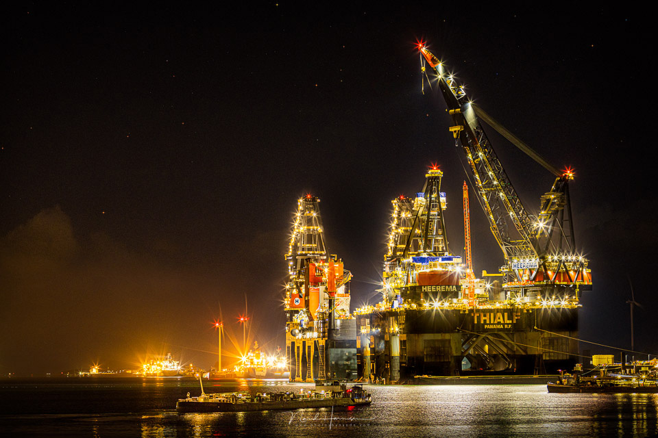
Is it a problem when pure white or pure black is present in a photo? I don't think so, as long as it is a conscious choice. You don't want blown-out white in important areas, or blocked-up black for that matter.
For less important areas, as far as you can call them that in a composition, white or black is not a problem at all. Look at the great masters of photography, and see how much blown-out white and blocked-up black they use.
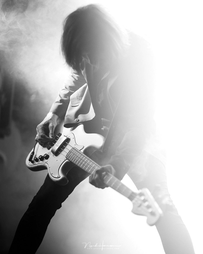
However, if you are going to print, pay attention to these areas in your photo. Not so much for pure black, but certainly for pure white. To understand this, we first need to take a quick look at printing itself.
When we print, at least three ink colours are used. These are cyan (C), magenta (M), and yellow (Y). Combining these three primary colours makes it possible to create all the usual colours. We see these three colours in the abbreviation CMYK.
The K in CMYK stands for Key, which is simply black. And yes, you need black for all the greys in your photo. Most printers often have even more colours available. The only thing they don't have is the 'colour' white.
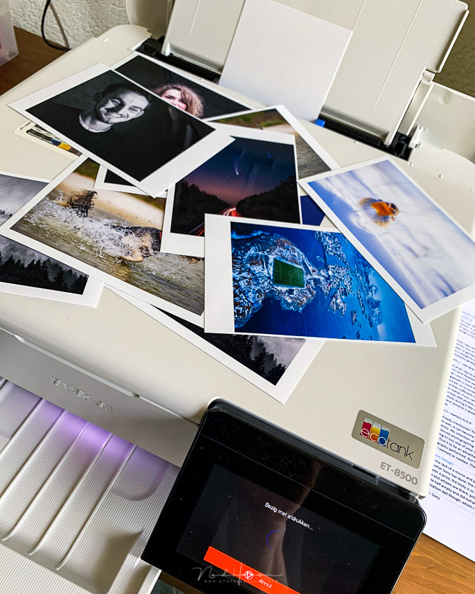
That is where the problem arises. If you have a photo with pure white in it, no ink will be used in that area. You therefore end up with the colour of your paper. For a perfect print, you would also want ink in the areas that should be white.
There is a very simple solution. Before printing, make sure that the white area is not completely white. This is easy to achieve by making a small adjustment to the curves. You can do this in Photoshop, Lightroom, and virtually any other serious photo-editing programme.
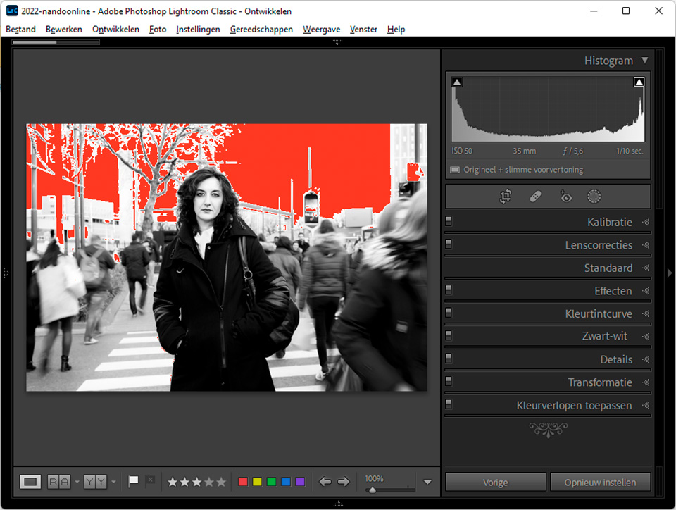
A curve has both an input and an output. White has a value of 255 on the histogram scale. This is the input. Normally, the output is equal to the input, but by changing the value to, for example, 250, you make the white a fraction greyer.
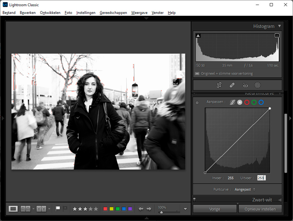
Because the white is now a fraction greyer, which is barely or not at all visible to the naked eye, the printer will still use ink in the areas that are white. This means that ink will be used across the entire photo, so that you will no longer see the blank photo paper anywhere.
You can apply the same trick to pure black by keeping the input at 0 but setting the output to 5. This makes the pure black slightly less pure. But because ink is used here anyway, the need is somewhat less urgent.
About the author
Nando Harmsen has been photographing for more than 40 years. He specialises in wedding photography and landscape photography. Nando also gives talks, workshops, masterclasses and photo trips, and regularly reviews new and interesting equipment.
You might also like
-
 Review: Photo Blocks from Profotonet
by Michelle Peeters
-
 Have Polaroid-style photo cards printed on paper
by Elja Trum
-
 Printing your photos? Which Canon printer should you choose?
by Nando Harmsen
-
 5 mistakes to avoid when printing your photos
by Elja Trum
-
 Do you print photos for the wall, or have them printed?
by Nando Harmsen
10 comments
-
 Tom wrote on Tuesday 17 May 2022 at 12:41 | reply
Curious that you don't explain why it isn't desirable to retain the white of the photo paper?
Translated from Dutch.
In my view, this isn't a problem, white is white and if it's good paper it should stay white too (and not e.g. turn yellow over time) I would think? -
 Danny de Jong wrote on Tuesday 17 May 2022 at 20:15 | reply
Funny, that whiteness of Ton's paper. The same question is: If your wall is beautifully white when it has plasterwork on it, then why do we paint it white once again... and still find it prettier (and I'm not talking about dust)
Translated from Dutch. -
Tom wrote on Wednesday 18 May 2022 at 09:45 | reply
For me, this is something completely different. A new plaster wall is namely not beautifully white, but matte and therefore often also slightly varied in color. It is rough, so it gets dirty quickly and cannot be maintained.
Translated from Dutch.
You paint the wall at the very least to make sure that it stays beautifully white.
You don't have that with paper.
So I'm still curious about Nando's motivation
-

-
 Mac wrote on Thursday 19 May 2022 at 07:44 | reply
@nando
Translated from Dutch.
You are right in writing that the printers do not have the color white.
But in the past there have been ink sets for B/W printing that had black, a number of shades of gray and white.
I don't think they exist anymore (a quick Google search turns up nothing), but I'm not sure. -
 Nando
wrote on Thursday 19 May 2022 at 09:44
| reply
Nando
wrote on Thursday 19 May 2022 at 09:44
| reply
@Mac:
Translated from Dutch.
With a bit of Googling (in English), you can find some information about white printing, which is mainly used industrially for printing on transparent materials.
You do regularly see grayscale cropping up with consumer printers. -
 Donald Willemsen
wrote on Saturday 21 May 2022 at 00:30
| reply
Donald Willemsen
wrote on Saturday 21 May 2022 at 00:30
| reply
@Nando, you rightly state that if everything that is pure white in a photo is printed on paper, the printer will not use any ink on those parts. As a solution, you recommend still having the printer use ink by setting the output of the curve to, for example, 250.
Translated from Dutch.
Now I sometimes turn color photos into graphic black-and-white images by converting the color photo to b/w and then removing all the gray values so that you are left with almost only pure black and white. In such a case, would you also adjust the output value of white in the curve? I can't attach a photo here as an example to show you what I mean. -
Donald Willemsen
wrote on Saturday 21 May 2022 at 00:37
| reply
@Nando, to show you what I mean, have a look at this link: https://www.facebook.com/Gempephotography/photos/a.1480513838943779/1480513862277110
Translated from Dutch. -
-
Donald Willemsen
wrote on Tuesday 24 May 2022 at 10:56
| reply
Nando, there was a small error while processing the GPS data. You're right. I had already noticed it but forgot to correct it.
Translated from Dutch.
Have your say
Please note: Articles older than a week can only be commented on by signed-in visitors.Would you still like to comment? sign in or create a free account.
Become a better photographer every week
A practical photography tip in your inbox every week.
39,025 photography enthusiasts already receive the tips! More about the weekly mail. Or keep up to date via  Facebook.

Elja Trum
Photofacts; everything to do with photography!
Would you like to take better photos and keep up with what is happening in photography? Photofacts publishes articles that teach you something about photography — from a product announcement to a practical shooting tip or a look at a website. Photofacts covers photography every day and is a hobby project of Elja Trum's that got out of hand. The articles are written by a team of volunteer authors. If you would enjoy writing one or more articles for Photofacts, do get in touch.More about PhotofactsPhotofacts is made possible in part by
