

Composition techniques for landscape photography
Monday 5 November 2018, 20:02 by Michelle Peeters | 13,807 views | 4 commentsThis article was translated from Dutch with the help of AI. Read the original.
The essence of landscape photography is good composition. The success of your photo depends on the arrangement of the different elements in the image.
Successful landscape photographers naturally have an eye for strong compositions, line patterns and the proportions of areas. You can train yourself by looking at other people's work.

Or look at the work of landscape painters in a museum. Their works form the basis for many rules of thumb in landscape photography. Actually, there is only one main rule for composition: anything that is not necessary can go. Dare to crop your photos. If you are unsure, make two versions and compare the 'bare' one with the original.
Any composition that does not work is a poor composition. If the eye is led to a particular point where there is then nothing to see, it has gone wrong. But other than that, the possibilities are endless.
The strange thing is that we, modern Western citizens of the world, are so overwhelmed with images that an old-fashioned composition according to the rules no longer scores that well. We want to be stimulated and surprised. So deviate from the standard rules sometimes too!
In this article I give you a number of pointers for creating a beautiful composition by choosing a good viewpoint and applying a number of basic composition rules. I also provide an insight into what you can do with lines, patterns and the use of colour.
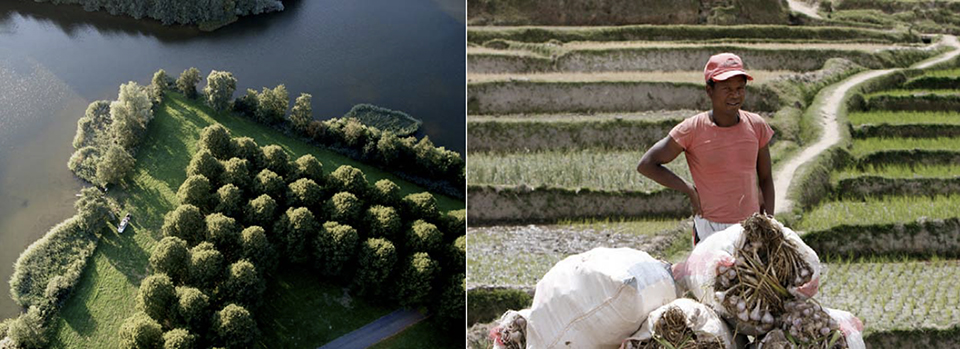
How do you find a good viewpoint?
The best photos are taken from a remarkable viewpoint. This makes them stand out among standard snapshots and hold your attention for longer. Just bend your knees a little, move slightly to the left or right...
This allows you to determine precisely how the foreground and background fit together. Sometimes you have to walk around a little to find the best viewpoint. Look behind you regularly, as this often produces surprising images.
Find the right depth of field. At f/18 everything is sharp, from 7 to 100 metres. The wider the aperture, the smaller the depth of field. If you make the aperture smaller, giving you greater depth of field, you need to use a slower shutter speed.
1/60th of a second is more or less the maximum you can still manage handheld, but this also depends on the focal length you are using. And finally: find the right exposure time and capture the right moment.
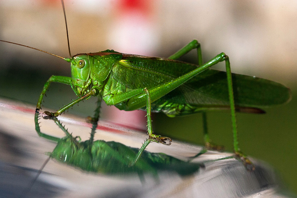
Basic patterns that attract us
- A strong diagonal line;
- A clear triangle;
- A winding line;
- Something massive filling a large part of the image;
- The “boundary” of the photo is the most important thing. Lines running from left to right are more pleasant to the eye;
- Repeating a number of exactly identical objects, such as a row of trees or houses, always works well. If you make sure there is an interruption somewhere in the row, you prevent it from becoming boring and draw attention again;
- Diagonal is dynamic. The main exception to this rule is the horizon. It must be exactly level, otherwise it looks careless and untidy. Incidentally, this is very easy to correct later in Photoshop, Lightroom and so on.
Rhythm and regularity
Creating a collection means deliberately putting related things together. If we put all our books together in a bookcase, this forms a collection. The same applies to a shell cabinet, in which the collector has placed their entire collection of shells.
A photo-filling image of a collection, without often distracting environmental factors, can be very fascinating! Think, for example, of texture, repetition and rhythm. Think of lots of postcards, sweets, apples, roses and so on.
Repetition
Repetition is applying the same element, the same shape or the same word over and over again. Rhythm is a form of repetition, but with a small 'vibration'. A small change.
Suppose you want to create a rhythmic image of a row of matches. If you place them all neatly next to each other, you create a continuous rhythm, actually a repetition. This becomes a little monotonous. An interesting image only emerges when we change the distance, direction or shape within the repetition.
The nice thing is that you often do not even have to go far. With a pile of stones or roof tiles, or a bunch of roses or pens, you can already create something very exciting! Look at a subject from different angles. You will get some really fun images from your camera!

Diagonals
Moving objects become extremely dynamic when they follow the direction of a diagonal in their movement. This applies not only to moving objects, but also, for example, to mountain slopes or buildings that recede at an angle.
Horizontal and vertical lines often look static, while diagonal lines look dynamic. Lines running parallel to the edges of the image have a static or slowing effect.
Diagonal lines, on the other hand, generally create a dynamic effect. They are often associated with depth. You can use striking lines to lead attention towards the subject.
Whether a line runs straight through your image or diagonally sometimes simply depends on where you are standing as a photographer. Think, for example, of a road in the photo.
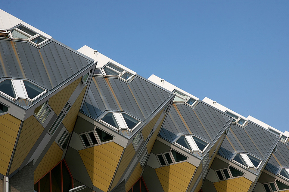
Lines
Horizontal lines make a shot calm. Vertical lines are ambitious, always reaching higher and bringing dynamism to the image. Diagonal lines are dynamic, for example with tower blocks, columns, towers and so on).
You achieve this by tilting the camera backwards. By holding the camera at an angle, if you want to place your subject on the diagonal lines. Make sure that the horizon does not run crookedly across the photo, as this is distracting.
Line patterns in a landscape can 'make' a photo. You can literally include a line in your photo that leads the viewer through the entire image. Roads, rivers, illuminated mountain ridges, hedgerows, electricity pylons and light trails from car headlights can naturally fulfil this role.
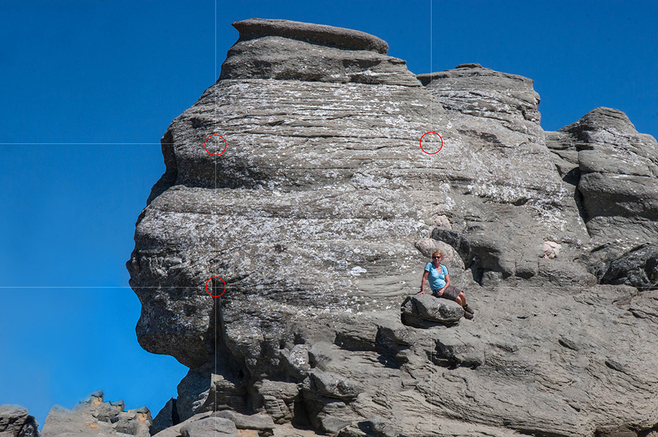
Rule of Thirds
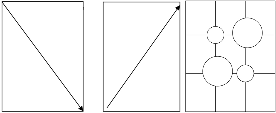
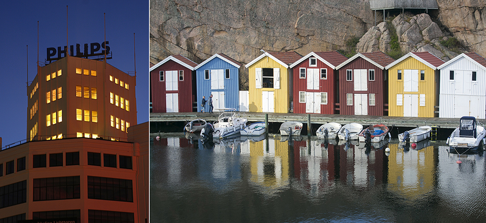
The Rule of Thirds divides the image into thirds with imaginary lines, both in height and width. A photo with the subject in the centre is usually not very exciting.
If the centre of interest falls on or around one of the four intersections of these lines, also known as 'strong points', a photo often becomes more powerful and dynamic.
The centre of interest is therefore no longer in the centre! The photo is divided horizontally and vertically into three equal parts. The strong points of the composition then lie at the intersections of those lines. If two objects absolutely belong together, they are placed at the intersections, diagonally opposite each other.
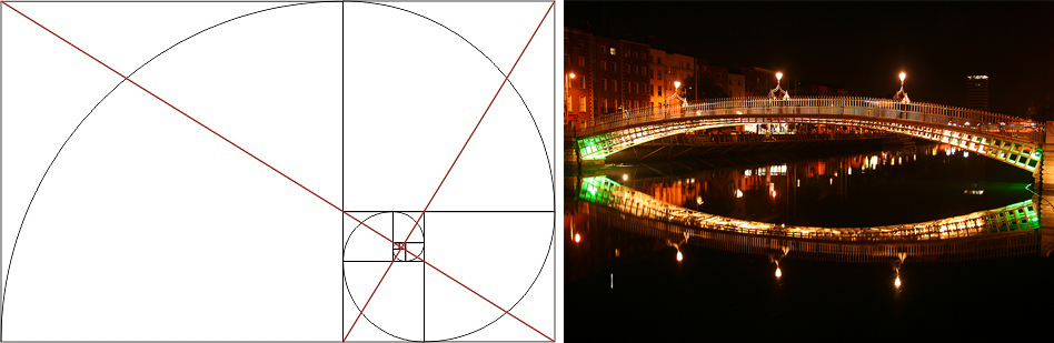
Golden Ratio
The 'Golden Ratio' creates balance in the image. The rule of thumb is to place your subject at 1/3 or 2/3 of the image. The rule of thumb says: place the horizon at 1/3 from the top if the landscape is the main subject, or at 1/3 from the bottom if the sky plays an important role. This works very well in general landscape photography.
So never place the horizon in the middle of the image, but at 1/3 or 2/3 from the bottom. The Golden Ratio also divides the image, just like the Rule of Thirds. But in this case, not all areas are the same size.
The Golden Ratio positions the elements in the image in a specific proportion that feels pleasing and logical to people. You can surprise your viewers by doing it differently sometimes. That is no excuse, however, for neglecting the rest of the image structure.
Colour
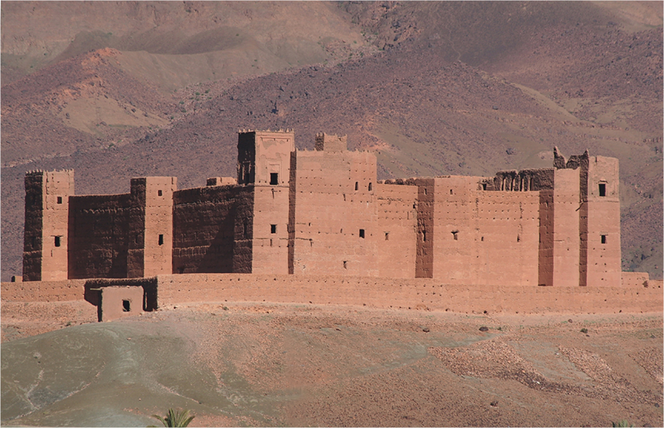
The use of colour is an important part of the overall composition of a photo. The way you use colours and make them stand out against each other in a photo can either reinforce the feeling of action or make a situation feel calmer.
People are attracted to colours for various reasons. Often it is simply because they like a particular colour.
In many cases, choosing colours based on personal preferences can produce garish combinations. Just look at the text and background colours you see on websites.
By gaining a basic practical understanding of how colours reinforce or weaken other colours, you have more control over the emotion your photo conveys.
Colour wheel: complementary and analogous
Painters often use colour wheels. You can use them as a photographer too.
If you look at the colour wheel below, you can see that red is opposite green. Colours that are directly opposite each other are called 'complementary colours'. They are used to enhance each other, and the contrast between the colours makes them appear as dynamic and vibrant as possible.
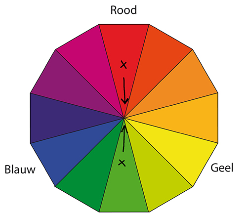
Complementary colours:
If you want the colour red to glow in your photo, place a complementary colour near the red, such as green or blue. The dynamism of complementary colours can reinforce the feeling of action and movement.
Imagine, for example, a mountain biker in yellow clothing with a green forest in the background. Now imagine that same image with a cyclist in purple clothing.
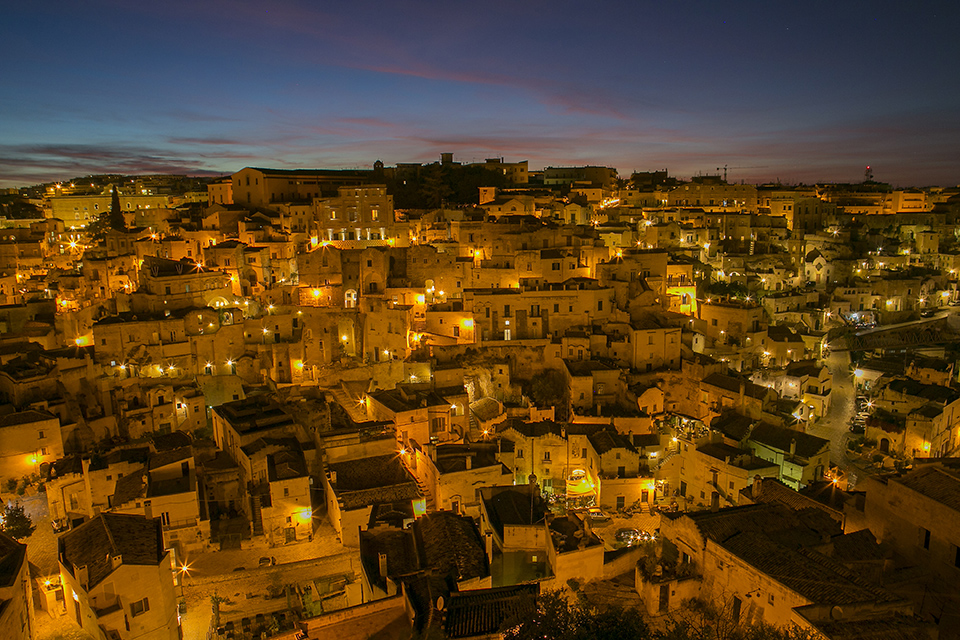
Analogue colours:
The colours that appear next to each other on the colour wheel below are called 'analogous' colours. These include red and orange, blue and green, or pink and purple. These colours do not contrast with each other and can be used to express calm. The viewer feels calm and at ease when seeing analogous colours.
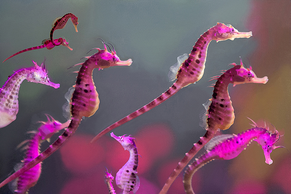
Conclusion
The rules and pointers in this article are of course very useful to refer back to when you are not sure what to do. But it is even more fun to deviate from them and do things completely differently. If you have any nice tips or ideas, be sure to share them in the comments!
Composition theory at Photofacts Academy
And if you want to go into more depth and see how to apply your knowledge of composition techniques in practice, take a look at our Macro photography course by Johannes Klapwijk at Photofacts Academy. Determining and creating a beautiful composition is also part of this course.
Composition is also one of the important subjects in Bart Heirweg's Landscape photography Basic Course.
About the author
Michelle Peeters is fotografe en oprichter van DeuxBleus Fotografie. Michelle herkent het bijzondere in het gewone en het gewone in het bijzondere. Ze heeft zich nooit willen specialiseren en is daardoor van alle markten thuis.
You might also like
-
 Compose your photos like the old masters
by Huub Keulers
-
 Review: Special Photography Techniques, Panoramas, HDR, Virtual Tours and More
by Michelle Peeters
-
 Tip: examine your own success rate
by Elvira Smit
-
 15 practical tips for sharper panning photos
by Huub Keulers
-
 Review: Discover Photoshop Elements 2022
by Elja Trum
4 comments
-
 Frank wrote on Tuesday 6 November 2018 at 11:10 | reply
Goed idee om schilderijen van de oude meesters te bestuderen. Dan kom je er ook achter dat de beeldverhouding ook nog een ding in de compositie is, die ik hierboven mis. Voor elk schilderij dat je in 3:2 vindt, vind je er minstens tien die dat niet zijn. Het is niet voor niets dat de professionele filmformaten, de uitzondering daargelaten, 5x4, 4x3 en 1x1 waren... (en zijn, zie de Fujifilm GFX middenformaat camera's en de Hasselblads).
This comment was written in another language and has not been translated yet.
De gulden snede is overigens primair een ordening van en in objecten, het onderwerp dus, en niet in beelden daarvan. Als het gaat om de Mona Lisa bijvoorbeeld zit de gulden snede in haar afbeelding, niet in het doek waarop dat geschilderd is. -

 Michelle Peeters wrote on Tuesday 6 November 2018 at 11:15
| reply
@Frank: mooie aanvullingen, dankje!
This comment was written in another language and has not been translated yet. -
 martinphili wrote on Tuesday 6 November 2018 at 18:56
| reply
Met Frank eens. Die gulden snede en 1/3 regels worden ook vaak omgekeerd gebruikt. Die regels zijn echter een gemiddeld resultaat van een reeks observaties. Het wil dus niet zeggen dat een foto goed is als hij aan die regels voldoet.
This comment was written in another language and has not been translated yet.
In een vergelijk: We nemen waar dat de meeste snoepjes als lekker beoordeeld worden als ze zoet zijn. Het wil uiteraard niet zeggen dat een zoet snoepje daarmee altijd lekker is. -
 Heleen van Tilburg wrote on Wednesday 7 November 2018 at 12:07 | reply
Wat fijn om de regels over compositie zo helder op een rijtje te hebben. Bedankt!
This comment was written in another language and has not been translated yet.
Have your say
Please note: Articles older than a week can only be commented on by signed-in visitors.Would you still like to comment? sign in or create a free account.
Become a better photographer every week
A practical photography tip in your inbox every week.
38,938 photography enthusiasts already receive the tips! More about the weekly mail. Or keep up to date via  Facebook.

Elja Trum
Photofacts; everything to do with photography!
Would you like to take better photos and keep up with what is happening in photography? Photofacts publishes articles that teach you something about photography — from a product announcement to a practical shooting tip or a look at a website. Photofacts covers photography every day and is a hobby project of Elja Trum's that got out of hand. The articles are written by a team of volunteer authors. If you would enjoy writing one or more articles for Photofacts, do get in touch.More about PhotofactsPhotofacts is made possible in part by
