

Colour manipulation, working with colour and gels
Sunday 22 September 2024, 22:11 by Frank Doorhof | 3,356 views | 2 commentsThis article was translated from Dutch with the help of AI. Read the original.
Today is the first article in a series about colour and colour manipulation in photography. We will look at colour theory, how you can manipulate colours and how you can use colour gels in a highly creative way.
Colour manipulation
Colours are all around us and are largely responsible for how we experience a product or scene. Think of the film Titanic in its fitting brownish tint. Or what about the colour used in The Matrix, green?
Think about this for a moment. If you are five kilometres below sea level in a concrete bunker, and you turn on the light, what colour is that light?
Most people will answer blue or hesitate. In essence, you do not need to hesitate. You are in a concrete bunker, so the light is... well, simply the same colour/temperature as above the water. So why is The Abyss, and almost every underwater film, filtered blue?
That is easy to explain, we immediately get the feeling that we really are underwater. And you are probably cold too. Colours evoke emotion.
Learned or emotional
The following has not been scientifically proven, I think, but I often use it during workshops. When we talk about colours and emotion, we can expect the following.
Red
Red stands for hate, warmth, love, warm, cosy, danger, etc. The funny and interesting thing is that red deals with both emotions that trigger us, hate and love.
Blue
With blue, you think of distant, uncertain, future, empty, sterile.
Green
To be honest, green does not give me any real emotion. Of course, we have associations such as envy or nature, eco, and some people will say calm.
Red is special
This is also why I like using the colour red in my photography. You can even find it in our logo. It is a very versatile colour.
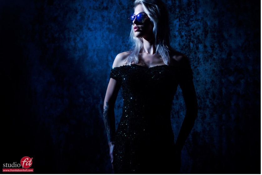
Today I am sharing a few photos we took of Lois during a recent workshop, where I used a blue gel as an accent light.
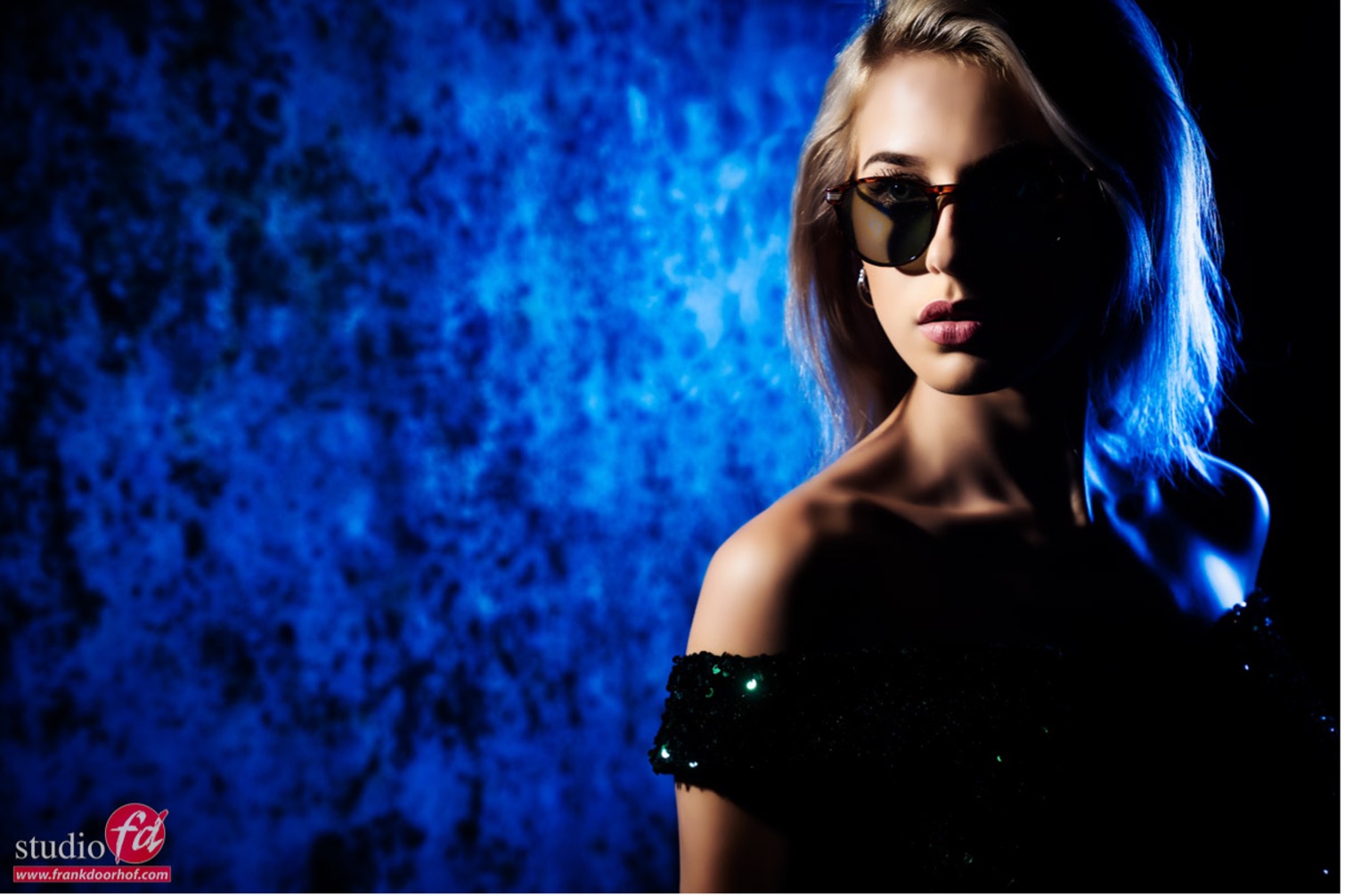
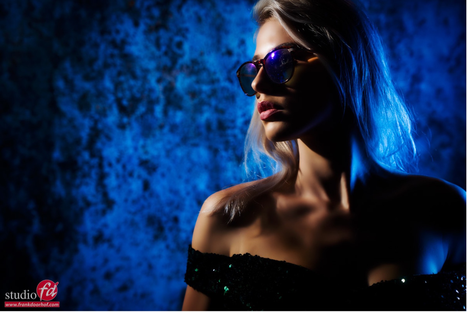
As you can see, I use 'normal' white light as my main light. As an accent, I use a blue Roguegel on our magnetic system. The advantage of these gels is that they are thick and give a beautiful, deeply saturated colour, which makes the trick I use much easier.
What trick?
When we look at the colour triangle, we see the colours Red, Green and Blue. And in the middle we see the so-called 'black body curve'. This is where the 'white points' or 'colour temperature points' are located.
A lower colour temperature is a warmer white, and a higher colour temperature means a bluer colour cast. For calibrations, we use D65, for example, for most photography/video applications.
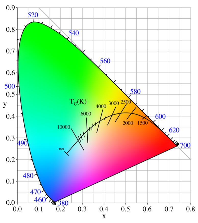
There is a connection between the colours, and with correct calibration, the ratios between the colours must be exactly equal for good colour reproduction across the entire spectrum, more on that in the article about calibrations.
When you draw a line from the primary colour, RGB, through the white point, you end up at your secondary colour, Cyan Magenta Yellow. You often see this as CMYK, where K is often confused with black, blacK.
This seems particularly true in printers, as there is a black module in the colour section. However, the K stands for Key, or brightness, which is why using a light meter is essential for obtaining accurate colours.
But enough boring theory, let's play. If you know how colours work together, we can do really cool things.
Today I will show you something very simple that you can do yourself. Use one light source with white light and one light source with an accent colour, preferably blue or red. As you have just seen, I chose blue for this article.
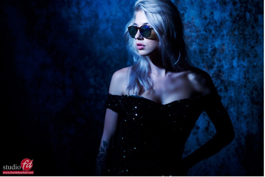
If you simply take the photo as you normally would, with a blue or red gel and normal white light, you get results like the ones you see above. But if you now change the colour balance in your RAW converter, you can get some really funky effects, like the examples below.
Because you use white light as the main light and a deep blue, you can create a nice mix, since both the skin tones and blue are in the same space and axis in the colour triangle.
So use only the colour temperature slider, which works horizontally in the colour triangle, the blue-red one, not the Green-magenta one.
You can now give the photo a very 'cool' look, as if the main light also has a slight blue tint. The strength of this technique lies in the fact that if the client does not like the "cool" look on the face, you can always go back. This is not possible when photographing with two gels.
Make sure that you use the thick, deeply saturated gels for the accent lighting.
An extra tip for colour manipulation
Using the colour triangle and the black body curve, you can see the balance in the colours.
By making clever use of the connection between colours, you can not only play with your colour balance, but also, for example, change the tints of the sky and surroundings outside. Without using Photoshop, by using coloured flashes on the model.
If there is interest, I could also write an article about that.
You do need the right equipment for colour manipulation
To assess your colours correctly, you need a good workflow. For me, this means a light meter and the colorchecker. I use the light meter to measure the light and set it precisely, and with the colorchecker I can create a profile and white balance for that series.
And remember that this is only to make all the images look the same, so that all the presets you apply produce the expected result. In my work, for example, you will rarely see photos that are not tinted.
I edit my photos fairly minimally, skin and tinting, but colour manipulation is an essential part of my workflow. I can spend quite a long time on the tint of a photo. That determines the look and feel of that photo/series.
And especially for clients, that can be the difference between an enthusiastic response and a disappointment. The downside is that if you adjust the colour afterwards, the client is often less enthusiastic than if you get it 'right' straight away. So make sure you discuss this properly with your client.
The choice of colour can completely ruin your photo or make it work. If in doubt, offer it in two or more versions.
You often hear that a light meter and colorchecker are unnecessary, but if you play with colours in this way and also need to deliver colour-critical work, the colorchecker and light meter are an essential part of your workflow. Fortunately, they are very easy to use.
About the author
Frank Doorhof blogt dagelijks in het Engels op zijn website en geeft wekelijks workshops model fotografie in zijn studio in Emmeloord, maar ook op locatie in binnen en buitenland. Van beginners tot gevorderde, iedereen kan bij Frank terecht. Ook voor specifieke 1 op 1 workshops, of maatwerk voor groepen.
You might also like
-
 Colour manipulation; Creating unusual skies with a colour gel
by Frank Doorhof
-
 Colour manipulation with colour filters
by Frank Doorhof
-
 Make a calibration folder (for your eyes)
by Elvira Smit
-
 Lens calibration, is it necessary or not?
by Nando Harmsen
-
 5 Colour Theory Tips from Designer Greg Gunn
by Elja Trum
2 comments
-
 Donald Willemsen wrote on Monday 23 September 2024 at 22:40 | reply
Unfortunately, this story is also beyond my understanding. At least from the heading 'What trick?' onward. At that point, at least for me, the light goes out. I do understand how to measure the light, but I don't understand the use of a colorchecker in combination with a light meter. As an aside: Why does a colorchecker have to be so expensive?
Translated from Dutch.
The graph you show in the article is complete abracadabra to me.
Frank, for you it's a piece of cake, but for me, who is bad at exact sciences (math, chemistry and physics), it is incomprehensible.
Is it me, or are you unable to explain it very simply. I would really like to be able to understand the theory behind it and apply it in practice. -

 frank doorhof
wrote on Monday 23 September 2024 at 23:03
| reply
frank doorhof
wrote on Monday 23 September 2024 at 23:03
| reply
Since I have been explaining this subject for years, I don't think it is the explanation, but perhaps these are articles for photographers who are already somewhat familiar with colour spaces and colour manipulation
Translated from Dutch.
More articles will follow, including one prompted by a question about the coordinates.
The trick is that with a blue gel you can both retain a natural key light and, by shifting the colour temperature, create a split light with a cool colour on the key light.
Why is a colorchecker expensive ?
I think the price is actually quite reasonable. These are in fact highly critical reference tools that need to retain perfect colours over a longer period of time. So you can't just print this on a piece of cardboard. Then after a few months it will be done
Why is the light meter important?
As mentioned, because the brightness of the colour is essential for an accurate representation.
You can always ask questions of course if you don't understand something.
Have your say
Please note: Articles older than a week can only be commented on by signed-in visitors.Would you still like to comment? sign in or create a free account.
Become a better photographer every week
A practical photography tip in your inbox every week.
38,982 photography enthusiasts already receive the tips! More about the weekly mail. Or keep up to date via  Facebook.

Elja Trum
Photofacts; everything to do with photography!
Would you like to take better photos and keep up with what is happening in photography? Photofacts publishes articles that teach you something about photography — from a product announcement to a practical shooting tip or a look at a website. Photofacts covers photography every day and is a hobby project of Elja Trum's that got out of hand. The articles are written by a team of volunteer authors. If you would enjoy writing one or more articles for Photofacts, do get in touch.More about PhotofactsPhotofacts is made possible in part by
