

Which Colour Profile Should You Use for Your Photos?
Monday 24 February 2025, 20:02 by Nando Harmsen | 6,493 views | 8 commentsThis article was translated from Dutch with the help of AI. Read the original.
You often do not think about it, but when colour rendering goes wrong, it suddenly becomes important. Which colour space should you use for your photos? It is a difficult subject, especially if you look into it in depth. But sometimes basic knowledge is enough to find your way.
Photos consist of pixels. Each pixel has a number for each of the different colour channels: red, green and blue (RGB). But a number is not yet a colour. For example, RGB(010-190-010) only says that it contains a little red, a lot of green and a little blue.
Which exact colour belongs to RGB(010-190-010) is open to interpretation. This is determined by the colour space. The range of colours that fits within a colour space is called its gamut.
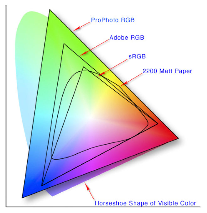
The colour spaces you may encounter are sRGB, AdobeRGB, ProPhotoRGB and Display-P3. sRGB has a small gamut. ProPhotoRGB has the largest gamut. The others lie between them, each with its own distribution.
This means that the colour RGB(010-190-010) may look slightly different in each colour space. If the colour space being used cannot be displayed, the colours will differ to some extent. Your photo will then look different from how you intended it.
Colour space in the camera
Many cameras offer the option of shooting in sRGB or AdobeRGB. This setting only applies to JPEG. Do you shoot in RAW format? Then this setting is not important.
A large colour space for editing
For editing photos, it is often a good idea to use a large colour profile. This can be AdobeRGB or ProPhotoRGB. Although opinions sometimes differ on this, you are best off doing so. The condition is that you work in 16-bit.
If you work with different software, make sure that each piece of software can handle the chosen colour space. That way, you can be sure that the correct colour is preserved. It is also possible to convert the photo to another colour space.
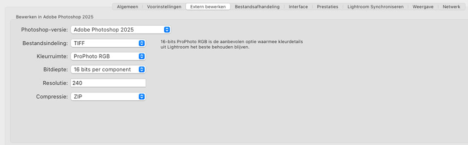
Do bear in mind that converting a colour profile with a small colour space to a large colour space does not create more colours. It does give you more editing room.
An overview and applications
The simplest approach is to give an overview of the different colour spaces and what they are suitable for. I will go from the smallest colour space to the largest.
sRGB
This is the smallest and most widely used colour profile. It is suitable for display on any screen, the internet, standard printers and print shops. It is the safest choice.
AdobeRGB
This is a variant of standard RGB (sRGB) with a larger gamut. It can display more colours and is often very suitable for printing. The condition is that the printer or print shop supports AdobeRGB. Check this or always ask first.
Cheaper and simpler screens may not display AdobeRGB correctly. They cannot handle the larger colour range. This also applies to many internet applications, including social media. Some browsers can display it correctly these days.
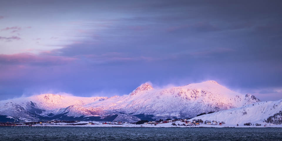
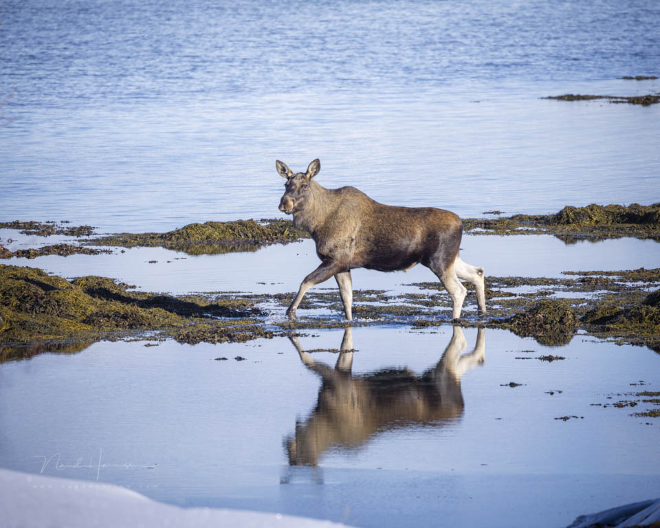
Are you shooting in JPEG with the camera set to AdobeRGB? Then bear in mind that you need to convert the photo to sRGB for the internet, social media and standard print shops.
ProPhotoRGB
This is the largest colour space and even includes colours that we cannot perceive with our eyes. It is only suitable for 16-bit files. Because of this large colour space, you do not run into limitations, but there are no, or hardly any, monitors that can display the full ProPhotoRGB colour profile. There are no printers that can handle it either.
Photos edited in ProPhotoRGB must always be converted to AdobeRGB or sRGB before they can be used. In other words, only use this colour profile for editing in photo-editing software.
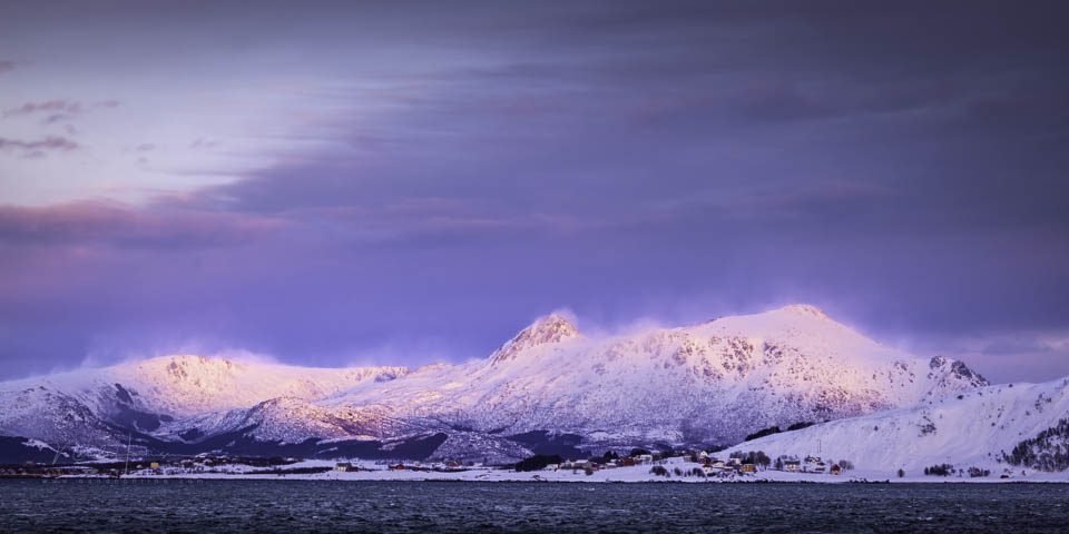
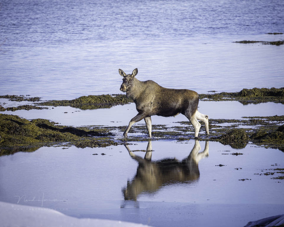
Display P3
This is a wide colour profile aimed at Apple screens. It is almost as large as AdobeRGB, but shifted more towards red and orange. This comes at the expense of green and blue tones. It is mainly suitable when you view the images exclusively on an Apple screen or on screens that support this colour profile.
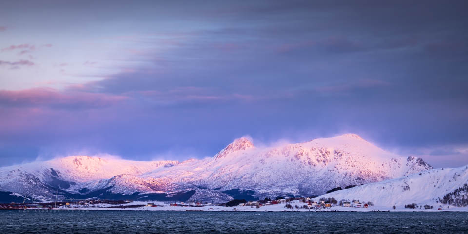
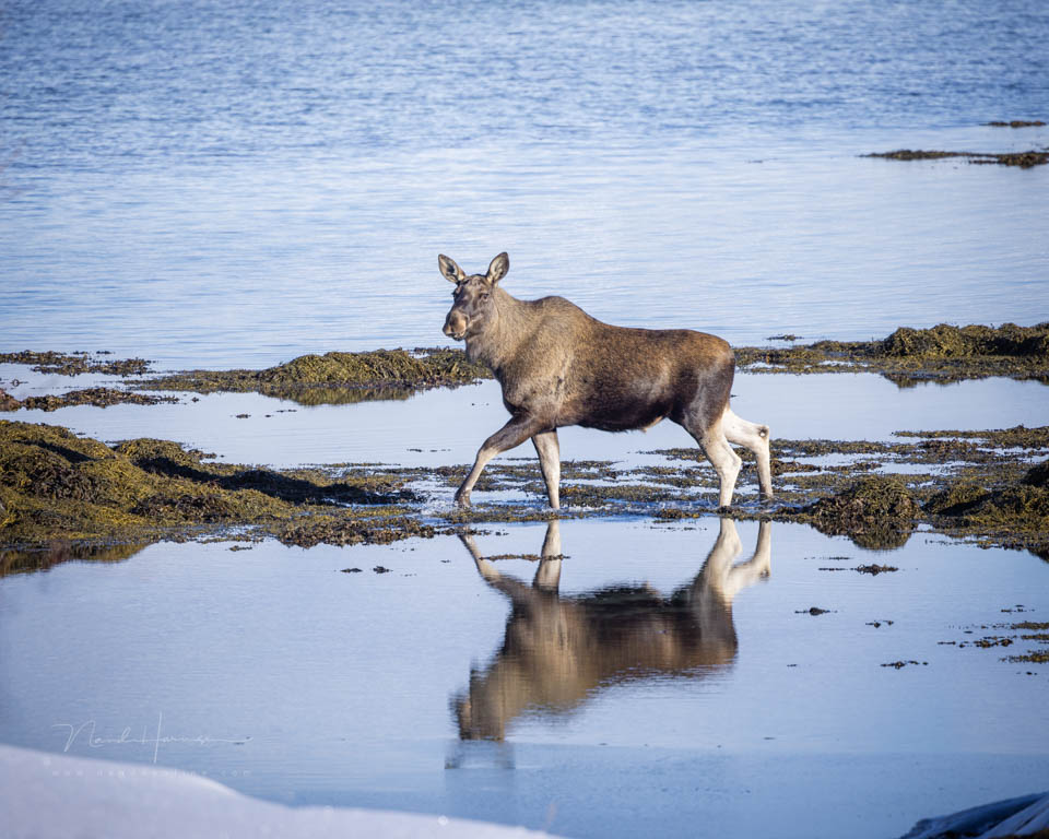
Do you want to print with this colour profile? Make sure that the printer or print shop supports it. If not, convert it to AdobeRGB or sRGB.
Colour management
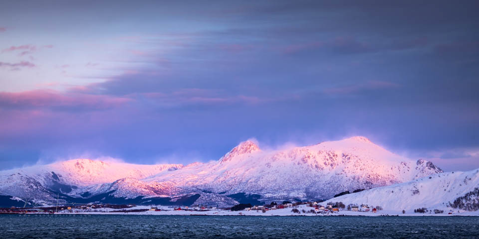
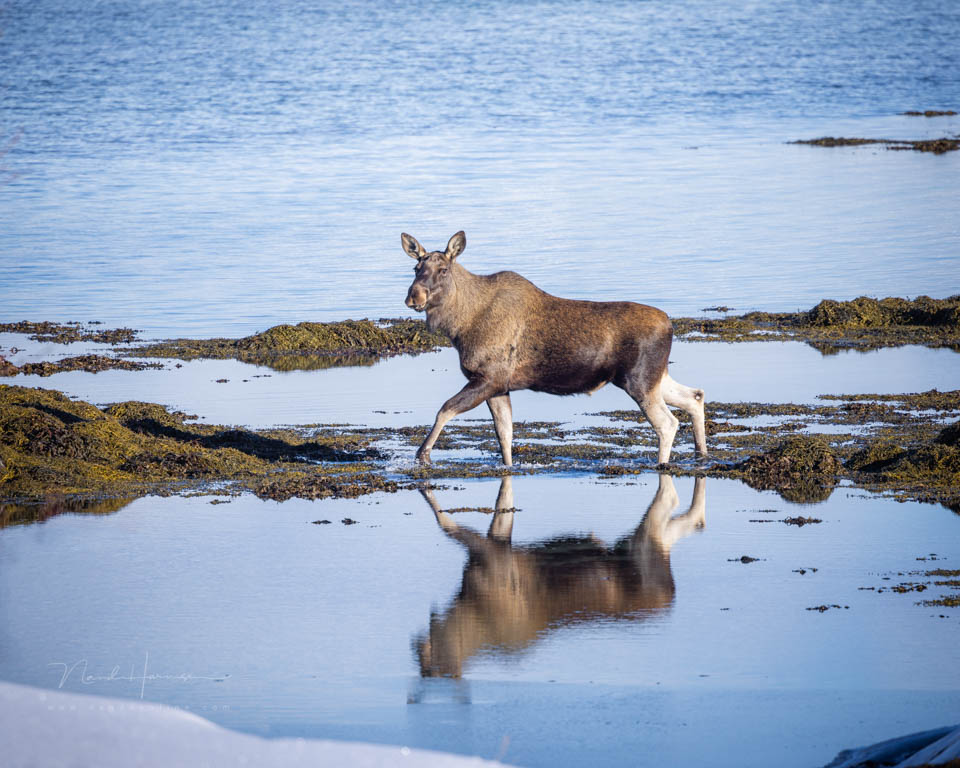
The differences between the examples are often subtle, depending on the colours present and whether they overlap. Because the browser can only show sRGB, you miss colours that are present in AdobeRGB and Display-P3. Colours look less vivid. ProPhotoRGB will always look dull and grey.
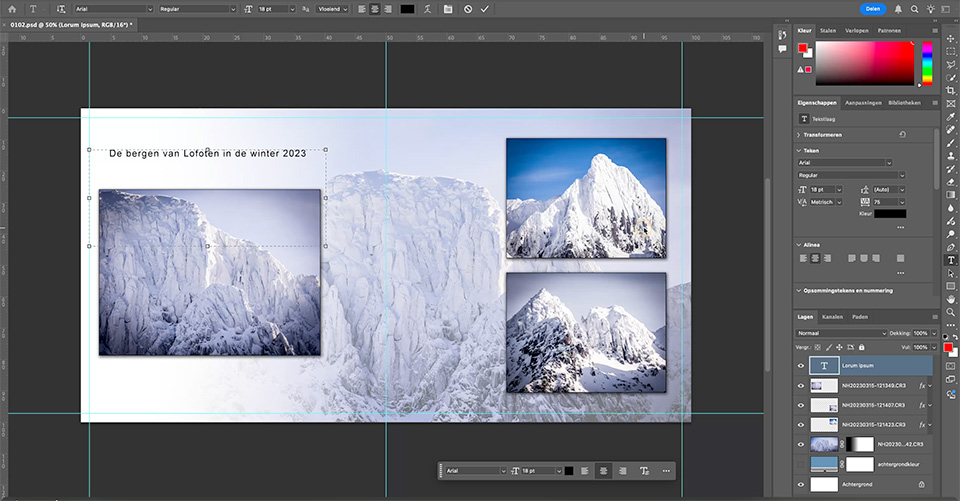
If you had the photo on your computer and opened it in suitable photo-editing software with colour management, the colours would be displayed correctly again. However, if you open a photo in software without colour management, colour rendering goes wrong.
What should you choose?
If you use photo-editing software with colour management, choose a large colour profile such as AdobeRGB or ProPhotoRGB. Or Display-P3 if you are an Apple user. This gives you plenty of freedom when editing without quickly reaching the edge of the gamut.
When exporting, sRGB is the best choice in almost all cases. This ensures that the colours are displayed correctly everywhere and for everyone. It is often the best choice for print shops too.
Are you printing at a shop that offers colour management, or on your own printer? Check which colour space is supported. This is usually AdobeRGB. In that case, you can choose that colour space.
Some print shops have their own ICC profile that you can download. This is optimised for the printer being used. The way the photo looks with that ICC profile may differ from reality on your screen.
Colours outside the gamut
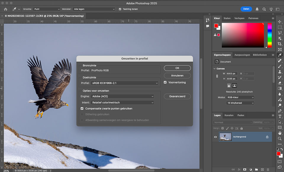
If you work in a large colour space such as AdobeRGB, ProPhotoRGB or Display-P3 and export the photo to sRGB, some colours may fall outside the sRGB gamut.
The software you use will intelligently assign the best matching, closest colour to colours that fall outside the gamut. You cannot go back after that. Keep this in mind.
About the author
Nando Harmsen has been photographing for more than 40 years. He specialises in wedding photography and landscape photography. Nando also gives talks, workshops, masterclasses and photo trips, and regularly reviews new and interesting equipment.
You might also like
-
 Should you set your camera to AdobeRGB or sRGB?
by Nando Harmsen
-
 Model shoots in small spaces
by Frank Doorhof
-
 Review: Eizo ColorEdge CG 2700S monitor
by Nando Harmsen
-
 Away from the Open Space
by Michiel Heijmans
-
 Optimise the Distribution of Space
by Nando Harmsen

8 comments
-
 Mac wrote on Tuesday 25 February 2025 at 08:28 | reply
Small addition to your story.
Translated from Dutch.
The largest color space is Lab, only it is mainly theoretical (and is used in drunk industry), and as a photographer you don't get much use out of it. But it is important for printers. They need it to be certain that the colors they print with in CMYK comply with ISO standards. So they don't print with RGB either.
For them, the correct conversion from RGB to CMYK is very important. And this is where those ICC profiles are so important.
RGB is actually only very important for photo labs that don't print with inkjet, but make photo prints on light-sensitive photo paper, just like in a darkroom, because then the RGB color space is used to expose the paper, and then an ICC profile is less important. -

 Nando
wrote on Wednesday 26 February 2025 at 09:52
| reply
Nando
wrote on Wednesday 26 February 2025 at 09:52
| reply
I know little about printing yourself. I find printing yourself far too expensive and doing it properly requires studying, which also comes across in your story.
Translated from Dutch.
Since ICC profiles are used, you don't need to know much about LAB, ISO standards, and all that sort of thing. I mentioned the most commonly used colour spaces that you come across as a photographer in the article, and what you should choose. I haven't seen LAB before, or seen it mentioned at print shops. -
 Hans van Vreeswijk wrote on Tuesday 25 February 2025 at 18:23 | reply
The intent is important too ..
Translated from Dutch.
Sometimes difficult to see in prints, relative colorimetric or perceptual.
Then it will cost you 2 prints with (too) expensive ink. -
-
Mac wrote on Wednesday 26 February 2025 at 12:38 | reply
Hello Nando,
Translated from Dutch.
I don't print at home either, I always have it done by a lab.
I only work in the printing ink industry, so that's why I know about it, I deal with it every day.
As a photographer you will also never have anything to do with Lab, that's really purely for printers.
But what you do always have to take into account at home, (if you have it printed by inkjet at a central service). is the conversion to CMYK colours. in LR you can do a soft proof before you send it to the central service. And every good central service has the ICC profiles that you can download to do the soft proof. -
-
Mac wrote on Thursday 27 February 2025 at 08:52 | reply
Hello Nando,
Translated from Dutch.
You also always deliver sRGB, but a printer will always have to convert it to CMYK, except if he prints on photosynthetic material.
But if your photo print or photobook is printed with inkjet, your file will always be converted to CMYK at the printer. And that is what the ICC profiles are for, among other things.
Because If you project Red-Yellow-Blue on top of each other, then you have white light. But if you print it, then you don't have white in your print.. -

Have your say
Please note: Articles older than a week can only be commented on by signed-in visitors.Would you still like to comment? sign in or create a free account.
Become a better photographer every week
A practical photography tip in your inbox every week.
38,983 photography enthusiasts already receive the tips! More about the weekly mail. Or keep up to date via  Facebook.

Elja Trum
Photofacts; everything to do with photography!
Would you like to take better photos and keep up with what is happening in photography? Photofacts publishes articles that teach you something about photography — from a product announcement to a practical shooting tip or a look at a website. Photofacts covers photography every day and is a hobby project of Elja Trum's that got out of hand. The articles are written by a team of volunteer authors. If you would enjoy writing one or more articles for Photofacts, do get in touch.More about PhotofactsPhotofacts is made possible in part by
