

Architecture photography: Colour, a chromatic collision
Tuesday 12 September 2017, 20:02 by Frank Toeset - Ohsevensix | 5,504 views | 0 commentsThis article was translated from Dutch with the help of AI. Read the original.
I am an architect and founder of OhSevenSix in Breda. My architecture photography is not limited to my own work.
I use photography as a research method to better understand and appreciate the work of colleagues, past and present. In this article, I explain the use of colour in architecture and architecture photography.
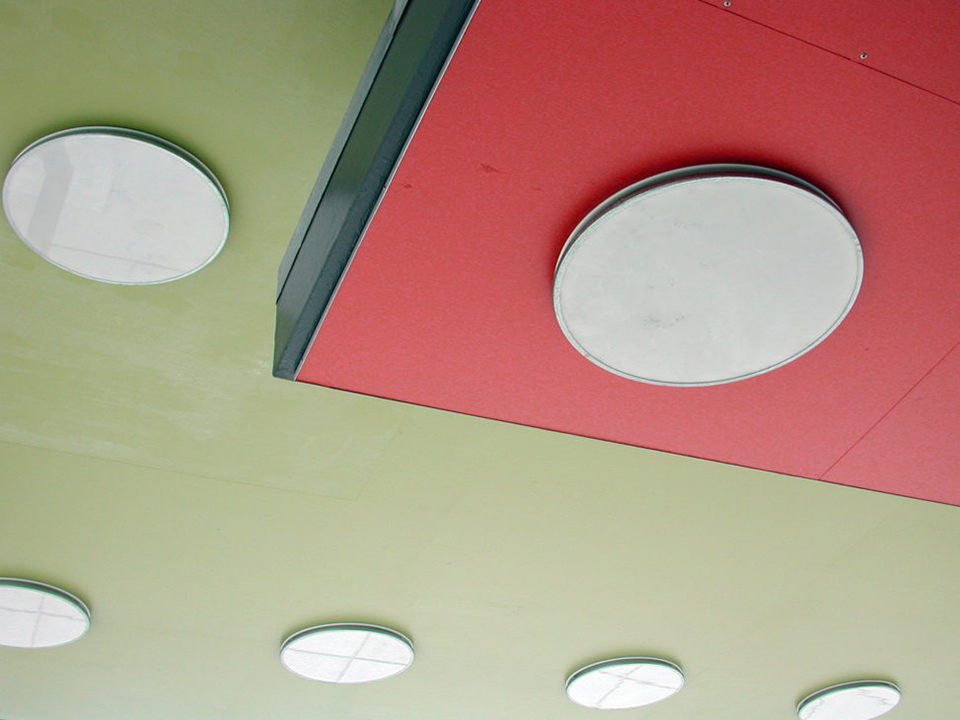
On my blogsite OhSevenSix, six themes are created for architecture photography:
- Colour
- Rhythm
- Light
- Contrast
- Detail
- Texture
My @rtoo's blogsite is in English. The themes are announced as:
- Colour, a chromatic collision
- Texture: don't finish!
- Masterly play of masses in Light
- Slave to the Rhythm
- Contradistinction in Contrast?
- God is in the Detail
The series of six blogs is always translated into Dutch for Photofacts. Here is the first blog about the use of colour in architecture photography.
Use of colour in architecture
The use of colour in architecture is not self-evident. The modernists had a special relationship with colour. Within De Stijl, the use of primary colours prevailed.
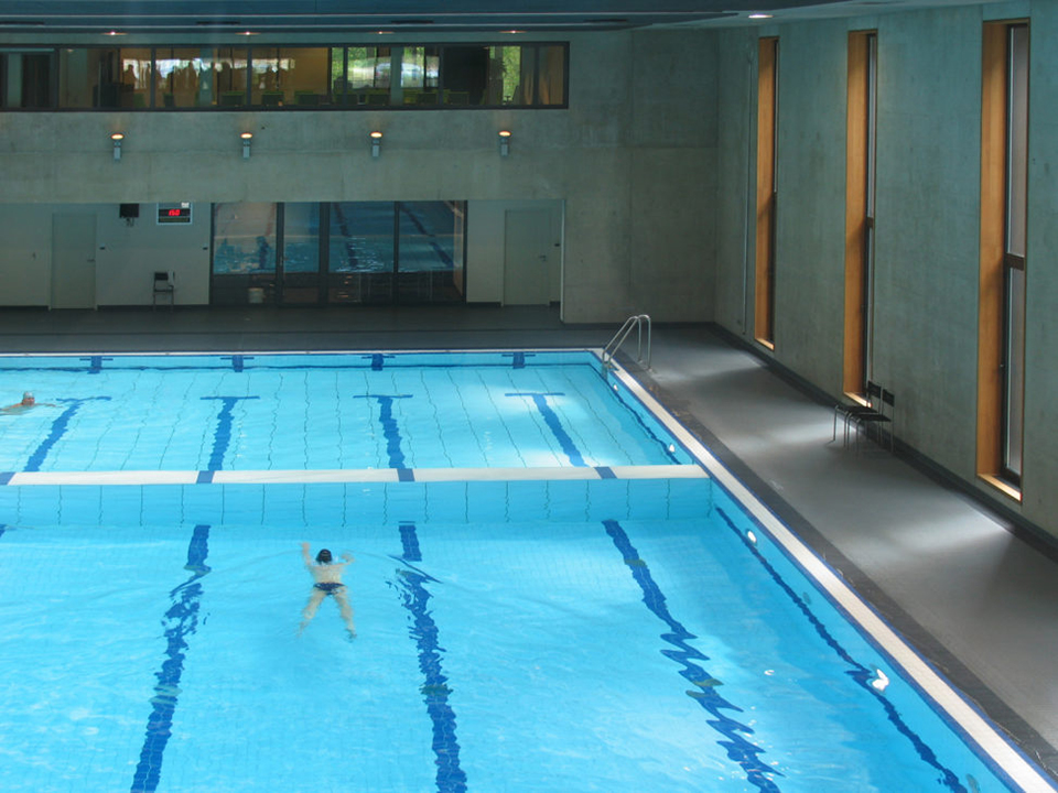
While architects such as Richard Meier eliminated colour completely and used only white, contemporaries were experimenting with colour.
Purists use colour only when it is a property of an applied material, such as the orange-red of rust on Corten steel or the blue-green of oxidised copper.
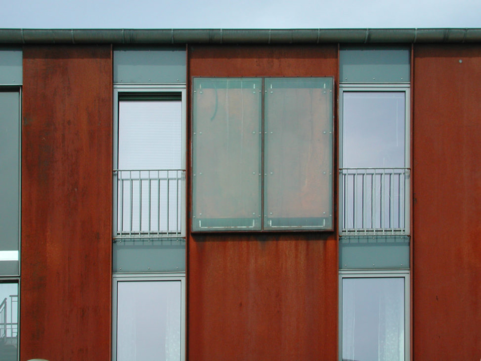
There are also regional differences and trends. Scandinavian architecture is predominantly colourful, while Flemish architects often work with warm shades of grey.
In the Netherlands, all kinds of movements exist alongside each other.
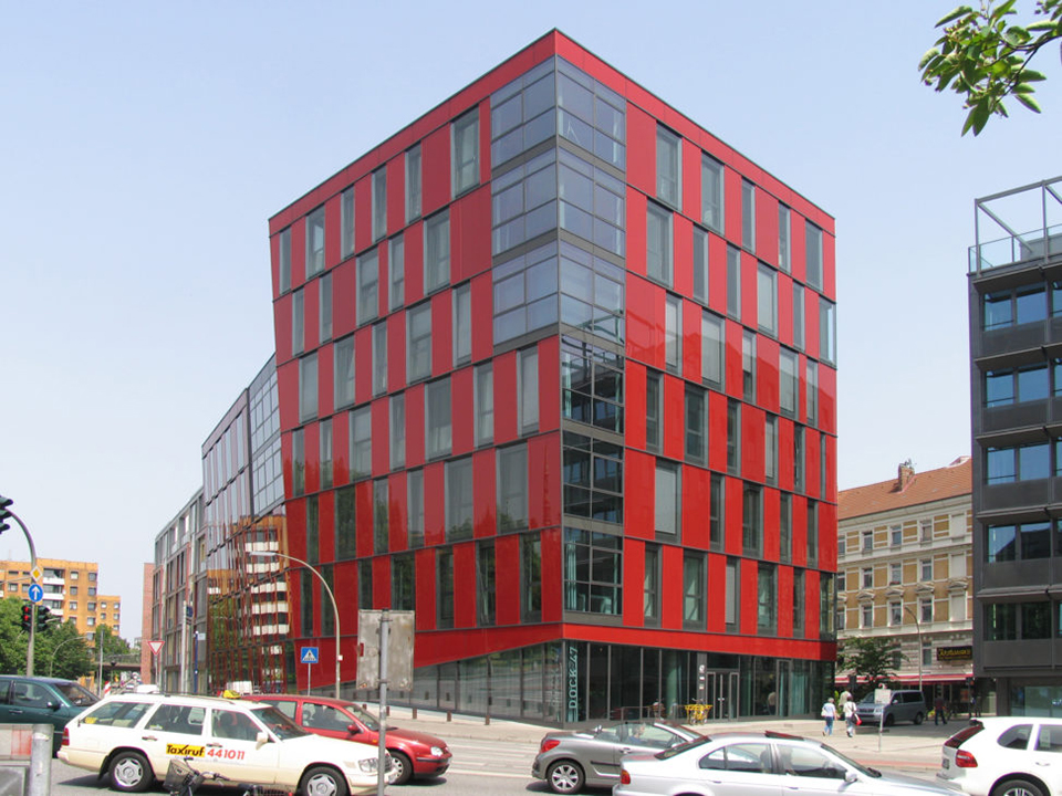
From a minimalist splash of colour in the immaculate white social housing by Havermans Hielkema architects in Breda to the striking, burning orange of NEXT architects in Almere. Architecture Must Burn, Aaron Betsky and Erik Adigard stated in their manifesto of the same name from 2000.
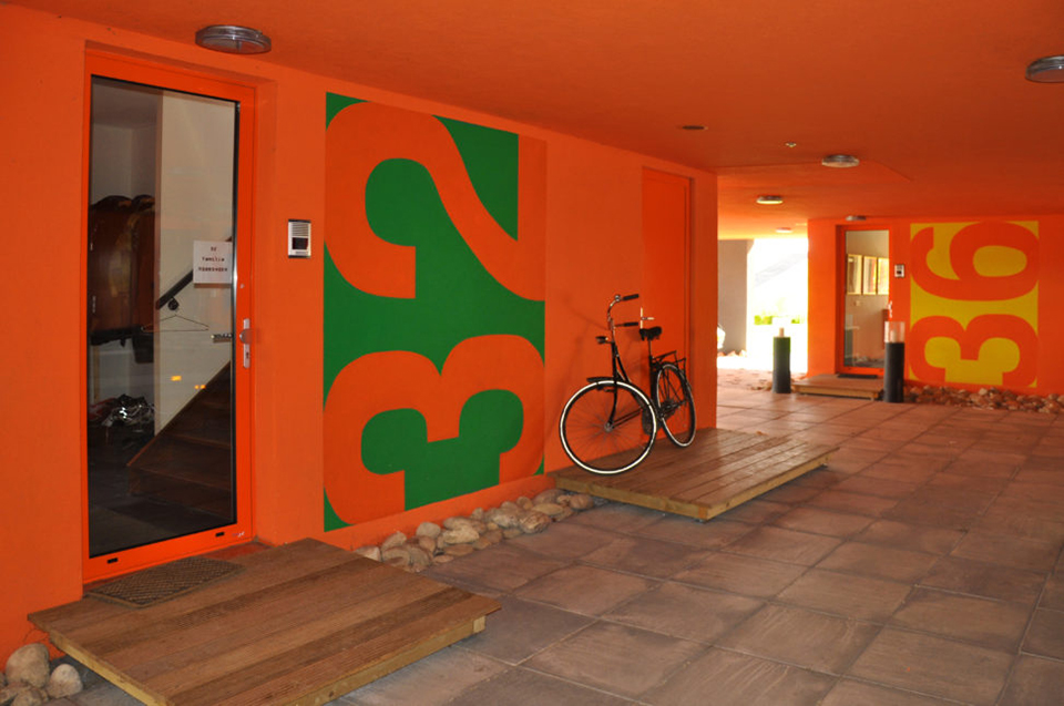
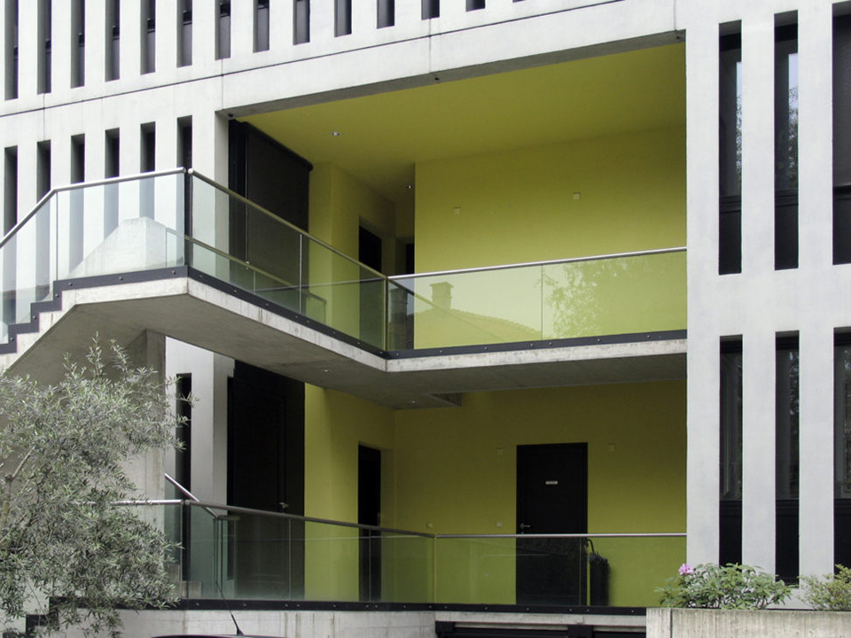
Sometimes colour is an addition to architecture, like a painting or mural.
This certainly applies to the work of the French conceptual artist Daniël Buren. He is best known for his striped wall panels. They give the space a different experience and a different meaning.
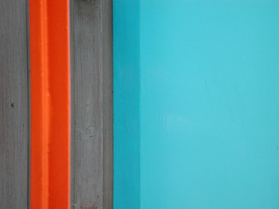
The same applies to the work of the Dutchman Peter Struycken. His kiosks with computer-generated tile patterns from 1975 were recently restored and integrated into Breda's new railway station.
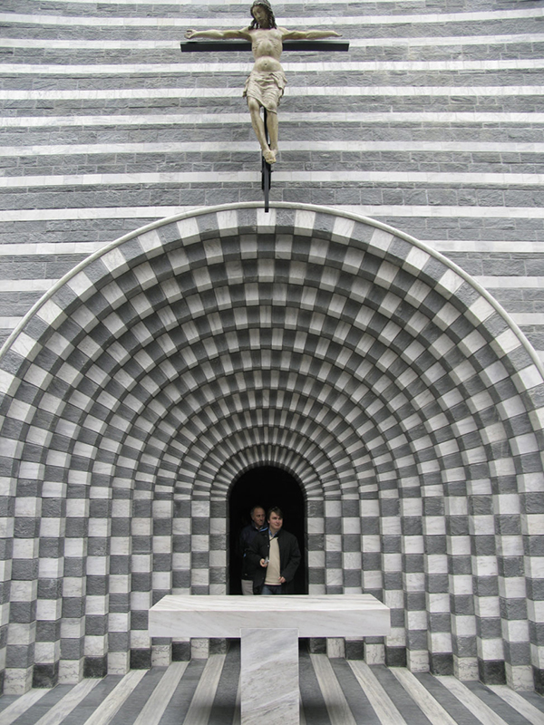
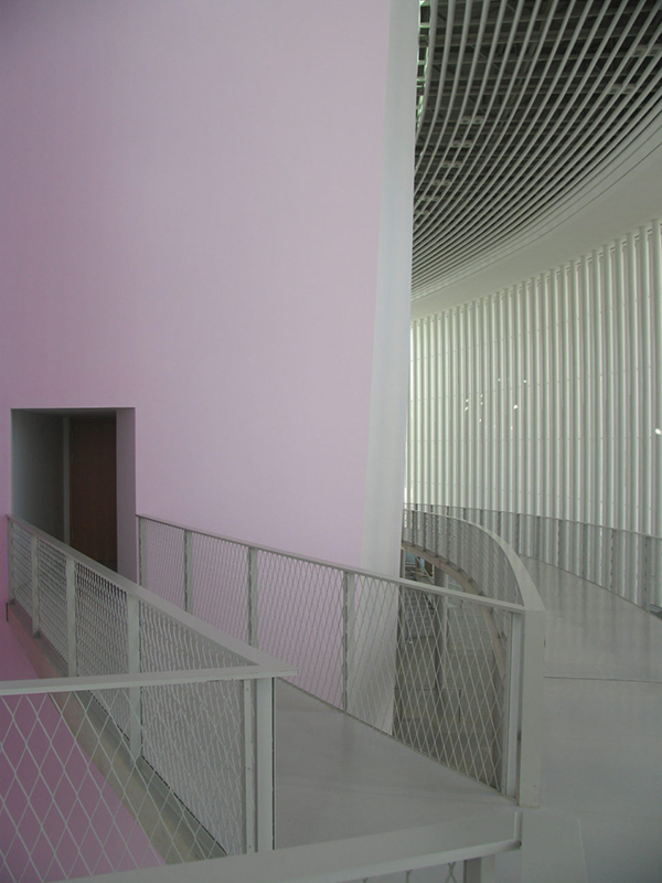
Another movement can be seen in the work of Christian de Potzamparc and Steven Holl. They use colour in a subtle way, making use of changes in intensity caused by daylight falling on coloured surfaces.
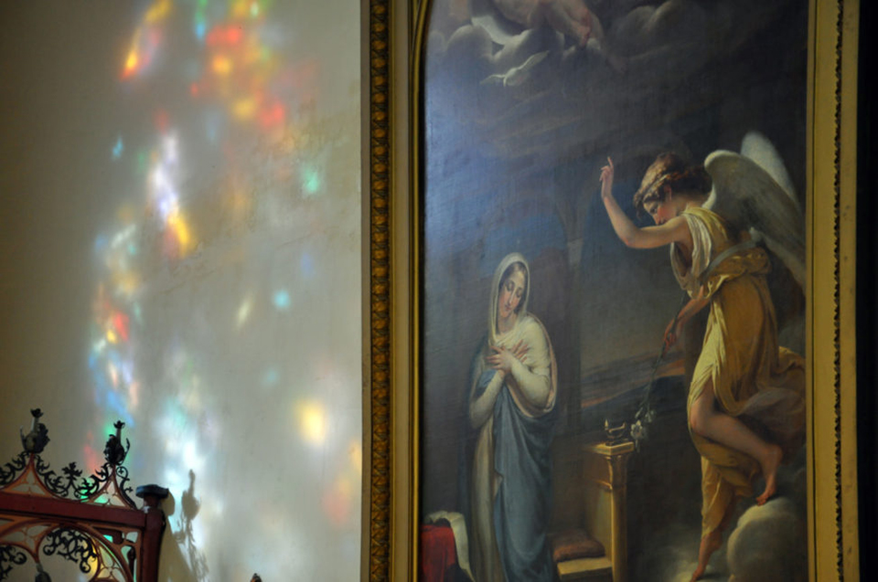
Holl does this by using reflections from indirectly lit coloured surfaces, following Le Corbusier. They have undoubtedly also wandered through a Gothic cathedral to be surprised by the reflections of stained-glass windows. Or perhaps they visited the Sint Jan in Den Bosch? Who can say.
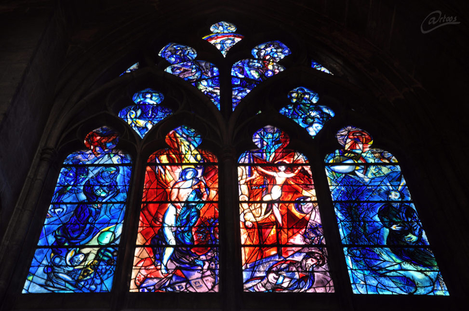
In music, but also in language, colour is often used figuratively, as colouring. In music, chromatic does not simply mean "coloured", but colouring by playing semitones.
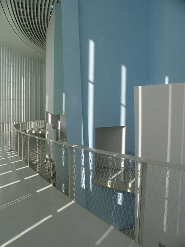
Such a subtle form of colouring clashes with the polychrome architecture of the Caribbean or with the burning monochrome objects of NEXT and MVRDV.
It can be found in the subtle colouring that Christian de Potzamparc gave to La Philharmonie de Luxembourg. In doing so, he brings the worlds of architecture and music together, producing interesting photography.
About the author
Onder de naam @rtoo's maakt Frank Toeset foto's, schilderijen en tekeningen. In zijn fotografie richt hij zich vooral op architectuur en tango. Frank Toeset is architect, hij deed zijn opleiding aan de Academie van Bouwkunst in Amsterdam.
You might also like
-
 17 Lightroom tips for editing architecture photos
by Michelle Peeters
-
 Review: Landscape & Architecture (Bas Meelker & Pieter Dhaeze)
by Michelle Peeters
-
 7 tips for architectural photography
by Michelle Peeters
-
 15 Favourite Architecture Locations in the Netherlands
by Michelle Peeters
-
 6 reasons to buy a tilt-shift lens
by Michelle Peeters
0 comments
Be the first to share what you think!
Have your say
Please note: Articles older than a week can only be commented on by signed-in visitors.Would you still like to comment? sign in or create a free account.
Become a better photographer every week
A practical photography tip in your inbox every week.
38,833 photography enthusiasts already receive the tips! More about the weekly mail. Or keep up to date via  Facebook.

Elja Trum
Photofacts; everything to do with photography!
Would you like to take better photos and keep up with what is happening in photography? Photofacts publishes articles that teach you something about photography — from a product announcement to a practical shooting tip or a look at a website. Photofacts covers photography every day and is a hobby project of Elja Trum's that got out of hand. The articles are written by a team of volunteer authors. If you would enjoy writing one or more articles for Photofacts, do get in touch.More about PhotofactsPhotofacts is made possible in part by
