

Improve your photos in post-processing in 8 steps
Wednesday 12 December 2018, 20:39 by Michelle Peeters | 52,883 views | 15 commentsThis article was translated from Dutch with the help of AI. Read the original.
Many photographers want to know how to make their photos look good without spending too much time on post-processing.
In the end, not everyone has the expertise or patience to master all the different tools in Photoshop and Lightroom. In this article, I show you the steps I normally take to edit my photos quickly so they look good.
You do not need extensive knowledge for this. The actions are carried out in Lightroom and Photoshop, but it should be possible to imitate them in other photo-editing packages.
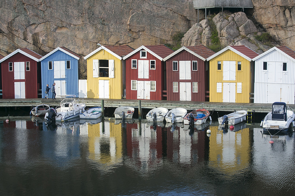
Bear in mind that when you look at a RAW file and wonder why it looks so flat and dull, this is because the camera has not worked on it yet. Remember that every RAW file needs post-processing to look its best.
First, here is a list of reasons why photos sometimes look unattractive. This explains the improvements I will clarify in more detail afterwards.
- Photo is too dark - modern cameras are designed to store as much information as possible in the highlights. This often means that photos look a little dark when you photograph in semi-automatic mode.
It is also common for photographers to underexpose slightly because they are afraid of losing information in clipped highlights. Unless you really intend to create a special dark atmosphere, these photos need to be adjusted in post-processing to make them lighter and more lively - Photo has too little contrast - this is very common. If a photo has too little contrast, it looks flat and unattractive. Adding a little contrast can already make a big difference
- Colours are oversaturated - many photographers sometimes make the mistake of oversaturating their photos. Either in the camera, through camera colour profiles, or during post-processing. This makes the colours look unrealistic.
It is tempting to make your photos look lively, but you need to be careful when applying too much saturation - Subject is not clear enough - as soon as the whole image is edited and there is no separation between different subjects or colour tones, your main subject is probably not clear enough. As soon as you add some clarity to your main subject, it will immediately stand out from your scene, and that is often exactly what you want
- Photo is not sharp enough - a good photo should be sharp in the right places. Sharpening in post-processing is important, but you need to know how to apply it properly and in moderation, without bringing out too much noise, artefacts or halos around your subject.
The list above leaves out other factors, such as exposure, composition, framing and camera technique. These factors need to be applied correctly when taking the photo, not during post-processing.
If a photo is not good quality, you can often still save something in post-processing, but certainly not everything. An out-of-focus photo cannot be made sharp afterwards.
Below is the list of steps I usually follow to improve my photos considerably in a quick way. Of course, prevention is better than cure, so make sure your exposure is as good as possible.
The first three points below are related to taking the photo itself, while the remaining points concern post-processing.
Contrast
If you want more punch in your photos, increasing the contrast is the way to make your photos stand out a little more and bring the whole image to life.
But if you want to increase contrast in a believable way, you need to take a number of things into account. It is not just about light and dark, but also about the world of nuances in between.
1. The right exposure
With post-processing, almost anything seems possible. But bear in mind that you cannot conjure up something that is not there. Not even with Photoshop. Severe overexposure or underexposure leads to irreparable loss of detail.
So make sure you set your camera settings, aperture, shutter speed and ISO value, in such a way that you avoid exposure errors as much as possible.
A perfect exposure is not strictly necessary, but try to avoid the extremes.
2. Using flash
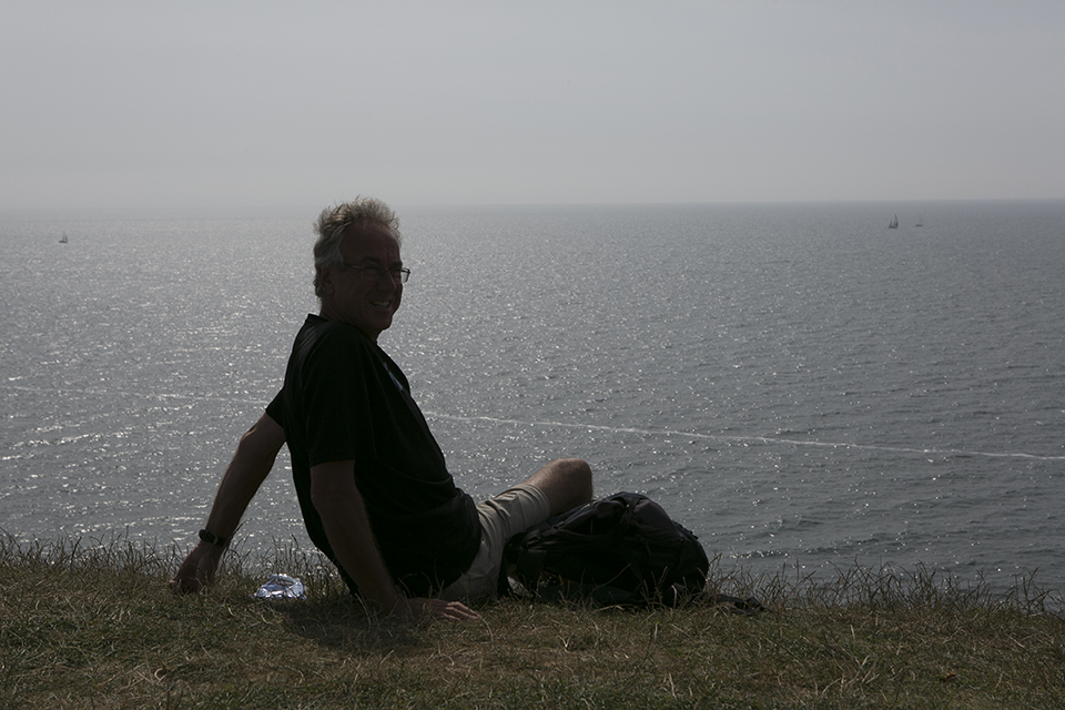
A natural way to add contrast is to use flash when you do not really need it. By using flash when there is enough light, you emphasise the person or object in the foreground.
The background receives less light as a result, without actually becoming underexposed. The right distance is crucial, neither too close nor too far away. Keep the same shooting distance you would use without flash.
That works fine without a separate flashgun, you will generally have enough with the built-in flash. A separate flashgun is of course better…
3. Photographing in evening light
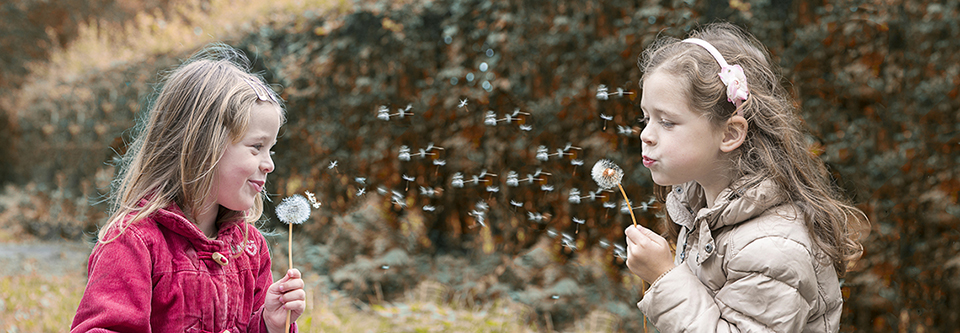
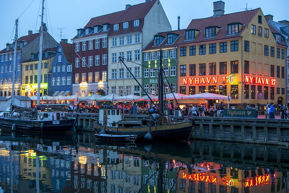
The final option for making your photos look attractive and lively while taking them on a drizzly, grey day is to wait until evening. The lights come on and you immediately see the colour returning to your photos.
You obviously have less light than during the day, so you will need to find support or use a tripod. Or use higher ISO values, which can cause noise.
4. Brightness
The simplest way to increase contrast in an image in Photoshop is by using the Brightness/Contrast option.
However, use it with some restraint. What this effect does is make certain characteristics of a photo more obvious, including unclear areas and imperfections.
Any exposure errors are exposed mercilessly. The same applies to image noise, which is particularly noticeable at higher ISO values.
This also becomes more visible as you increase the contrast. To increase the contrast, click Image in the menu at the top, followed by Adjustments, Brightness/Contrast.
A window with adjustment options then appears. By dragging Brightness upwards, you make the image lighter. At first, the whole photo seems to become paler.
But if you increase the contrast at the same time, the dark areas become darker and the lighter areas lighter, making the contrast stronger. This approach gives the quickest, but also the least subtle, result. That does not necessarily have to be a disadvantage.
5. Levels
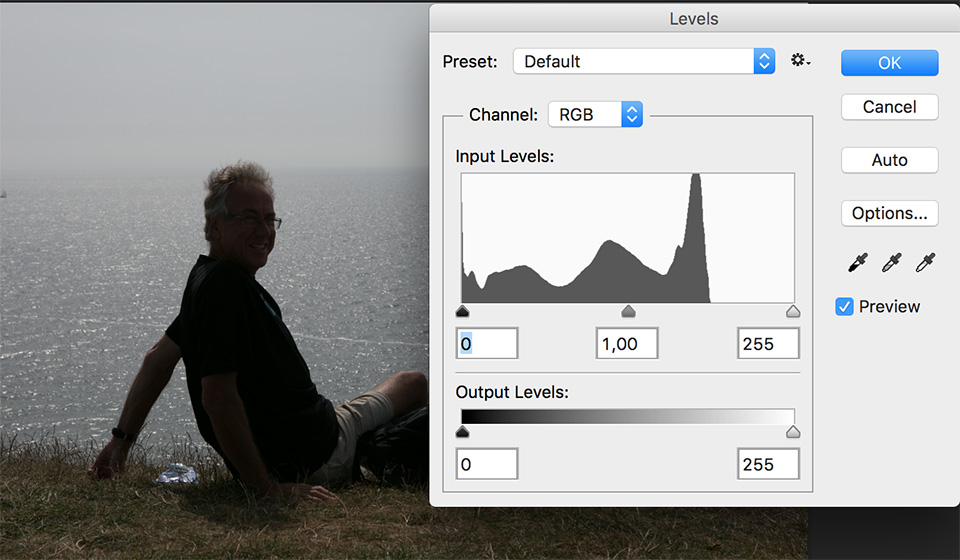
You can also increase the contrast using Levels. In fact, this window tells you how much image information the photo contains. This lets you see clearly whether your exposure was successful.
With a correct exposure, you see an evenly progressing graph in the shape of a not-too-steep hill. If you see large spikes on the left and almost nothing on the right, the photo is too dark, with irreparable loss of detail in the shadows.
If there is a huge peak on the right while the left side is almost empty, the photo is too light and detail has been lost in the highlights.
In extreme cases, there is little left to save. Smaller errors, on the other hand, are easy to correct. Click Image, Adjustments, Levels or use the keyboard shortcut Ctrl-L, and leave the drop-down menu set to RGB, unless you want to adjust a specific colour channel.
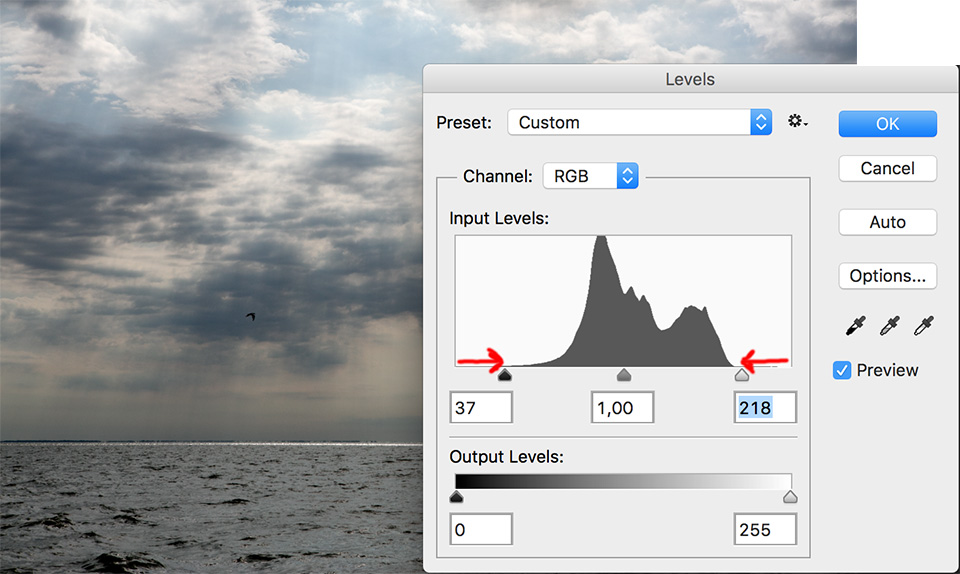
By moving the left slider to the right, you make the dark areas of the image even darker.
By moving the right slider to the left, you make the light areas of the image lighter. Use the middle slider to find the balance.
By moving the outer sliders a little closer together, you subtly increase the contrast. Be careful not to overdo it, otherwise you will get pitch-black shadows and blown-out highlights.
If you hold down the ALT key while moving the sliders inwards, your screen turns black. As soon as you start to see detail, you know you need to stop to prevent clipping.
6. Sharpening
In most cases, you increase contrast by adjusting the dark and light values in a photo.
Sharpening the photo also helps, however. Sharpening is an adjustment that is often misunderstood. You cannot make a blurry photo much sharper, no matter which filters and tricks you apply.
What you are actually doing is increasing contrast at a microscopic level. This makes lines and contours stand out more clearly from their surroundings, creating the illusion of sharpness at least.
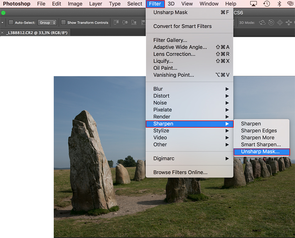
This makes the whole image look a little crisper. Applying this effect is very simple. Click Filter in the menu at the top, then Sharpen and finally Unsharp Mask.
A window with three sliders appears. The top slider actually controls the sharpness. You can move this quite far to the right, even beyond 150% here.
Then move the middle slider to the right very carefully, making the effect more clearly visible. You will soon see when you have gone too far, because it will look as though a bucket of wax has been poured over the image.
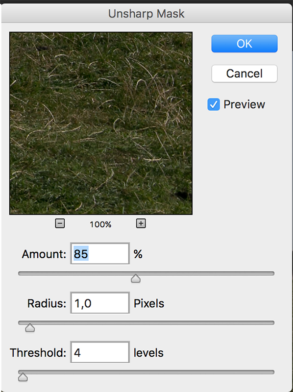
You can use the bottom slider to make the whole thing a little more subtle and softer, finding the golden mean. This is the kind of effect where you need to check afterwards that you have not gone too far.
A setting that gives a nice subtle effect for many photos is: Amount 85%, Radius 1, Threshold 4.
7. Shadows/Highlights
The name Shadows/Highlights already gives away what this option does. Photoshop looks for the darkest and lightest areas in your photo, after which you can lighten or darken them.
This option gives you a lot of influence over the final result, since the effect is not spread across the entire photo. You can decide how dark or light areas of the image need to be before they are affected by this effect.
The disadvantage is that the effect can be so subtle that it produces an unrealistic result without you immediately noticing exactly what is wrong. So remain critical and keep the original to hand.
Click Image, Adjustments, Shadows/Highlights. Shadows logically refers to the dark areas, but moving the top slider for this option to the right does not add shadows, it makes existing shadows lighter.
The middle slider determines how dark a shadow needs to be before it is affected. The further this slider is to the right, the greater its range.
The bottom slider is intended for a more subtle effect with smooth transitions. The same basically applies to Highlights: the further the top slider is moved to the right, the darker the light areas become.
With the middle slider, you once again indicate how light or dark an area of the photo needs to be to be affected.
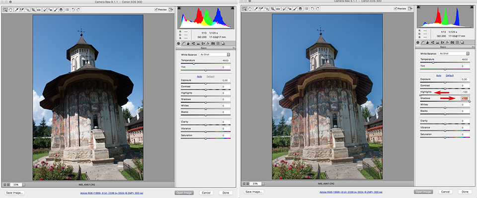
All these actions are easier in the RAW editor. This gives you much more leeway and a much greater dynamic range, which you can also use to correct or even out exposure errors or excessive differences in contrast.
8. Vibrance or saturation
If you want to boost your colours a little, it is best to use 'vibrance' rather than 'saturation'.
The difference from saturation is that vibrance mainly affects less saturated colours, while saturation makes all colours more primary.
If you edit your photos in RAW, it is also possible to adjust your colours selectively in RAW editing. This gives a much subtler effect.
More tips and tricks?
Do you have any good tips for making your photos look good, fresh and lively without too much complicated post-processing? Let us know in the comments!
Want to learn more about Photoshop image editing?
At Photofacts Academy, our online learning environment for photographers, we have several courses about Adobe Photoshop.
- Photoshop for Beginners (Johan Elzenga)
- Photoshop for Photographers (Piet van den Eynde)
- Advanced Photoshop (Marit Hilarius)
- Photoshop Effects (Elja Trum)
And much more...
You can follow these courses for two weeks with a free trial membership.
About the author
Michelle Peeters is fotografe en oprichter van DeuxBleus Fotografie. Michelle herkent het bijzondere in het gewone en het gewone in het bijzondere. Ze heeft zich nooit willen specialiseren en is daardoor van alle markten thuis.
You might also like
-
 Wanneer Lightroom en Photoshop niet meer samenwerken
by Nando Harmsen
-
 How much do Lightroom and Photoshop subscriptions really cost?
by Nando Harmsen
-
 6 Tips for Importing Photos into Lightroom
by Nando Harmsen
-
Does Lightroom make Photoshop redundant?
by Nando Harmsen
-
 Een wit kader met afgeronde hoekjes maken in Lightroom
by Nando Harmsen

15 comments
-
 Helly Coppens wrote on Tuesday 22 August 2017 at 11:19 | reply
Good tips and clear explanation, thank you!
Translated from Dutch. -
 Ron wrote on Tuesday 22 August 2017 at 11:25 | reply
Unfortunately a bit messy. Flashing (point 2) and photographing in evening light (point 8) are not post-processing. Moreover, the order of the actual post-processing differs from what is promoted as logical by many other authors and websites. Perhaps it is possible to give a short explanation sometime of the 7-point system promoted by Scott Kelby; 1-RAW processing, 2-Adjusting curves, 3-Shadows highlights, 4-'Painting with light', 5-Adjusting channels, 6- Blending modes and layer masks, 7-Sharpening.
Translated from Dutch.
Perhaps unnecessarily, beginner should be pointed out that the crop should be done first if desired, otherwise the post-processing is influenced by colours and brightnesses that are subsequently cropped away. -

 Piet Nicolaas wrote on Tuesday 22 August 2017 at 11:43
| reply
A wonderfully enlightening piece, which will certainly be very useful to me and that I’ll put into practice. I don’t have Lightroom though, but I can get quite far with Adobe Elements too. Thanks for this.
Translated from Dutch. -
 Michelle Peeters wrote on Tuesday 22 August 2017 at 13:27
| reply
@Ron: I agree with you, thanks for your tip and I will do it!
Translated from Dutch. -
 Donald Willemsen
wrote on Tuesday 22 August 2017 at 14:26
| reply
Opinions can differ enormously when it comes to the vibrancy and saturation of colours. Often, that is also a matter of taste. Many people like punchy colours like on postcards. So you also see many photos passing by as if they were postcards. Others deliberately remove some saturation from the photo, so that the colours become softer or even almost approach black and white. I apply the latter quite often, because such an edit also evokes a certain atmosphere. After all, every photo has to convey some kind of atmosphere to appeal to and captivate the viewer. If a photo is merely a copy of reality, it quickly becomes boring.
Translated from Dutch.
I did enjoy reading Michelle's article, by the way, and beginners can certainly benefit from it. -
 Reina wrote on Tuesday 22 August 2017 at 18:21 | reply
For the sake of clarity... a peak in the histogram on the right side is not a problem at all. It is even deliberately applied with the expose to the right technique.. slightly overexposing to the right. You can actually better tone down the highlights than brighten the shadows. In the shadows you are, after all, introducing visible noise. Peaks on the right side are a problem if they are all the way on the far right and also all the way to the top. That is called clipping. There is no information left in that white spot in the image (if you photograph directly into the sun, you often get this too and clipping is usually forgiven then).
Translated from Dutch. -
Michelle Peeters wrote on Tuesday 22 August 2017 at 18:27
| reply
@Reina, that's completely right! @Donniebelg: still better to use 'vibrance' than 'saturation'. Works more subtly!
Translated from Dutch. -
 R. Peterse wrote on Tuesday 22 August 2017 at 22:05 | reply
My (modest) experience tells me that every (advanced) photographer has their own approach to post-processing. I find it all interesting, try it out, and take from it what works for me. You learn something from it every time, even if it’s just one little thing.
Translated from Dutch. -
 Lauran van Schilt wrote on Wednesday 23 August 2017 at 09:37 | reply
You always write great articles Michelle. Better than in many photo magazines. What I do miss everywhere, however, is an article about photographing with volume. It's such a shame that it never gets any attention. It is actually one of the most important things in both photography and other types of art.
Translated from Dutch. -
Michelle Peeters wrote on Wednesday 23 August 2017 at 15:16
| reply
@Lauran: thank you! What exactly do you mean by 'photographing with volume'?
Translated from Dutch. -
Lauran van Schilt wrote on Wednesday 23 August 2017 at 16:05 | reply
@I’d be happy to write an article about that if you’d like, Michelle.
Translated from Dutch. -
Michelle Peeters wrote on Wednesday 23 August 2017 at 16:14
| reply
Sure Lauran, great! Just send your copy to michelle@photofacts.nl
Translated from Dutch. -
Lauran van Schilt wrote on Wednesday 23 August 2017 at 16:30 | reply
@Will do Michelle.
Translated from Dutch. -
 guest wrote on Wednesday 23 August 2017 at 21:52 | reply
I agree with Ron to some extent: the tips aren't only about post-processing and some already go fairly deep in my opinion. How do I go about it then?
Translated from Dutch.
1. Throw away bad photos (more than 50% as a rule of thumb). Also throw away photos that may be nice in themselves but don't add anything to the story / the choices you've made (no sunsets in a portfolio about birds).
2. With duplicates or triplicates: choose the best one and throw the others away.
3. Start by improving the crop, horizon, etc. before you start on exposure and contrast.
4. Try "auto enhance" for a moment, sometimes this already gets you quite a way in the desired direction.
5. And from here on, use Michelle's tips.
Good luck, Hans van Leeuwen -
Michelle Peeters wrote on Thursday 24 August 2017 at 23:50
| reply
@Guest: indeed, selecting your photos is part of it too and is quite a story in itself. Also something to dedicate an article to sometime. Cropping and straightening are something to start with, sharpening is what you do right at the end!
Translated from Dutch.
Have your say
Please note: Articles older than a week can only be commented on by signed-in visitors.Would you still like to comment? sign in or create a free account.
Become a better photographer every week
A practical photography tip in your inbox every week.
38,764 photography enthusiasts already receive the tips! More about the weekly mail. Or keep up to date via  Facebook.

Elja Trum
Photofacts; everything to do with photography!
Would you like to take better photos and keep up with what is happening in photography? Photofacts publishes articles that teach you something about photography — from a product announcement to a practical shooting tip or a look at a website. Photofacts covers photography every day and is a hobby project of Elja Trum's that got out of hand. The articles are written by a team of volunteer authors. If you would enjoy writing one or more articles for Photofacts, do get in touch.More about PhotofactsPhotofacts is made possible in part by
