

Choose the right background when editing your photos
Wednesday 18 November 2020, 20:40 by Nando Harmsen | 6,653 views | 3 commentsThis article was translated from Dutch with the help of AI. Read the original.
What does your background look like when you edit a photo? Do you use the standard grey shade of your photo editing software, or choose your own shade? Whatever you choose, it always affects your photo editing. So choose the right background when editing your photos.
A photo should be properly exposed. You do this first when taking the photo. Yet this is often not the final result. To get the photo looking its best, you will always need to do some fine-tuning in post-processing.
To edit your photos as well as possible, you need a good monitor that is also calibrated, and the lighting conditions around your computer need to be properly adjusted.
But even when all these things are set up optimally, there is still one thing you need to take into account: the background of your photo editing software.
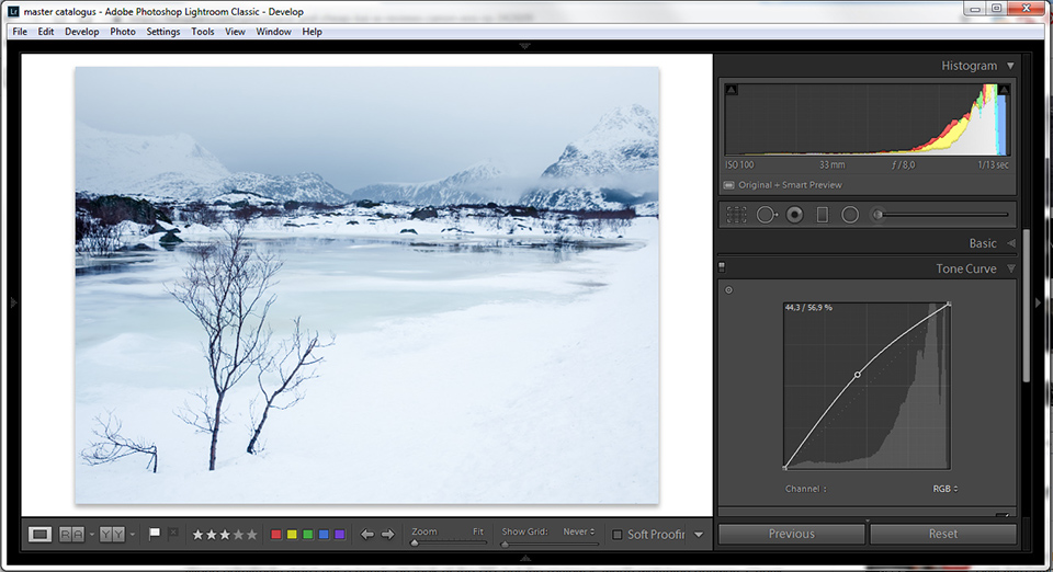
Editing a photo can be very critical. It is easy to adjust the exposure, change the colour balance, or alter the contrast and brightness locally. Yet getting the perfect brightness and colour remains difficult.
A calibrated monitor and properly adjusted ambient light are not the only things that affect how you edit your photo. Reflections from windows and incoming sunlight also affect what we see and assess on the screen. A completely darkened room is not good either.
When you have set everything up as well as possible, you will probably have forgotten about the background colour or shade of your software programme. Because this affects the brightness we set for the photo.
The effect of the background
Regardless of which photo editing software you use, your photo will always be displayed against a background. This background is usually a dark shade of grey, to cause as little distraction as possible. But this grey shade in the background will act as a reference when setting the brightness of the photo.
If you choose the wrong background shade for your photo, you can easily be misled. Compared with your background, a photo may therefore appear lighter than it really is, or the other way around.
That is why it is advisable to adjust the shade of your background to the brightness of your photo.
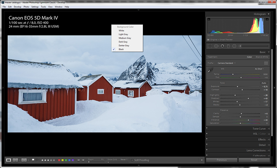
To give you an idea of what I mean, I have a few examples. The first photo is a snowy landscape displayed against a dark, black background. The snow seems nicely bright compared with the black background. But this changes when you view the same photo against a white background. The snow then looks grey and dull.
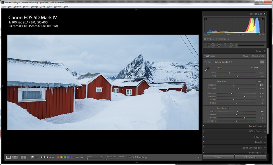
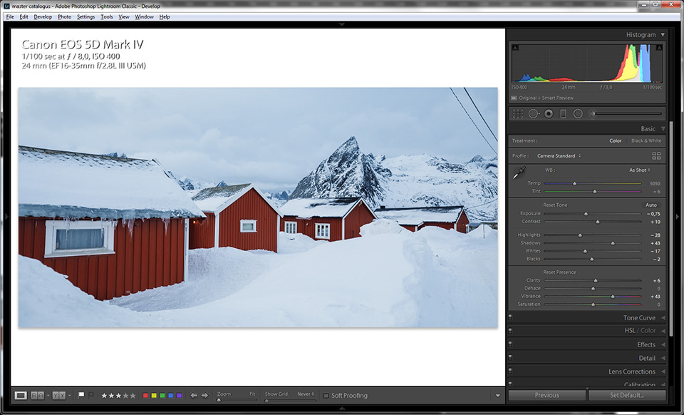
When I edit the brightness of the photo based on the white background, the snow becomes much whiter and fresher in appearance. When I then view that edited photo against the black background, the snow looks very white indeed.
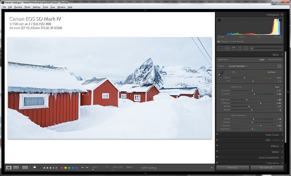
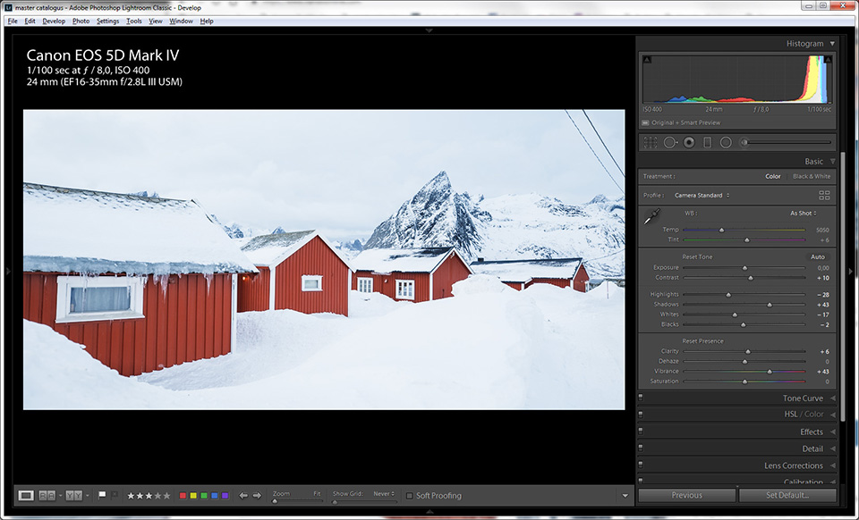
This difference occurs because the background acts as a reference against which we view and assess the photo. We see this not only with light photos, but also with dark photos. Take a look at the following example of a nocturnal landscape.
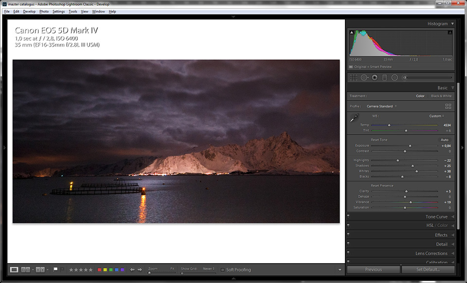
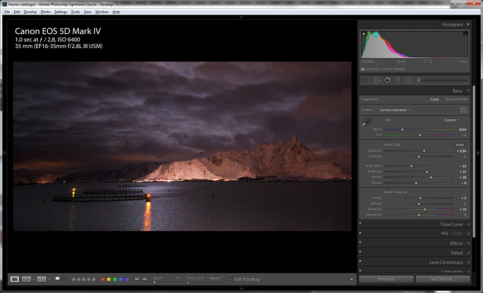
When the photo is viewed against a light background, you get the impression that the photo is very dark. You might be inclined to make the image much lighter. However, it looks very different when you view the photo against the dark background.
What if the photo is not extremely light or dark?
What background should you choose if the photo is not as light or dark as the examples I have given? I have found that an 18% grey shade works best in that case. This 18% grey shade is exactly halfway between white and black.
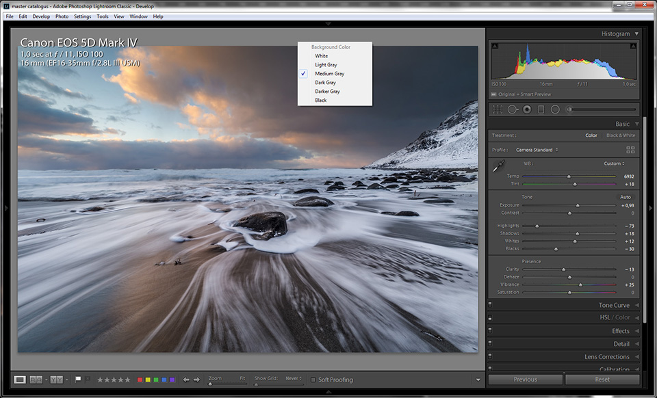
I recommend choosing a grey shade as standard that is around that 18% grey value, exactly halfway between black and white. This allows you to edit most photos perfectly without being misled.
If your photo mainly contains light shades, like the example with snow, make your background much lighter. Perhaps even completely white. With dark photos, such as my example of a night photo, a very dark background may work better.
How do you set the background?
I use Lightroom and Photoshop. In these programmes, it is very easy to change the background. Right-click on the background and choose the shade you need.
It is that simple. If you use different software, look it up on the internet. It will probably be possible to set it in a similar way.
About the author
Nando Harmsen has been photographing for more than 40 years. He specialises in wedding photography and landscape photography. Nando also gives talks, workshops, masterclasses and photo trips, and regularly reviews new and interesting equipment.
You might also like
-
 Presets in Lightroom Classic
by Nando Harmsen
-
 What's new in the Lightroom Classic 13 update?
by Nando Harmsen
-
 Lightroom Classic tip: Create smart presets
by Elja Trum
-
 5 Tips for Managing Photos in Lightroom Classic (and Other Software)
by Nando Harmsen
-
 Playing with black and white contrast in Lightroom Classic
by Nando Harmsen
-
 Review: Blurb photo books via Lightroom Classic
by Nando Harmsen
3 comments
-
 Rian wrote on Tuesday 24 November 2020 at 13:02 | reply
I’ve never noticed it before, but I’m definitely going to give it a try. It seems to make a big difference. Thanks!
Translated from Dutch. -
 Ton Hoenen wrote on Tuesday 24 November 2020 at 19:24 | reply
Sorry Nando but this has never stood out to me either.
Translated from Dutch.
I tried it but I don't see much difference in it, I think it comes down to taste.
Greetings Ton. -


Have your say
Please note: Articles older than a week can only be commented on by signed-in visitors.Would you still like to comment? sign in or create a free account.
Become a better photographer every week
A practical photography tip in your inbox every week.
39,079 photography enthusiasts already receive the tips! More about the weekly mail. Or keep up to date via  Facebook.

Elja Trum
Photofacts; everything to do with photography!
Would you like to take better photos and keep up with what is happening in photography? Photofacts publishes articles that teach you something about photography — from a product announcement to a practical shooting tip or a look at a website. Photofacts covers photography every day and is a hobby project of Elja Trum's that got out of hand. The articles are written by a team of volunteer authors. If you would enjoy writing one or more articles for Photofacts, do get in touch.More about PhotofactsPhotofacts is made possible in part by
