

Prefer High Contrast in Your Nature Photos
Saturday 29 March 2025, 14:07 by Nando Harmsen | 2,671 views | 0 commentsThis article was translated from Dutch with the help of AI. Read the original.
Many photographers always want everything to fit within the dynamic range. That is understandable, because blown-out highlights and blocked-up shadows are not always desirable. But that does not mean everything has to be in the midtones. It is usually better to choose high contrast.
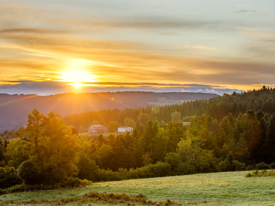
High contrast creates a big difference between the light areas and the dark areas in a photo. Look for it, because it makes the photo more exciting. You can achieve this with backlighting or in daylight. Play with light and dark and use it.
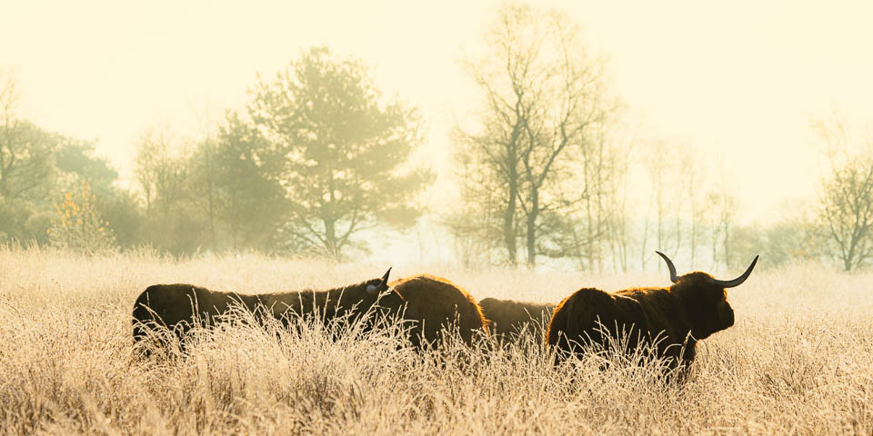
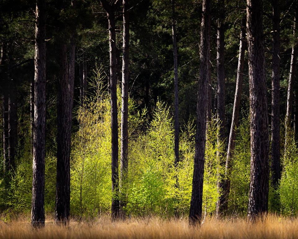
In a studio, it is often used deliberately, but in nature photos it is usually avoided. That is a shame, because using light and dark also gives a photo more dimension and depth.
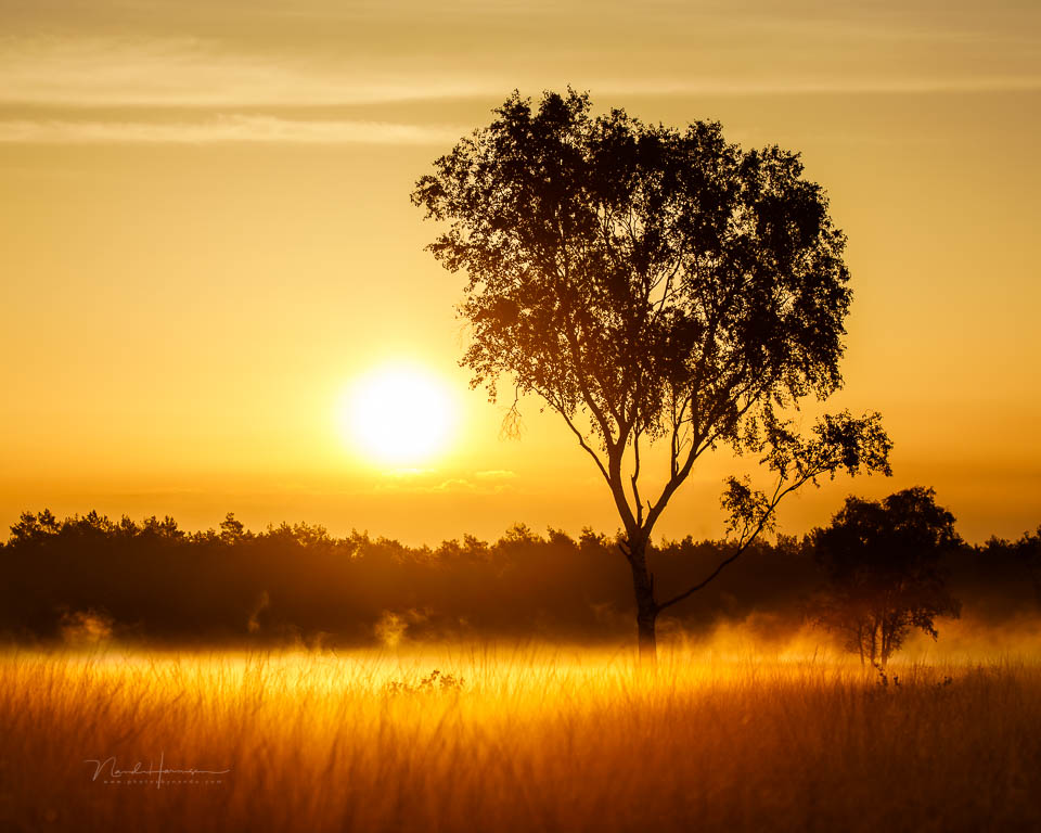
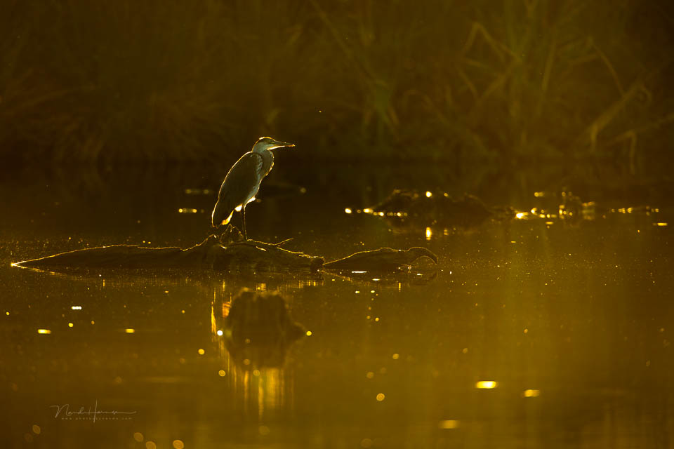
High contrast does not mean that your photo must also contain blown-out highlights or blocked-up shadows. If the situation does produce these, exposure bracketing is recommended. As long as your subject allows it. But make sure you keep contrast in your HDR photo. Do not 'brighten everything'.
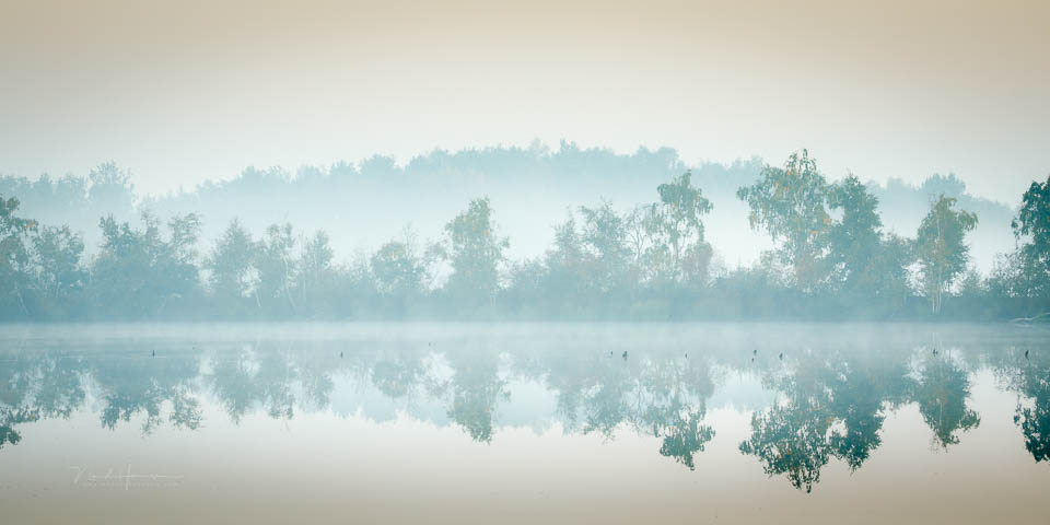
Is there no clear light source, such as under an evenly overcast sky? Then it is impossible to use light and shadow in the photo. The photos have low contrast. That is not wrong, it just produces a very different kind of photo. In that case, it is wrong to increase the contrast during post-processing.
If there is a clear light source, such as the sun, make use of light and shadow. Do not add light during post-processing where there is none. That looks unnatural. Make sure there is contrast, and your photo will look much better.
About the author
Nando Harmsen has been photographing for more than 40 years. He specialises in wedding photography and landscape photography. Nando also gives talks, workshops, masterclasses and photo trips, and regularly reviews new and interesting equipment.
You might also like
-
 Review: HDR and Dynamic Range Course
by Martin van Rooij
-
 Landscape photography tip: add contrast to your photo
by Nando Harmsen
-
 Playing with black and white contrast in Lightroom Classic
by Nando Harmsen
-
 Blown-out white and blocked-up black in your photo print
by Nando Harmsen
-
 Don't be afraid of dark and light in your photos
by Nando Harmsen
-
 Review: Photo Blocks from Profotonet
by Michelle Peeters
0 comments
Be the first to share what you think!
Have your say
Please note: Articles older than a week can only be commented on by signed-in visitors.Would you still like to comment? sign in or create a free account.
Become a better photographer every week
A practical photography tip in your inbox every week.
39,024 photography enthusiasts already receive the tips! More about the weekly mail. Or keep up to date via  Facebook.

Elja Trum
Photofacts; everything to do with photography!
Would you like to take better photos and keep up with what is happening in photography? Photofacts publishes articles that teach you something about photography — from a product announcement to a practical shooting tip or a look at a website. Photofacts covers photography every day and is a hobby project of Elja Trum's that got out of hand. The articles are written by a team of volunteer authors. If you would enjoy writing one or more articles for Photofacts, do get in touch.More about PhotofactsPhotofacts is made possible in part by
