

Selective colour adjustments in Raw editing
Wednesday 12 December 2018, 15:04 by Michelle Peeters | 16,794 views | 5 commentsThis article was translated from Dutch with the help of AI. Read the original.
As a photographer, you can communicate with your images. You guide the viewer in a particular direction. You do this by conveying visual information, and there are all sorts of ways to do that.
For example, you can leave parts of your photo out, by making selections. You can also use colours to apply your intended effect to your selection, making this part cooler or warmer, for example.
Effect per colour
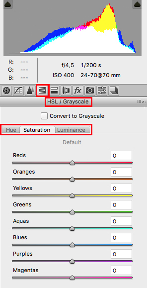
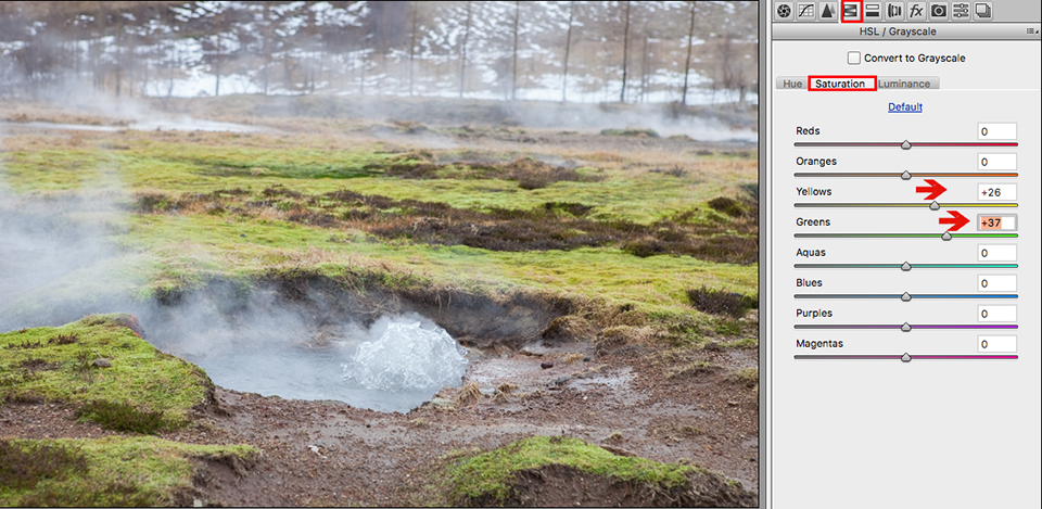
If you want to apply a particular effect to each colour, you do not apply it to the entire image. Suppose you want the grass in your photo to look fresher and greener. In the RAW editor, you can increase the saturation of the Yellow and Green tones a little.
So this is not an increase in saturation across the entire image. A white balance adjustment towards yellow and green would not work well here either, because it would colour other tones as well, such as the white in the photo.
The colour order in the HSL/Grayscale or KVL/Grijswaarden menu in Adobe Camera Raw is always the same. An end colour on the right is always a starting colour for the one below it. Overlap is also possible. You can create all sorts of combinations, and you can save adjustments you have made for reuse.
In the image below, the saturation of the yellow and green tones has been increased a little, making the grass look sunnier and creating more depth. This is also because the contrast is automatically increased as a result.
Hue, Saturation and Luminance
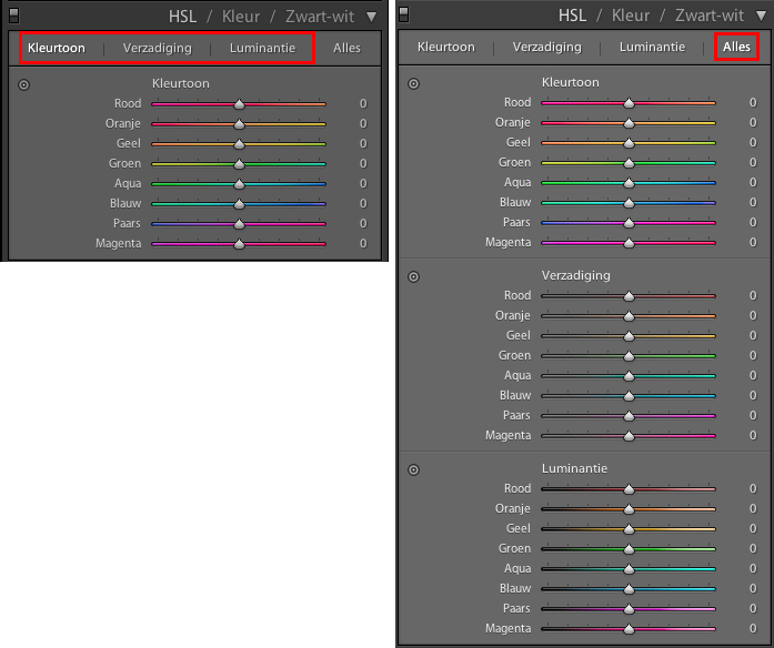
In Lightroom, you will find the menu for selectively adjusting colours under HSL, Hue, Saturation, Luminance. You can show everything, all three groups, or select an individual colour, whichever you prefer.
Hue
Adobe Camera Raw works with just three subtabs instead of the four in Lightroom. In both applications, however, there are always eight colours in the same order: Red, Orange, Yellow, Green, Aqua, blue-green, Blue, Purple and Magenta, purplish pink.
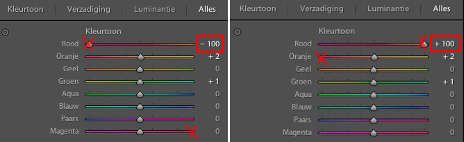
Starting with the colour red, you can vary it from -100, which is the same as purplish red, to +100, which is orange. The extreme settings for each colour therefore connect to the next colour. This lets you try out different combinations and emphasise or suppress colours.
Saturation
Saturation is a measure of the purity of a colour. Colours with high saturation are vivid, bright, clear or deep. Colours with low saturation are muted, pale or grey. In the Raw editor, you will also find the term 'Vibrance'.
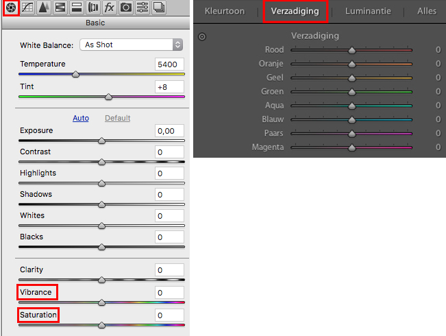
The difference is that vibrance mainly affects less saturated colours, while saturation turns all colours into primary colours.
If you move the 'vibrance slider' all the way to the right, to +100, you get striking colours. If you move it all the way to the left, to -100, almost no colours remain.
You can therefore increase the saturation of the eight colours separately, or fade them towards grey. This lets you guide your viewer's eye towards particular parts of your photo, or away from them.
Natural greens, such as grass, moss and leaves, contain quite a lot of yellow. If you reduce the yellow a little and increase the green, it looks purer and fresher, and less sunny.
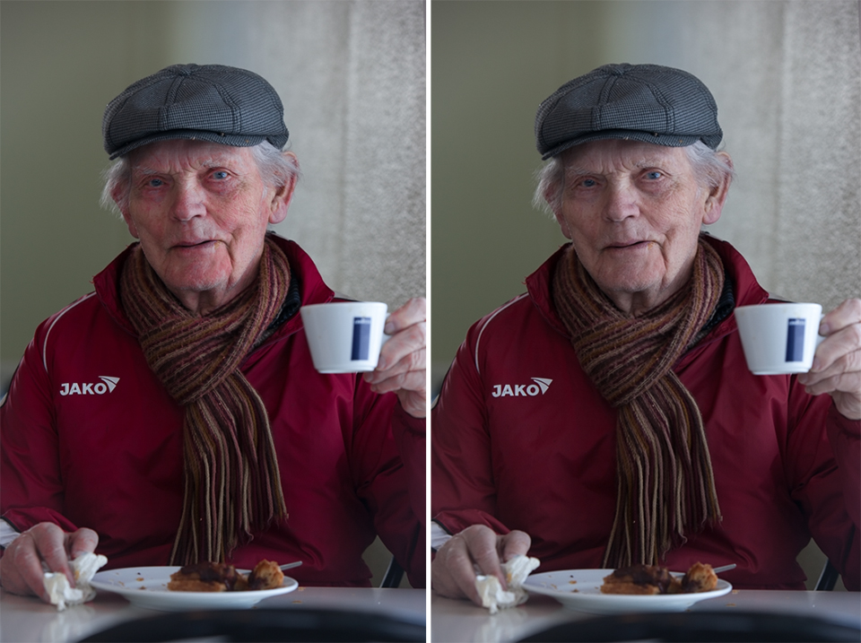
Be careful when increasing the saturation of skin tones. You can flatter someone with a slightly red face or lots of spots by reducing the saturation of the red a little.
Wrinkles and age spots are also emphasised more by high saturation, because it increases the contrast.
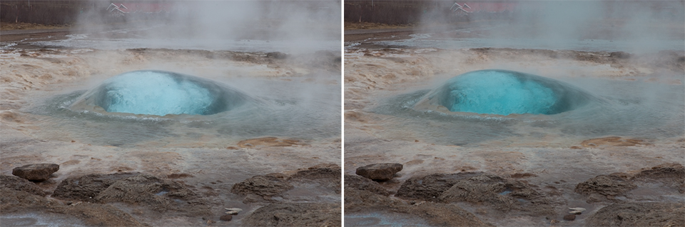
You can make a cloudless sky bluer by moving the 'blue tones' slider a little to the right. You can also accentuate blue water, such as that around this geyser in Iceland.
You can also correct overexposure with 'luminance'. Be careful not to overdo it with 'saturation'!
Luminance
This lets you increase the brightness of a specific colour. You can use it to brighten dark areas in your photo effectively.
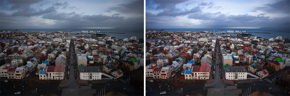
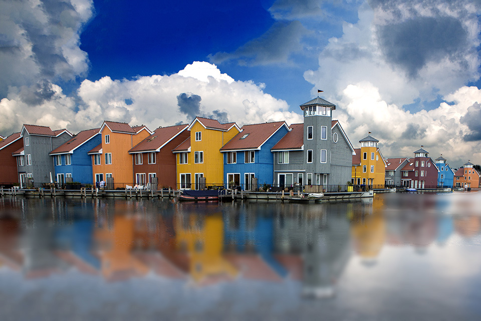
In the photo above, Hue, Saturation and Luminance adjustments have all been applied to create a much more colourful and expressive photo. The fairly dark foreground has been lightened with Luminance and by reducing the saturation of magenta.
The coloured wooden houses have been made much more colourful by strengthening the specific colours, in this case red, blue and green.
By strengthening the colour blue, also with Saturation, the sea now looks fresher, as does the cloudy sky. Increasing the saturation of the red, blue and green colours also creates more contrast, making the photo deeper and more dramatic.
The Blue Hour
In the morning, you often see pastel colours before the sun rises. You also see this in the evening, just after the sun has gone down, the so-called 'blue hour'. Our eyes adapt so well that we do not see this, but it does become visible in the photo.
You can correct this by reducing the saturation of the blue tones and boosting all colours a little by increasing the vibrance.
When the lights come on and the daylight becomes weak, it takes on a deep blue colour. Dark areas become black, without any detail. You can reduce the saturation of the magenta a little and shift the yellow artificial light towards orange with Hue.
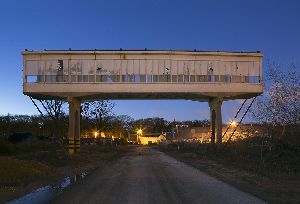
You can dim the brightness of the yellow, artificial light, with Luminance if it is too dominant in your photo.
The Golden Hour
When the sun has just risen or is about to set, you often see a 'golden glow' on everything still lit by the sun. The rest is cool or blue, such as the sky, through to magenta.
You can correct this by reducing the saturation of the magenta tones a little and making the orange tones lighter using Luminance, not Saturation. If you want to add some drama, increase the contrast.
More drama
Dramatising your photo is not always desirable or useful. Think of product photos, architecture, journalistic photos, which also includes sports photos, and reports, for example. But if you do it subtly, it can increase the impact of your photo. As long as you do not overdo it!
You can add drama by increasing the contrast and vibrance, for example. You can shift the colour yellow, sunny, a little towards green, fresh, for more depth.
Saturating certain colours gives them more attention than less saturated colours. This lets you draw attention to a subject with a particular colour.
Alternatively, you can create a more harmonious combination with the colours in the background. You can do this very subtly, so that it is barely noticeable. That often gives the best result.
Want to learn more about Photoshop image editing?
At Photofacts Academy, our online learning environment for photographers, we have several courses about Adobe Photoshop.
- Photoshop for Beginners (Johan Elzenga)
- Photoshop for Photographers (Piet van den Eynde)
- Photoshop for Advanced Users (Marit Hilarius)
- Photoshop Effects (Elja Trum)
And many more...
You can take these courses for two weeks with a free trial membership.
About the author
Michelle Peeters is fotografe en oprichter van DeuxBleus Fotografie. Michelle herkent het bijzondere in het gewone en het gewone in het bijzondere. Ze heeft zich nooit willen specialiseren en is daardoor van alle markten thuis.
You might also like
-
 Microsoft releases free RAW Image Viewer extension for Windows 10
by Michelle Peeters
-
 Everyone photographs in raw, there are no exceptions
by Nando Harmsen
-
 Boosting a Single Colour in Photoshop
by Michelle Peeters
-
 30 techniques for using colour in your photos
by Michelle Peeters
-
 10 tips for photographers who prefer shooting JPEG
by Nando Harmsen
-
 Is there a quality difference between raw and compressed raw?
by Nando Harmsen
5 comments
-
 Henk wrote on Tuesday 9 May 2017 at 14:23 | reply
A clear article, Michelle. Thanks!
Translated from Dutch. -
 Toni wrote on Tuesday 9 May 2017 at 15:27 | reply
Interesting!
Translated from Dutch. -
 lispa wrote on Tuesday 9 May 2017 at 20:36 | reply
Learned something new again, thanks for this
Translated from Dutch. -

 info@dekuijperfotografie.
wrote on Saturday 9 September 2017 at 15:58
| reply
The story isn't entirely correct. Under effects per color it says that you don't adjust the entire image.
Translated from Dutch.
However, you do, just not for all colors.
However, if you adjust green in this way, everything that contains green gets adjusted. This too can have an unwanted effect. It can suddenly cause a green tint in water or sky, for example, or in a sweater that is already bright enough in color. It often works fine, but always check for possibly unwanted side effects. -
 Michelle Peeters wrote on Saturday 9 September 2017 at 16:01
| reply
@info@dekuijperfotografie: thanks for the tip!
Translated from Dutch.
Have your say
Please note: Articles older than a week can only be commented on by signed-in visitors.Would you still like to comment? sign in or create a free account.
Become a better photographer every week
A practical photography tip in your inbox every week.
38,764 photography enthusiasts already receive the tips! More about the weekly mail. Or keep up to date via  Facebook.

Elja Trum
Photofacts; everything to do with photography!
Would you like to take better photos and keep up with what is happening in photography? Photofacts publishes articles that teach you something about photography — from a product announcement to a practical shooting tip or a look at a website. Photofacts covers photography every day and is a hobby project of Elja Trum's that got out of hand. The articles are written by a team of volunteer authors. If you would enjoy writing one or more articles for Photofacts, do get in touch.More about PhotofactsPhotofacts is made possible in part by
