

Colour as a solution for a bad black-and-white photo
Monday 30 January 2023, 20:40 by Nando Harmsen | 3,669 views | 9 commentsThis article was translated from Dutch with the help of AI. Read the original.
A bad or uninteresting colour photo is often converted to black and white. That is supposedly artistic. Unfortunately, it cannot repair a flawed photo.
If you want to improve a bad or uninteresting photo, you can actually add colour instead. I explain why I think this.
It happens so often. A colour photo that is not interesting enough is turned into a grey black-and-white photo at the press of a button. At that point, we label it artistic.
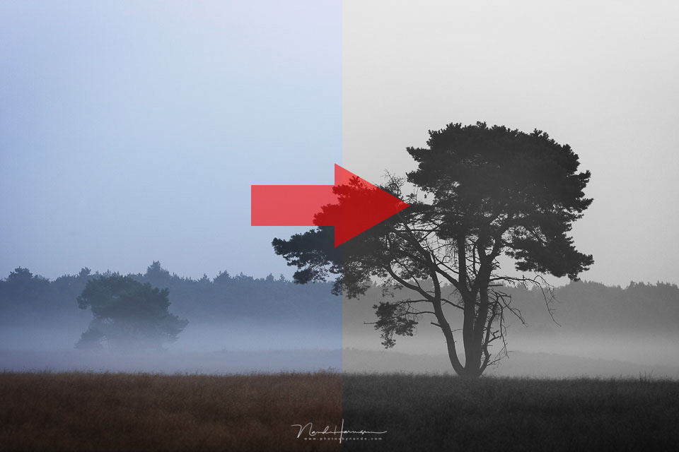
This almost never works. A bad photo cannot be repaired this way. Removing the colours makes composition and contrast even more important in the photo. After all, colours distract from these kinds of aspects in a photo.
Take a colour photo with a poor or uninteresting composition, but with a stunning, colourful sky. This will produce plenty of positive reactions. Remove the colour, and nothing remains of the impressive colour photo.
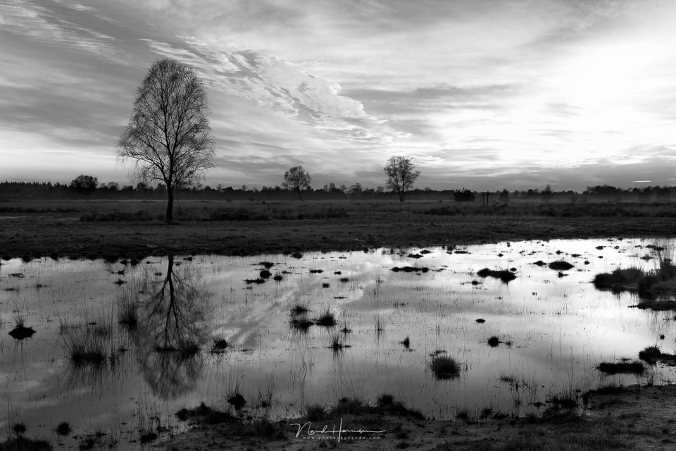
This automatically means that when you have an uninteresting composition, adding an impressive colour effectively saves the photo. From that moment on, we are no longer looking at the composition, but at the colours.
This does not mean that the photo becomes better. Of course not. But the colours do give you an easy way to make the photo more impressive.
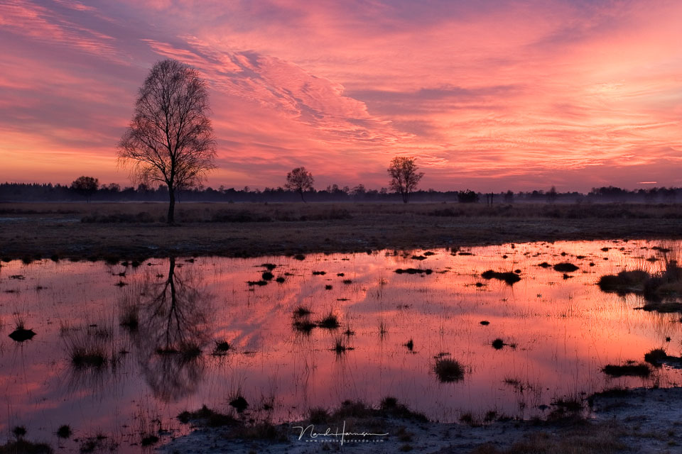
We often turn to black and white to save a bad photo, while in fact we could achieve this better by adding colour.
Ultimately, a good photo will not depend solely on colour or the lack of colour, but on the composition you choose. Get that right, and a photo will often work in both black and white and colour.
About the author
Nando Harmsen has been photographing for more than 40 years. He specialises in wedding photography and landscape photography. Nando also gives talks, workshops, masterclasses and photo trips, and regularly reviews new and interesting equipment.
You might also like
-
 Playing with black and white contrast in Lightroom Classic
by Nando Harmsen
-
 5 tips to work faster in Lightroom Classic
by Thijs Schouten
-
 Black and white is not a solution for a failed colour photo
by Nando Harmsen
-
 My 10-step Lightroom Classic workflow
by Nando Harmsen
-
 Landscape photography tip: add contrast to your photo
by Nando Harmsen
-
 Wanneer Lightroom en Photoshop niet meer samenwerken
by Nando Harmsen
9 comments
-
 Donald Willemsen wrote on Tuesday 31 January 2023 at 10:37 | reply
Nando, in broad terms I agree with you.
Translated from Dutch.
Color can/will be an eye-catcher. Yet I still believe that a flawed or uninteresting photo remains a flawed or uninteresting photo whether you convert it to b/w or add color. Merely attracting attention with color does not make it a good photo.
What might work, however, is converting it to b/w and then removing all the shades of gray from the photo so that you are left with almost only black and white, thereby giving it a graphic design (a kind of pen drawing). -

 Nando
wrote on Tuesday 31 January 2023 at 10:56
| reply
Nando
wrote on Tuesday 31 January 2023 at 10:56
| reply
That's right, Donald. You can't fix a failed photo. It does mask the flawed photo because colors do, after all, provide distraction. Just look at photo community sites, and you'll see it everywhere.
Translated from Dutch.
Your suggestion of what would work implies that for such a graphic design, the design/image composition doesn't matter at all. That is of course not true. -
 PixelDude Raoul
wrote on Tuesday 31 January 2023 at 11:32
| reply
PixelDude Raoul
wrote on Tuesday 31 January 2023 at 11:32
| reply
@ Nando
Translated from Dutch.
I think the title is completely wrong.
The point should be to add color to a not-so-good color photo. Adding a certain color to a bad b&w will still be bad. -
-
Donald Willemsen wrote on Tuesday 31 January 2023 at 11:37 | reply
@Nando, of course design and image composition continue to play an important role. You are absolutely right about that. What I meant to say is that with the method I described, you can sometimes still give a boring image some added value. Just as you do with color.
Translated from Dutch. -
-
 Lauran wrote on Tuesday 31 January 2023 at 11:50 | reply
Tip: a bad photo never becomes a good one. Throw it away!
Translated from Dutch. -
-
 Kurt M ( FC8400 ) wrote on Tuesday 31 January 2023 at 18:53 | reply
Black and white conversion is not just one button and done here. I use multiple layers with different black and white settings. Certain colors are sometimes made garish or super soft, to obtain specific shades of gray. Masks in those layers are sometimes needed. Contrast and highlights are adjusted.
Translated from Dutch.
The layers are given different opacities, causing certain shades of gray to be accentuated. Every selected color photo also gets a black and white version.
From black and white to color, no experience with that. Never stopped to consider that thought. It is an interesting idea though, still being tested.

Have your say
Please note: Articles older than a week can only be commented on by signed-in visitors.Would you still like to comment? sign in or create a free account.
Become a better photographer every week
A practical photography tip in your inbox every week.
39,079 photography enthusiasts already receive the tips! More about the weekly mail. Or keep up to date via  Facebook.

Elja Trum
Photofacts; everything to do with photography!
Would you like to take better photos and keep up with what is happening in photography? Photofacts publishes articles that teach you something about photography — from a product announcement to a practical shooting tip or a look at a website. Photofacts covers photography every day and is a hobby project of Elja Trum's that got out of hand. The articles are written by a team of volunteer authors. If you would enjoy writing one or more articles for Photofacts, do get in touch.More about PhotofactsPhotofacts is made possible in part by
